All graphs
The react graph gallery displays hundreds of graphs made with React, often with the help of d3.js. This page provides an overview of all charts showcased in this gallery.
Note that all chart types are presented on the welcome page of the gallery. It is probably a more convenient way to browse this website if you know what you are looking for!
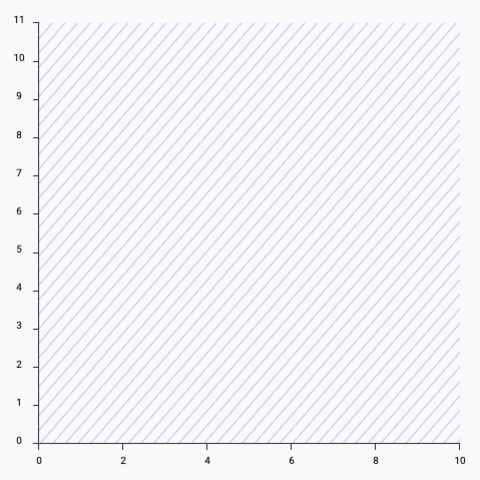
Scales and axes
How to map your data in a 2d space, and how to draw the axes
Scatterplot Hover effect
How to add a hover effect to highlight a group on a scatterplot
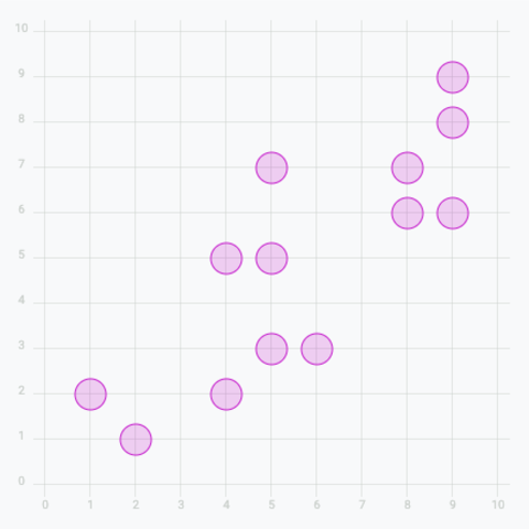
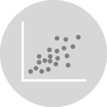
Basic scatter plot
Add circles to get a basic scatter plot
Add tooltip
Get more details about each datapoint by adding a tooltip on hover
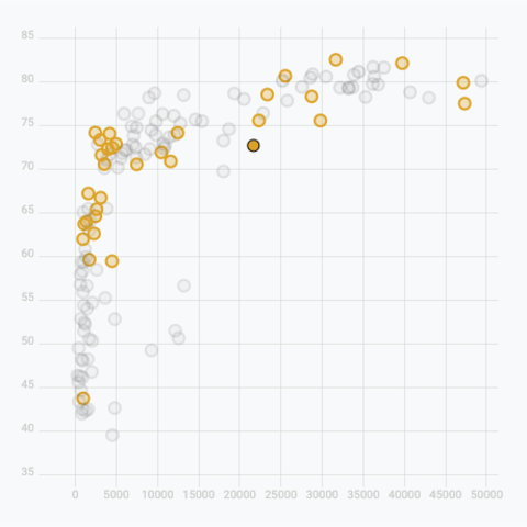
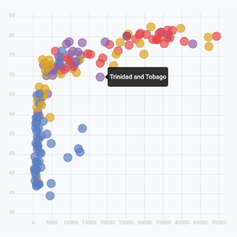
Add a hover effect
Highlight a specific group on hover
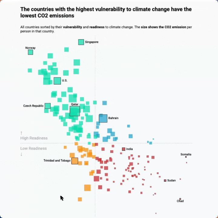
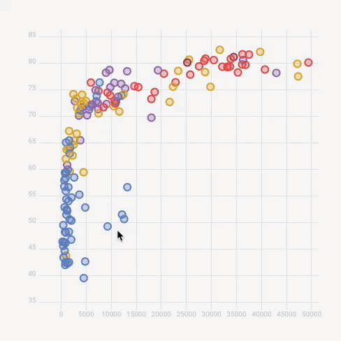
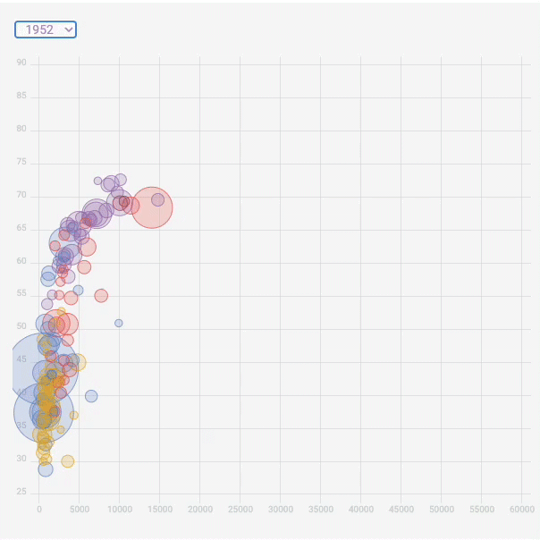
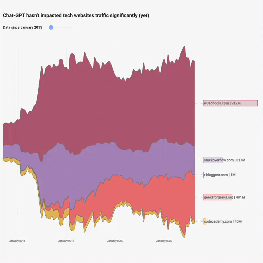
Real life use-case
Reproduction of a data wrapper chart representing countries CO2 data
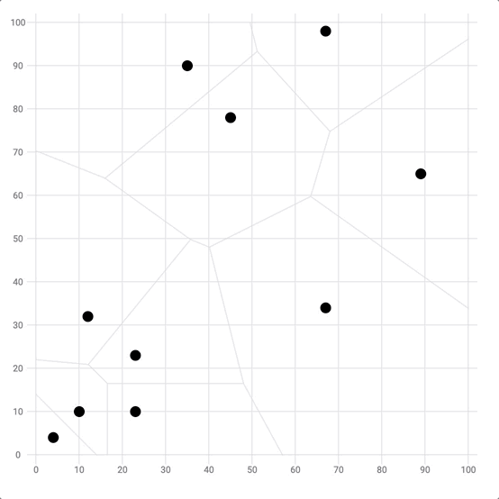
Closest point detection with Voronoi
Voronoi diagram in the scatterplot bg to find the mouse closest point
Scatterplot in Canvas
Learn how to render a scatterplot in canvas to improve performances
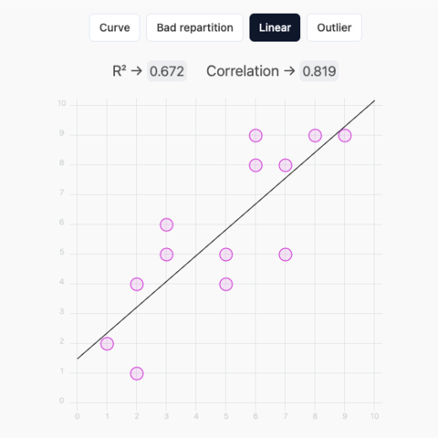
Scatterplot with r2, linear regression and draggable circles
What does r2 mean? Check this draggable linear regression to find out
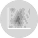
Basic heatmap
Most basic heatmap
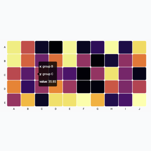
Heatmap with tooltip
Learn how to add a tooltip to a heatmap with react
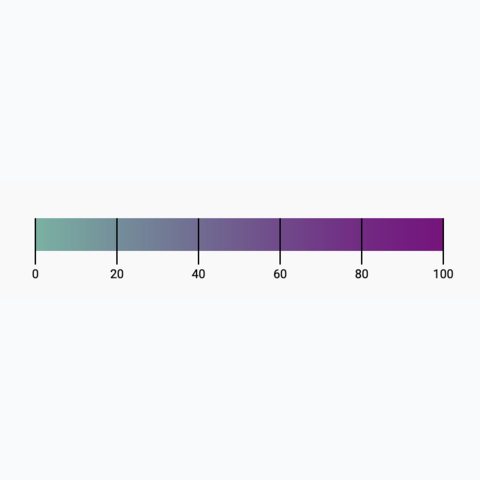
Continuous color scale
How to add a color legend to your chart that uses a continuous color scale
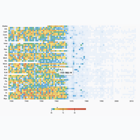
Vaccination heatmap
Reproduction of a famous vaccination heatmap using d3 and react
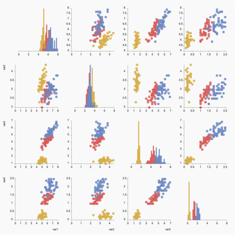
Basic correlogram
Learn how to build a correlogram with react and d3
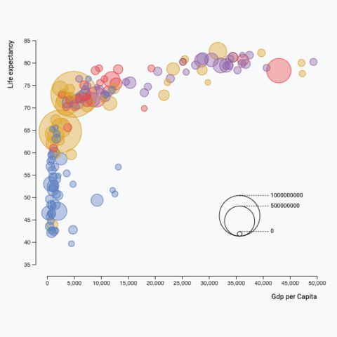
Bubble plot
Learn how to build a bubble plot with react and d3.js
Bubble plot data set transition
How to smoothly animate the transition between dataset
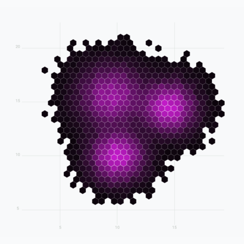
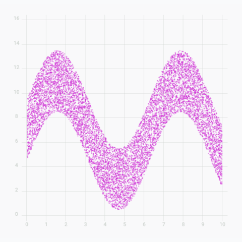
Hexbin chart
A hexbin chart split the figure in hexagons to show a 2d density
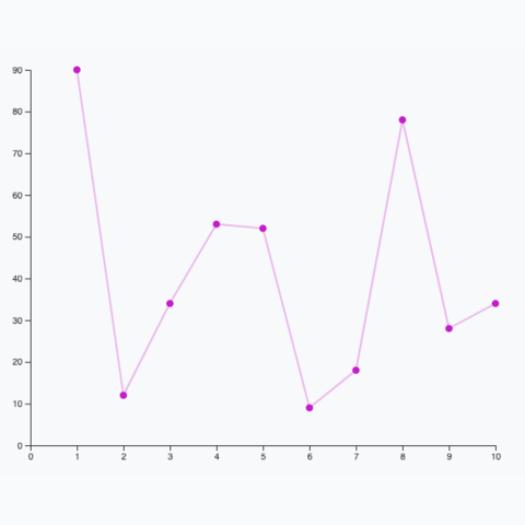
Simple connected scatterplot
A very simple connected scatter plot showing the evolution of 1 numeric variable
Violin to Boxplot transition
Using shape morphism to smoothly transition from a boxplot to a violin and reverse
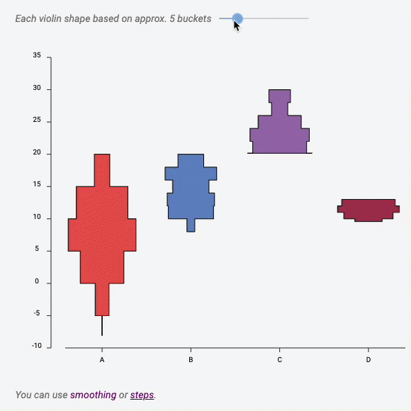
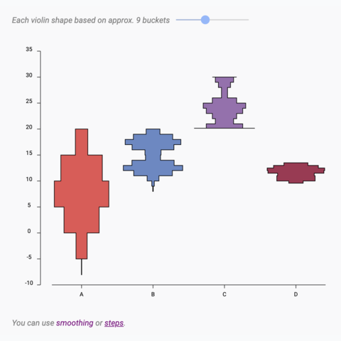
Bucket size effect
Interactive example showing the bucket size effect on a violin chart

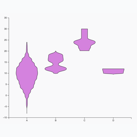
Violin shape
How to build the shape of a violin with SVG
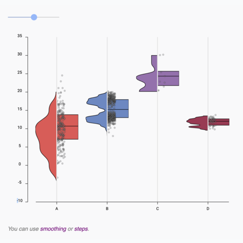
Boxplot to Violin plot
Interactive example showing the difference between a boxplot and a violin
Basic violin plot
Learn how to build a basic violin chart with d3 and react
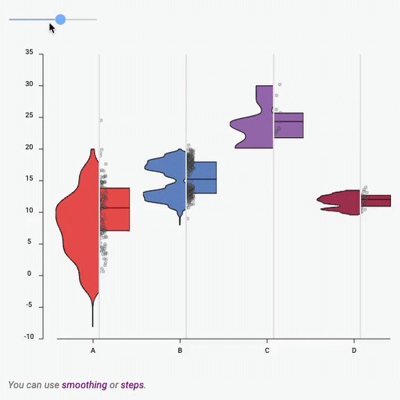
Violin with variable bucket size
A violin plot with a slider to change the bucket size in use
Interactive Beeswarm
Interactive Beeswarm with hover effect, annotation and search bar.
Basic density plot
Most basic density plot built with React and d3
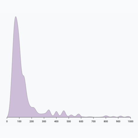
Density plot with multiple groups
How to add several groups on the same density plot
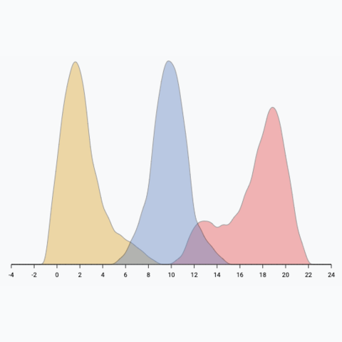
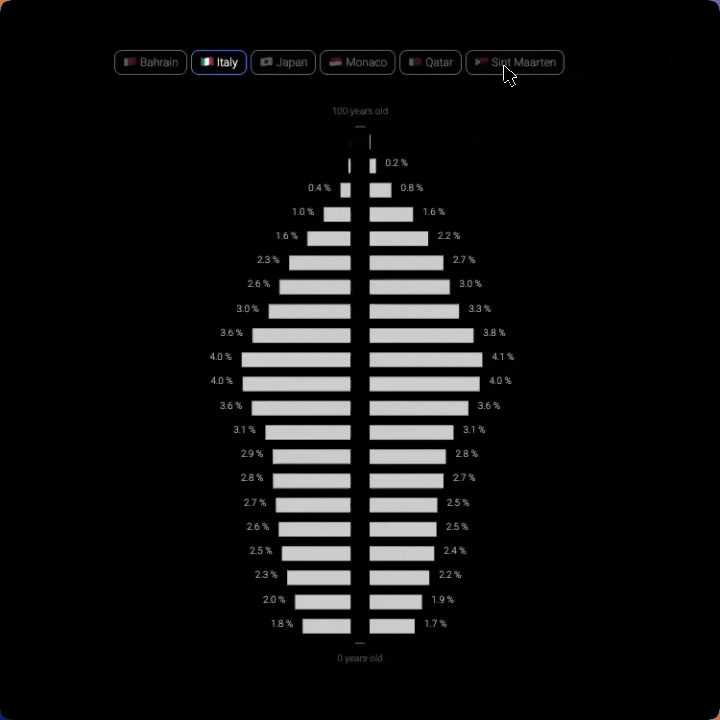
Population Pyramid
A very customized version of a population pyramid
Population Pyramid
A very customized version of a population pyramid
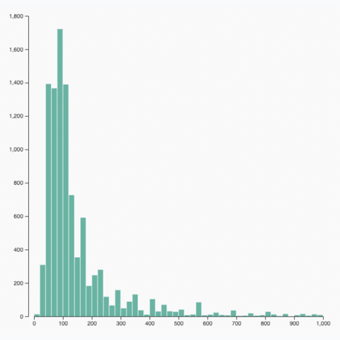
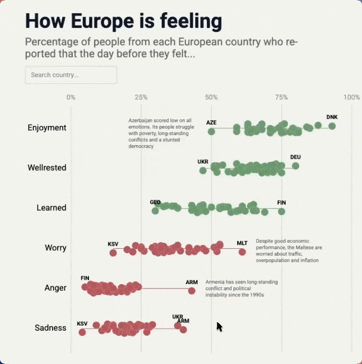
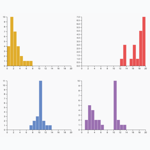
Histogram
Learn how to build a histogram with react and d3.js
Histogram dataset transition
How to animate the transition between datasets
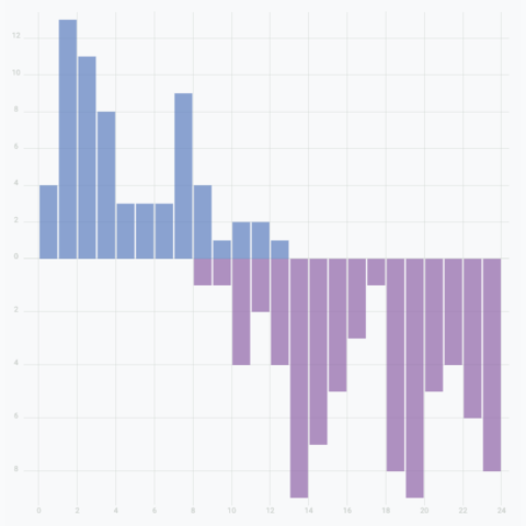
Mirror histogram
Create a mirror histogram to compare the distribution of 2 groups in a dataset
Small multiple
Create one panel per group to show its distribution separately
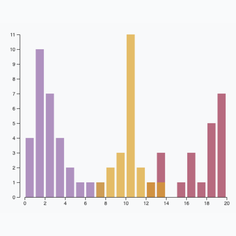
Multiple groups
A histogram with <b>multiple</b> groups displayed on the same axis.
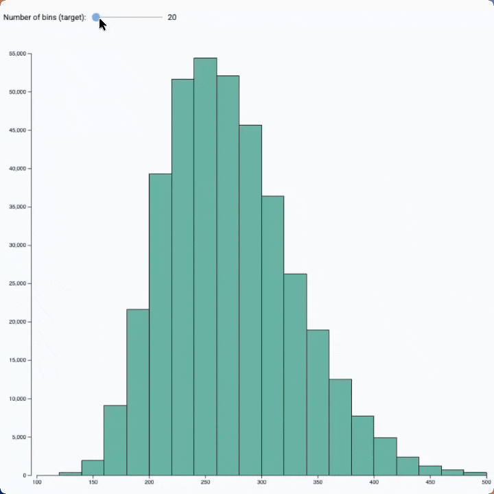
Bin size slider
See the effect of bin size on a histogram with this interactive example
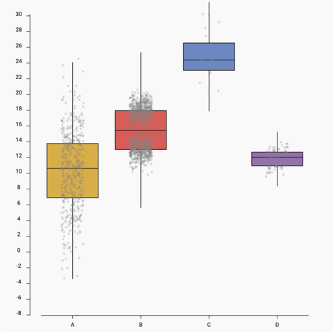
Boxplot with jitter
Add individual data points using jitter on top of the boxplot
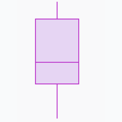
Boxplot shape
How to build a boxplot shape in SVG
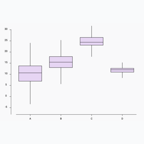
Basic boxplot
How to build a basic boxplot with react
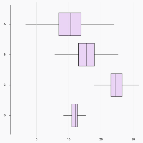
Horizontal boxplot
How to build a horizontal boxplot with react
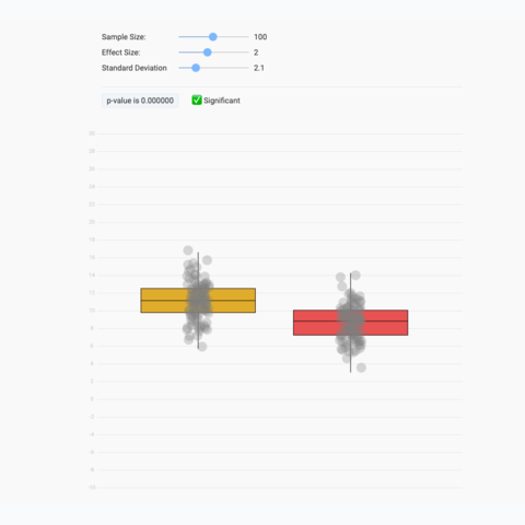
Stop chasing the p-value
A playground to compute a t-test in real time. Stop trusting the p-value only!
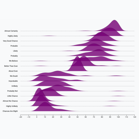
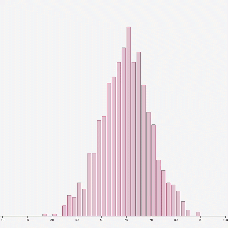
Basic ridgeline chart
Most basic version of a ridgeline plot
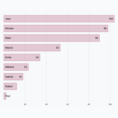
Basic barplot
Most basic barplot built with React and d3
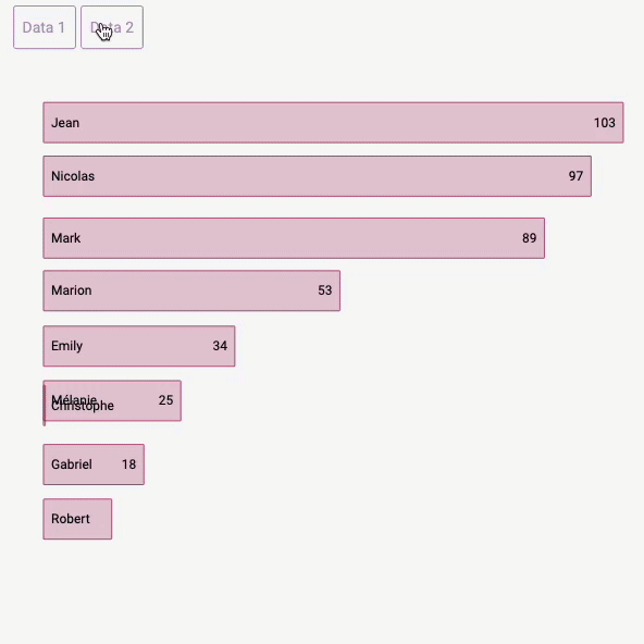
Barplot dataset transition
How to smoothly animate the transition between dataset
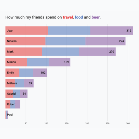
Horizontal Stacked Barplot
Represent group and subgroup values by stacking the data
Vertical Stacked Barplot
Represent group and subgroup values by stacking the data
Stacked Barplot Alternative
An alternative to the stacked barplot: grouped barplot plus background for total
The Economist Barplot repro
Reproduction of a barplot made by The Economist
Vertical barplot
How to switch to a vertical barplot
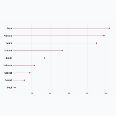
Most basic lollipop plot
Learn how to build a very simple lollipop chart with React and D3.js
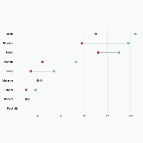
Most basic dumbbell plot
Learn how to build a very simple dumbbell chart with React and D3.js
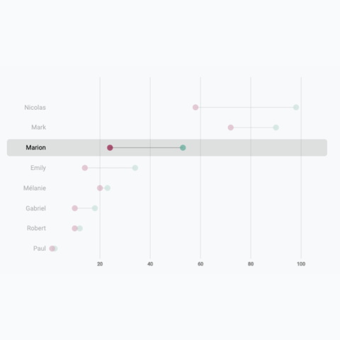
Lollipop with hover effect
Learn how to add a hover effect to your lollipop chart
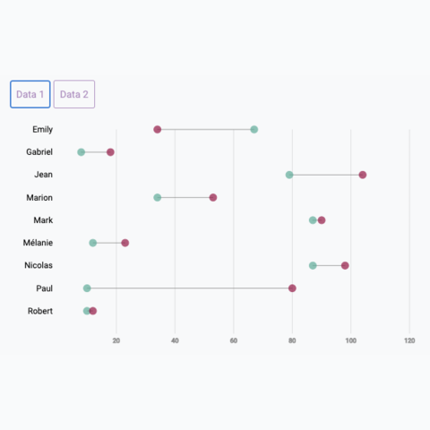
Animation between dataset
Learn how to build a smooth animated transition between 2 datasets
Most basic line chart
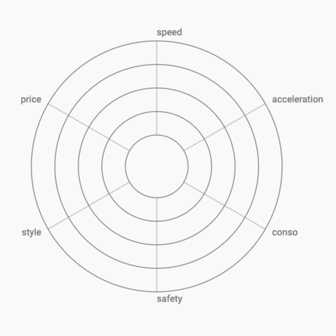
Learn how to build the background grid of a radar chart
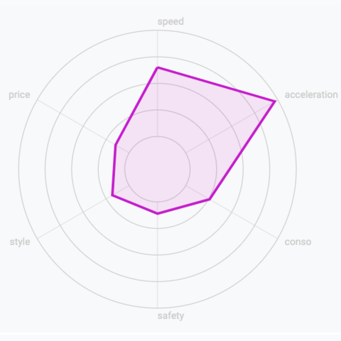
Most basic radar chart
The most basic radar chart one can make using d3 and react
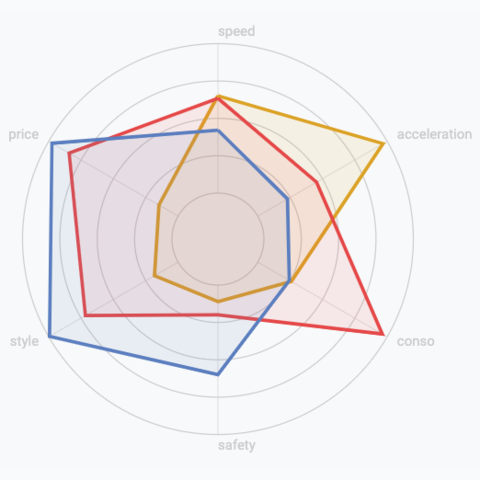
Multi-group radar chart
Radar chart with several groups displayed
Radar chart, line chart an lollipop with animated transition
Three charts connected to same buttons, with smooth, synchronized animation when a button is clicked
Basic treemap
Most simple treemap, with 1 level of hierarchy only
Treemap with 2 levels
Simple treemap with 2 levels of hierarchy
Hover effect
Treemap with hover effect to highlight a group
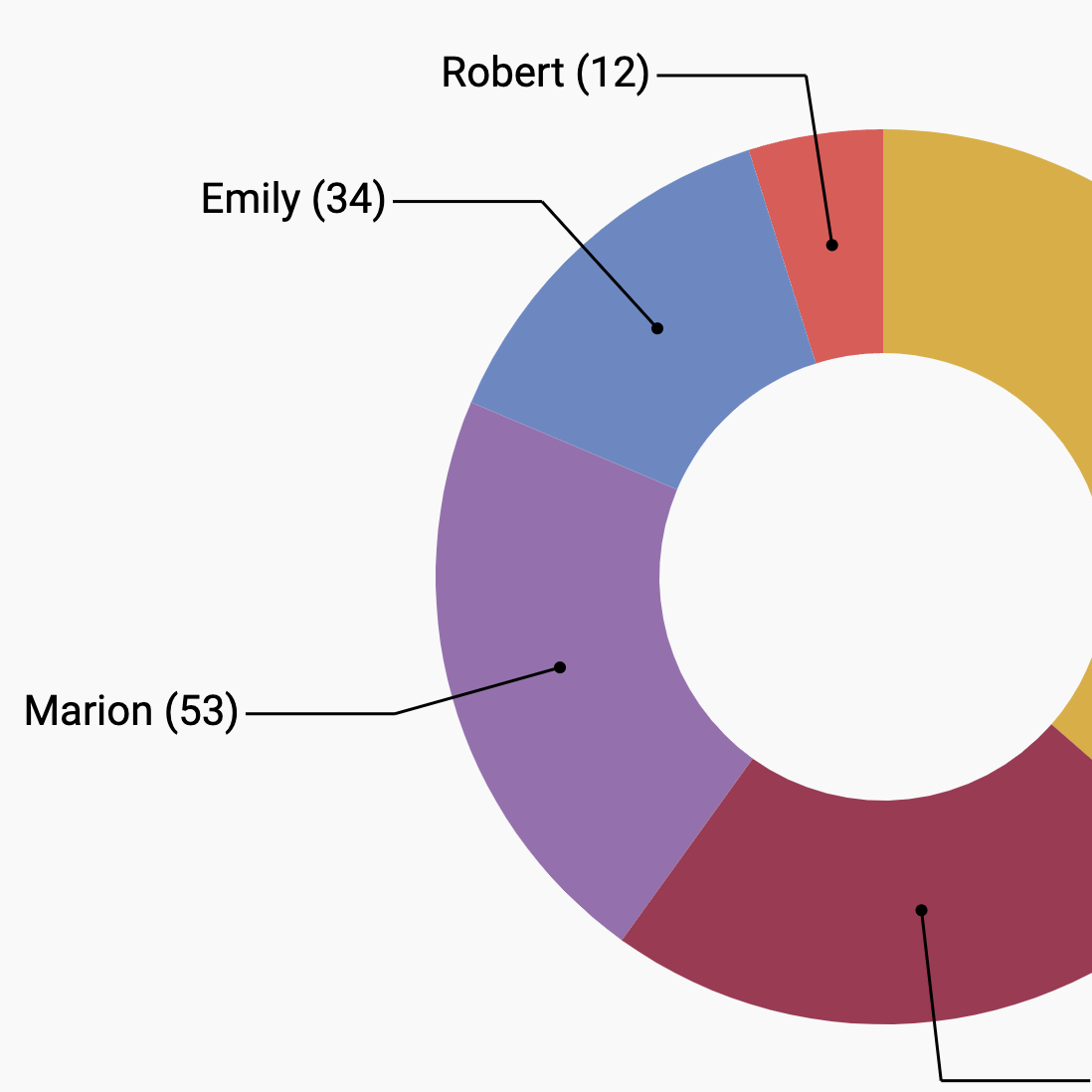
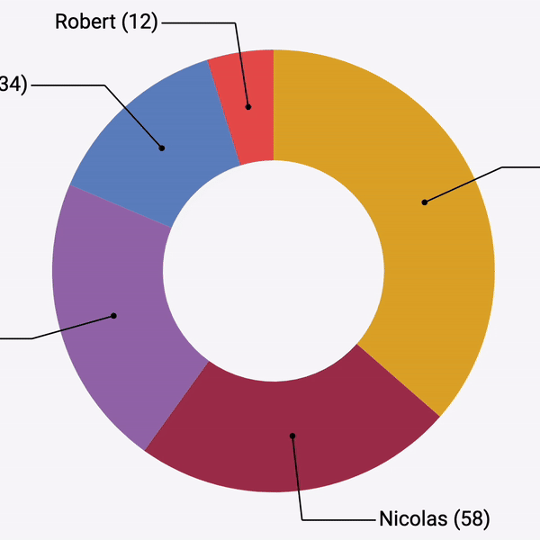
Basic Donut chart
Most simple donut chart. No annotation, static figure.
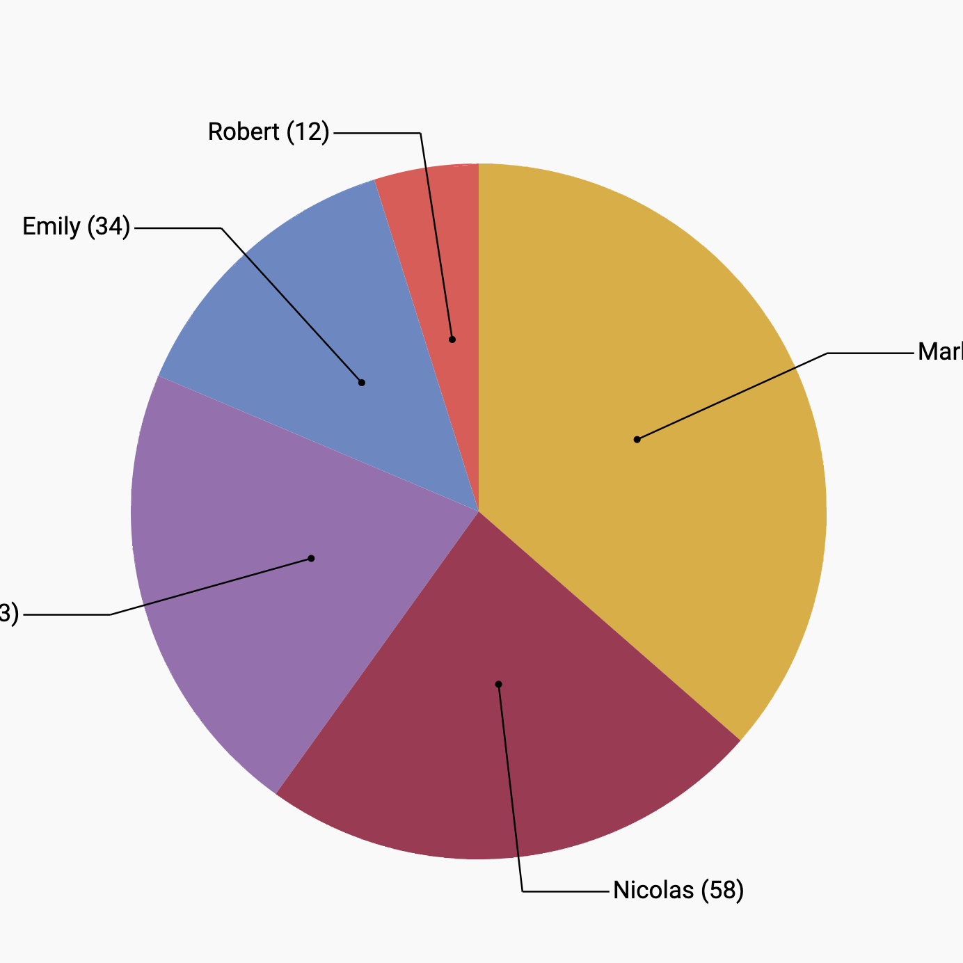
Inline labels
Donut chart with inline labels and connection lines
Hover effect
Donut chart with hover effect to highlight a slice
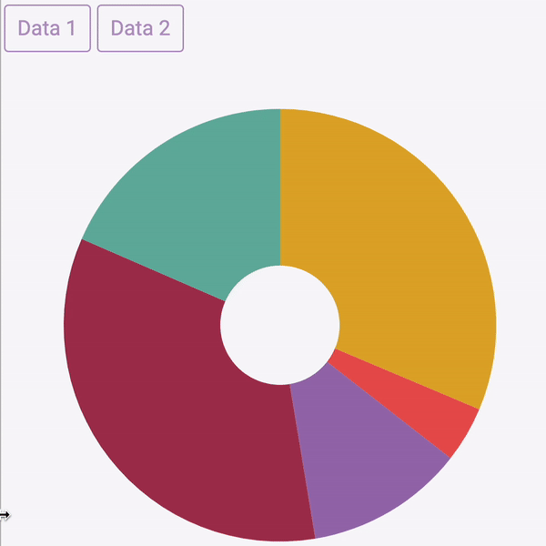
Data transition
How to smoothly transition dataset
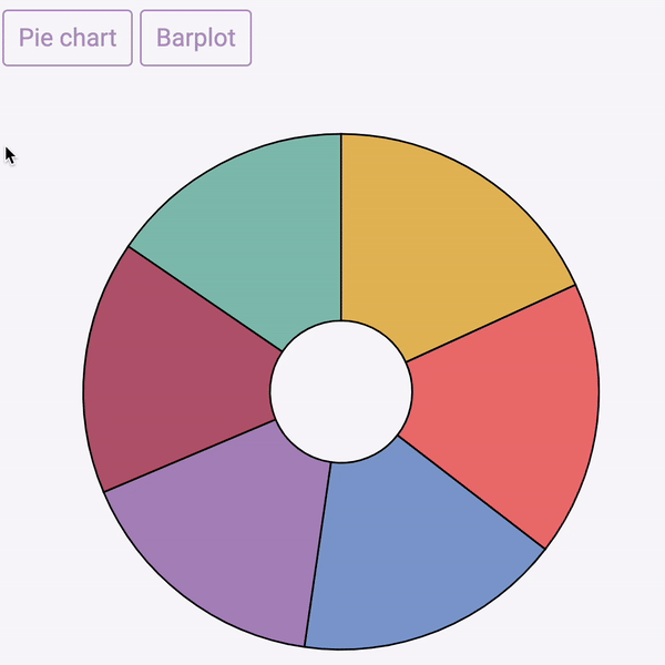
Shape morphism
Transition between a barplot and a donut chart
Basic Pie chart
Most simple pie chart. No annotation, static figure.
Inline labels
pie chart with inline labels and connection lines
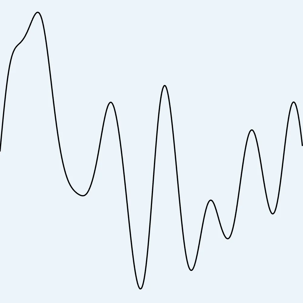
Most basic line chart
The most basic line chart one can make using d3 and react
Line chart with dataset transition
How to smoothly animate the transition between 2 dataset on a line chart
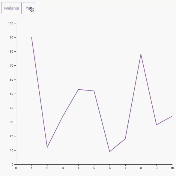
Synchronized cursors
Add a cursor synchronized on all your charts
Dual Y axis chart
How to make a dual Y axis chart, and why you should not make one.
Line Chart improvement
See how to improve a line chart, step by step, both in terms of storytelling and design
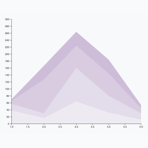
Basic Area Chart
Most basic version of an area chart made with react and d3.js
Basis stacked area chart
Most basic version of a stacked area chart. Explains how to use the stack() function of d3.js
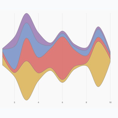
Basic Streamgraph
Most basic streamgraph one can build using d3 and react
Streamgraph with hover effect
How to add a hover effect on a streamgraph to highlight a group
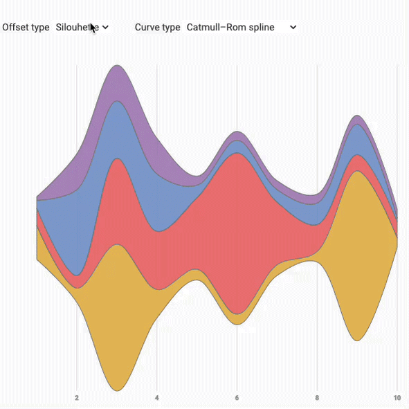
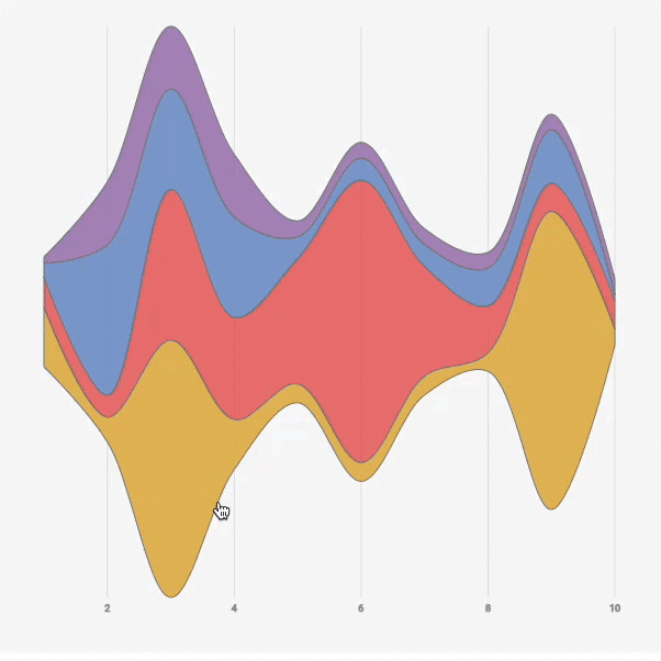
Offset and Smoothing transition
An interactive streamgraph example showing how to animate transition between the chart stacking features.
Streamgraph application
Streamgraph with a slider to zoom on a time stamp and with interactive inline legends
Timeseries with moving average
A scatterplot used for timeseries, with the moving average shown as a line chart on top.
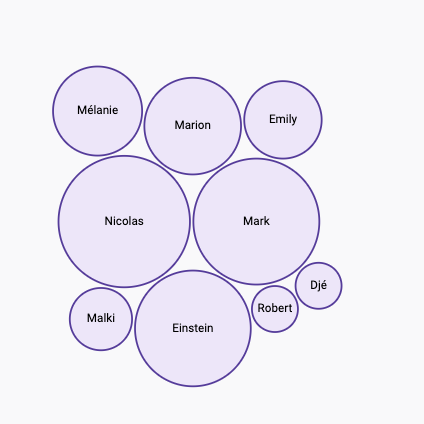
Most basic circular packing chart
The most basic circular packing chart one can make using d3.js and React.
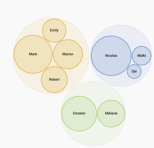
Circular packing: 2 levels of hierarchy
A simple circular packing chart with 2 levels of hierarchy built with React and d3.
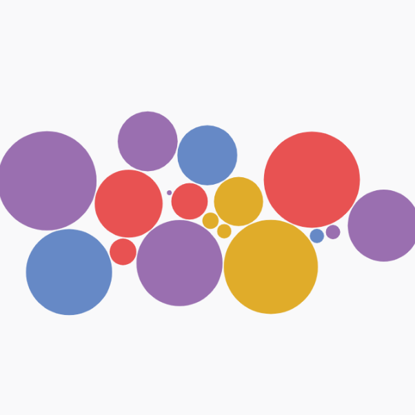
Circle Pack with d3-force
Another approach to build a circle packing chart using physical forces to compute node positions.
Vertical arc diagram
The vertical version of the arc diagram is more convenient to display labels
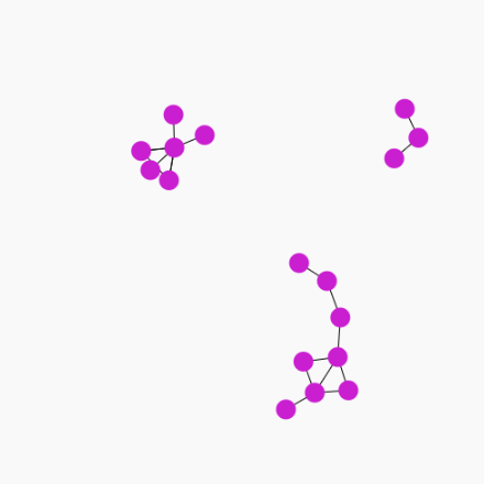
Most basic network chart
Most basic network chart using the d3-force plugin to apply physical forces.
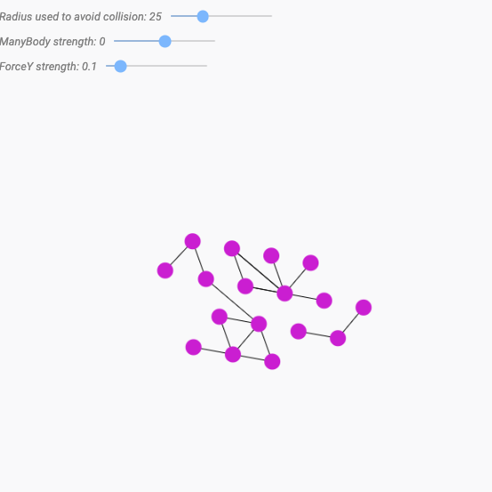
Play with forces
A playground to discover the effect of the various forces you can apply to your particles
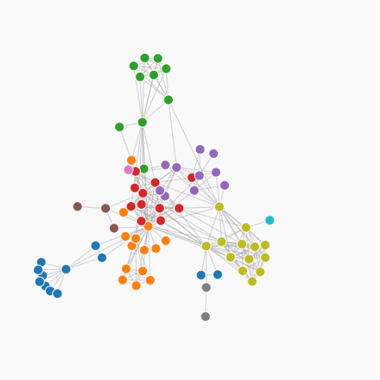
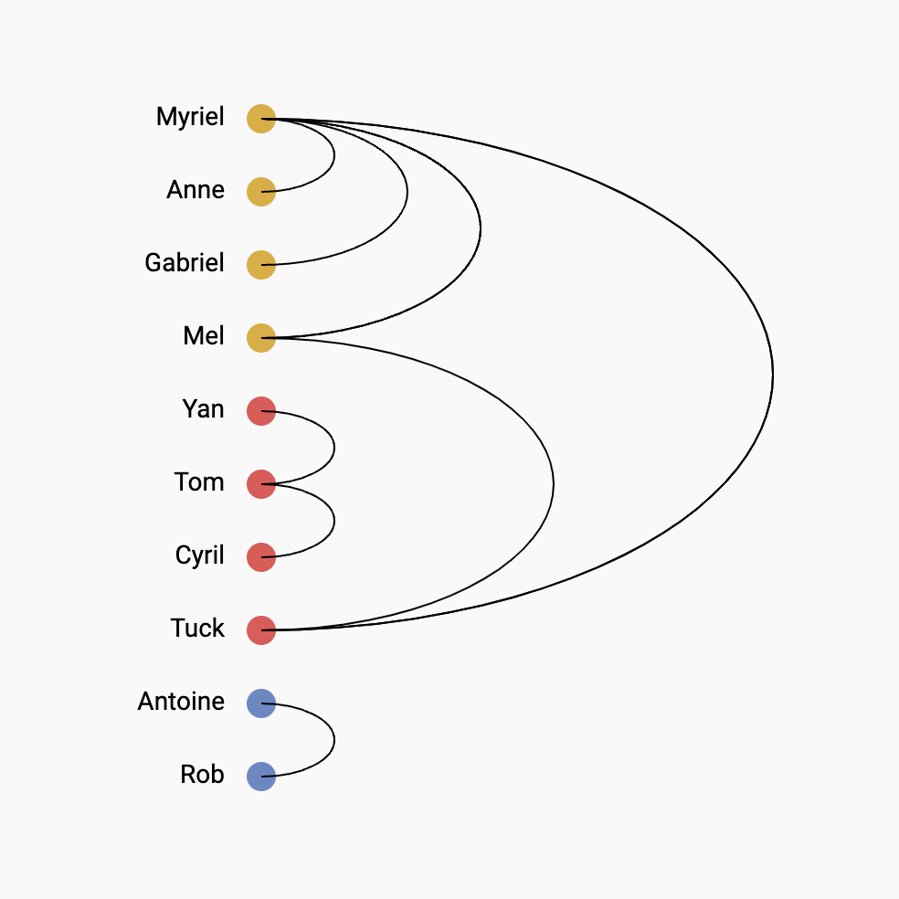
Force directed graph
A force directed network chart showing character co-occurence in les miserables
Intro to 1D perlin noise
The most simple intro to perlin noise, and how to draw it in react


Contact
👋 Hey, I'm Yan and I'm currently working on this project!
Feedback is welcome ❤️. You can fill an issue on Github, drop me a message on LinkedIn, or even send me an email pasting yan.holtz.data with gmail.com. You can also subscribe to the newsletter to know when I publish more content!
