Histogram

This tutorial is a variation around the general introduction to histogram with react and d3.js. You should probably understand the concepts described there before reading here.
This example explains how to plot the distribution of several groups, each distribution being drawn on its own pannel. This dataviz technique is called small multiples. It can be useful to compare the distribution of several items in a dataset.
A code sandbox is provided for the final result, but explanations target what's different compared to an usual histogram.
Plot and code
If you are in a hurry, this is what we're trying to achieve here.🙇♂️
The distribution of several groups are displayed, one on each panel of the graphing window. It allows to compare the distributions.
Note that this works even if groups have very similar distributions as the bars won't overlap each other. It is thus a very good alternative to the histogram with multiple groups that would get unreadable in this condition.
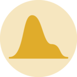
Histogram representing the distribution of 4 groups in a dataset using the small multiple display. Made with react (rendering) and d3.js (scales)
The Data
The dataset used here is slightly different as the one used for the simple 1 group histogram.
An array is used, with each object in it providing the name (group property here) and the values of a group.
Here is a minimal example of the data structure:
const data = [
  {
    group: "A",
    values: [0, 0, 2, 2, 2, 0]
  },
  {
    group: "B",
    values: [0, 0, 2, 2, 2, 0]
  },
  ...
];
Color scale
There is a finite number of groups here. We need to assign a specific color to each group. This is called an ordinal scale and is implemented in the d3 scaleOrdinal function.
What's needed here is thus a list of colors to use (the range) and a list of group names: the domain.
To put it in a nutshell, that's how the color scale is implemented:
// List of arbitrary colors
const COLORS = ["#e0ac2b", "#e85252", "#6689c6", "#9a6fb0", "#a53253"];

// List of all group names
const allGroups = data.map((group) => group.group);

// Color scale
const colorScale = d3.scaleOrdinal<string>()
  .domain(allGroups)
  .range(COLORS);
It's fundamental to understand that with this code organization, d3.js will be used to prepare the svg circle, but it's react that will render them in the return() statement. We won't use d3 methods like append that you can find in usual d3.js examples.
Rendering
The Histogram component used to render each sub-panel is almost exactly the one presented in the histogram section of the gallery.
The only difference is that it receives 2 new properties. The color prop is computed in the parent component using the logic described above. The xRange prop is necessary to make sure all histograms have the same x axis, allowing to compare them efficiently.
Now, we just need to call the Histogram component for each group of the dataset and render tham in a grid layout as follow:
export const Histogram = ({ width, height, data }: HistogramProps) => {
  const allGroups = data.map((group) => group.group);
  const colorScale = d3.scaleOrdinal<string>().domain(allGroups).range(COLORS);

  const maxPerGroup = data.map((group) => Math.max(...group.values));
  const max = Math.max(...maxPerGroup);

  const numberOfColumn = 2;
  const numberOfRow = Math.ceil(allGroups.length / numberOfColumn);

  return (
    <div
      style={{
        width,
        height,
        display: "grid",
        gridTemplateColumns: "repeat(2, minmax(0, 1fr))",
      }}
    >
      {data.map((group, i) => (
        <SingleHistogram
          key={i}
          width={width / numberOfColumn}
          height={height / numberOfRow}
          color={colorScale(group.group)}
          xRange={[0, max]}
          data={group.values}
        />
      ))}
    </div>
  );
};


Contact
👋 Hey, I'm Yan and I'm currently working on this project!
Feedback is welcome ❤️. You can fill an issue on Github, drop me a message on LinkedIn, or even send me an email pasting yan.holtz.data with gmail.com. You can also subscribe to the newsletter to know when I publish more content!
