Scatterplot
A scatterplot displays the relationship between 2 numeric variables. This page is a step-by-step guide on how to build your own scatterplot for the web, using React and D3.js.
It starts with very basic concepts like data structure, scales and svg circle rendering. It then shows how to add interactivity to the chart with hover effects and tooltips. At the end of the post, you should be able to build you own ready-to-publish scatterplot 🙇♂️.
The Data
The dataset used to build a scatterplot is usually an array of objects.
For each object, at least 2 properties are required: x and y. The value of x will control the position of the datapoint on the horizontal axis. The value of y will be linked with the vertical axis.
const data = [
  {
    x: 2,
    y: 4
  },
  {
    x: 8,
    y: 5
  }
]
We will see later in this guide that some additional properties can become useful. For instance, a third numeric value could be added as a size property, and a categorical property could be used as a group to control the color.
This tutorial starts by using dummy data for the most simple examples. It then uses the famous gapminder dataset that provides the life expectancy and the population size for every country.
Component skeleton
The goal here is to create a Scatterplot component that will be stored in a Scatterplot.tsx file. This component requires 3 props to render: a width, a height, and some data.
The shape of the data is described above. The width and height will be used to rendering a svg element in the DOM, in which we will insert the scatterplot.
To put it in a nutshell, that's the skeleton of our Scatterplot component:
import * as d3 from "d3"; // we will need d3.js

type ScatterplotProps = {
  width: number;
  height: number;
  data: { x: number; y: number }[];
};

export const Scatterplot = ({ width, height, data }: ScatterplotProps) => {

  // read the data
  // do some stuff with d3
  // compute all the <circle>

  return (
    <div>
      <svg width={width} height={height}>
        // render all the <circle>
      </svg>
    </div>
  );
};
It's fundamental to understand that with this code organization, d3.js will be used to prepare the svg circle, but it's react that will render them in the return() statement. We won't use d3 methods like append that you can find in usual d3.js examples.
Scales and axes
→ Scales
Building a scatterplot requires to transform a dimension (a numeric variable like life expectancy) in a position in pixels. This is done using a fundamental dataviz concept called scale.
D3.js comes with a handful set of predefined scales. scaleLinear is what we need for the X and Y axis. Here is a quick overview on how to build and use a scale:
const scale = d3.scaleLinear()
  .domain([0, 10]) // data goes from 0 to 10
  .range([0, 200]); // axis goes from 0 to 200

scale(0); // 0 -> item with a value of 0 will be at the extreme left of the axis
scale(5); // 100 -> middle of the axis
scale(10); // 200 -> extreme right
To dig more into d3 scales, visit this dedicated page. It's a crucial concept that will be used everywhere in this website.
→ Axes
Axes are rather complicated elements. They are composed of the main segment, several ticks that each have a label, and are often decorated with a title.
D3.js offers some powerful functions to draw those axes for you, based on the scales discussed above. For instance, one could call axisBottom() in a useEffect hook to imperatively draw the X axis into a specific DOM element. But this comes with some caveats and is thus not the option used in this gallery.
Instead, I suggest creating the axes from scratch and storing them in 2 react components called AxisBottom and AxisLeft. Those components expect a d3 scale as input and do all the svg drawing for us.
Compute scales to map numeric values to a 2d canvas. Use custom react components to render axes with react from this scales.
The code for those X and Y axis components is provided below. The following examples will show how straightforward it is to tweak them to reach other chart styles.
code for the X axis react component
import { useMemo } from "react";
import { ScaleLinear } from "d3";

type AxisBottomProps = {
  xScale: ScaleLinear<number, number>;
  pixelsPerTick: number;
};

// tick length
const TICK_LENGTH = 6;

export const AxisBottom = ({ xScale, pixelsPerTick }: AxisBottomProps) => {
  const range = xScale.range();

  const ticks = useMemo(() => {
    const width = range[1] - range[0];
    const numberOfTicksTarget = Math.floor(width / pixelsPerTick);

    return xScale.ticks(numberOfTicksTarget).map((value) => ({
      value,
      xOffset: xScale(value),
    }));
  }, [xScale]);

  return (
    <>
      {/* Main horizontal line */}
      <path
        d={["M", range[0], 0, "L", range[1], 0].join(" ")}
        fill="none"
        stroke="currentColor"
      />

      {/* Ticks and labels */}
      {ticks.map(({ value, xOffset }) => (
        <g key={value} transform={'translate(${xOffset}, 0)'}>
          <line y2={TICK_LENGTH} stroke="currentColor" />
          <text
            key={value}
            style={{
              fontSize: "10px",
              textAnchor: "middle",
              transform: "translateY(20px)",
            }}
          >
            {value}
          </text>
        </g>
      ))}
    </>
  );
};
code for the Y axis react component
import { useMemo } from "react";
import { ScaleLinear } from "d3";

type AxisLeftProps = {
  yScale: ScaleLinear<number, number>;
  pixelsPerTick: number;
  width: number;
};

const TICK_LENGTH = 10;

export const AxisLeft = ({ yScale, pixelsPerTick, width }: AxisLeftProps) => {
  const range = yScale.range();

  const ticks = useMemo(() => {
    const height = range[0] - range[1];
    const numberOfTicksTarget = Math.floor(height / pixelsPerTick);

    return yScale.ticks(numberOfTicksTarget).map((value) => ({
      value,
      yOffset: yScale(value),
    }));
  }, [yScale]);

  return (
    <>
      {/* Ticks and labels */}
      {ticks.map(({ value, yOffset }) => (
        <g
          key={value}
          transform={"translate(0, {yOffset})"} // TODO struggling with back ticks
          shapeRendering={"crispEdges"}
        >
          <line
            x1={-TICK_LENGTH}
            x2={width + TICK_LENGTH}
            stroke="#D2D7D3"
            strokeWidth={0.5}
          />
          <text
            key={value}
            style={{
              fontSize: "10px",
              textAnchor: "middle",
              transform: "translateX(-20px)",
              fill: "#D2D7D3",
            }}
          >
            {value}
          </text>
        </g>
      ))}
    </>
  );
};
Note: do not forget to use the crispEdges value of the shape-rendering svg attribute. Otherwise the vertical and horizontal segments might be blurry.
Add circles
We are now pretty close to the first scatterplot. There is just one more critical part missing: markers.
To add them, we have to map() on the data input and add an svg circle for each. That's the code snippet that needs to be added:
const allShapes = data.map((d, i) => {
  return (
    <circle
      key={i}
      r={7} // radius
      cx={xScale(d.x)} // position on the X axis
      cy={yScale(d.y)} // on the Y axis
      opacity={1}
      stroke="#cb1dd1"
      fill="#cb1dd1"
      fillOpacity={0.2}
      strokeWidth={1}
    />
  );
});
That's it! 🎉
Calling the allShapes object in the return() statement of the component will add as many circles as needed.
Note that styling attributes are written as prop here. In production, you should consider adding a class to those circles and setting it using css.
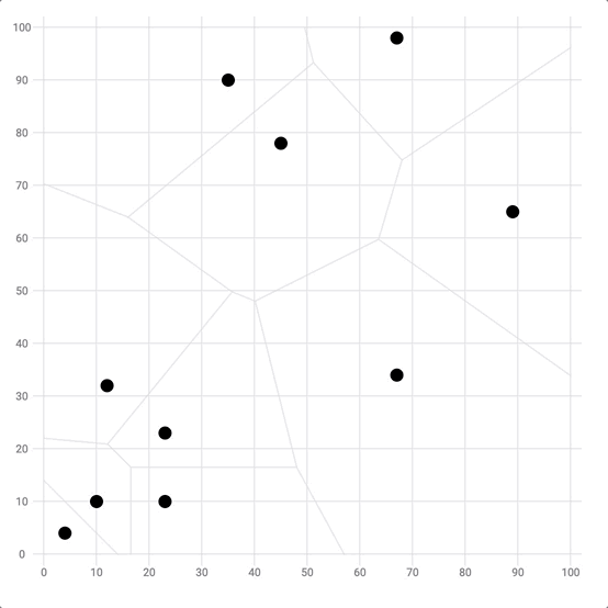
Add a svg circle for each item of the dataset to get a first scatterplot
That's not the best scatterplot in the world yet, but it's definitely a first working version.
Responsive Scatterplot with react
The component above is not responsive. It expects 2 props called width and height and will render a Scatterplot of those dimensions.
Making the Scatterplot responsive requires adding a wrapper component that gets the dimension of the parent div, and listening to a potential dimension change. This is possible thanks to a hook called useDimensions that will do the job for us.
useDimensions: a hook to make your viz responsive
export const useDimensions = (targetRef: React.RefObject<HTMLDivElement>) => {

  const getDimensions = () => {
    return {
      width: targetRef.current ? targetRef.current.offsetWidth : 0,
      height: targetRef.current ? targetRef.current.offsetHeight : 0
    };
  };

  const [dimensions, setDimensions] = useState(getDimensions);

  const handleResize = () => {
    setDimensions(getDimensions());
  };

  useEffect(() => {
    window.addEventListener("resize", handleResize);
    return () => window.removeEventListener("resize", handleResize);
  }, []);

  useLayoutEffect(() => {
    handleResize();
  }, []);

  return dimensions;
}Responsiveness is a deep topic.
The responsiveness module covers it in depth: the
useDimensions hook, the wrapper pattern, and the common pitfalls to avoid.Tooltip
There is a very common frustration with scatterplots: you're interested in a specific data point (let's say it's out of the general trend for instance), but you ignore everything about this item.
This is when tooltips come into play. You can add as much information as you want to it, making the chart much more insightful.
In the following chart based on the gapminder dataset, don't you want to know what are the countries with the highest life expectancy or GDP per capita? Labeling all circles would result in a very cluttered figure, so let's learn how to add tooltips instead.
Scatterplot with tooltip. Hover over a circle to get the corresponding country name.
There are many different approaches to building tooltips.
The tooltip module covers them in depth: the reusable component, positioning, and how to show it on hover.
Everything starts with an internal state using the useState hook.
interactionData is an object providing everything you need to draw a tooltip. It usually has 2 xPos and yPos properties that are the position of the tooltip. It then has as many props as needed to fill the tooltip. (I'm just adding the country name in my example)
const [interactionData, setInteractiondata] = useState<InteractionData | null>(null);setInteractiondata is a function allowing to update this state. We can use it on each circle to update interactionData each time it is hovered over:
<circle
  r={8}
  cx={xScale(d.x)}
  cy={yScale(d.y)}
  onMouseEnter={() => // Each time the circle is hovered hover...
    setInteractionData({ // ... update the interactionData state with the circle information
      xPos: xScale(d.x),
      yPos: yScale(d.y),
      name: d.subGroup,
    })
  }
  onMouseLeave={() => setInteractionData(null)} // When the user stops hovering, reset the interactionData to null
/>
We can now create a Tooltip component that will render only when the interactionData is not null. It is usually more convenient to render the tooltip using html, not svg (it is easier to customize it).
To do so, the tooltip is rendered in an absolute positioned div that is drawn exactly on top of the chart area, excluding axes. This is how to return statement of our Scatterplot component now looks like:
return (
  <div style={{ position: "relative" }}>
    <svg width={width} height={height}>
      // axes and circles go here
    </svg>

    {/* Tooltip */}
    <div
      style={{
        width: boundsWidth, // the width of the chart area excluding axes = width - left margin
        height: boundsHeight,
        position: "absolute",
        top: 0,
        left: 0,
        pointerEvents: "none",
        marginLeft: MARGIN.left,
        marginTop: MARGIN.top,
      }}
    >
      <Tooltip interactionData={interactionData} />
    </div>
Now you can add whatever content in the Tooltip component. Check the code below the example above to see an example.
For a more in-depth explanation, read the tooltip module.
Hover effect
Showing a tooltip on hover is helpful, but it's often a nice touch to add a hover effect. Hover effects on scatterplots are usually used for 2 main reasons:
- Highlight one circle: makes sure the tooltip you're reading is associated with the circle you're targeting.
- Highlight a group: it's often interesting to see all the related points in the dataset.
Let's implement both on the chart below. Hovering over a country will fade all circles except the ones of the same continent.
Scatterplot with hover effect: hover over a circle to highlight it and its group
As for the tooltip example above, everything starts with an internal state (called hoveredGroup) that stores which circle is hovered hover.
const [hoveredGroup, setHoveredGroup] = useState<string | null>(null);Now, this state needs to be updated when a user hovers over the circle. setHoveredGroup can be passed as a callback to the onMouseOver attribute of each circle.
On top of this, some specific css classes can be attributed to circles depending on the circle that is hovered hover. In the example above, a class called dimmed is added to circles that must disappear.
To put it in a nutshell, the circles are created as follows:
const allShapes = data.map((d, i) => {
  const className = // class if the circle depends on the hover state
    hoveredGroup && d.group !== hoveredGroup
      ? styles.scatterplotCircle + " " + styles.dimmed
      : styles.scatterplotCircle;

  return (
    <circle
      key={i}
      r={5}
      cx={xScale(d.x)}
      cy={yScale(d.y)}
      className={className} // class is attributed here
      stroke={colorScale(d.group)}
      fill={colorScale(d.group)}
      onMouseOver={() => setHoveredGroup(d.group)} // callback to update the state
      onMouseLeave={() => setHoveredGroup(null)} // and to set it back to null
    />
  );
});
Last but not least, some css needs to be added to customize the circle depending on if they are in default, .dimmed or :hover mode.
Note that the filter: saturate(0) is a good way to dim unwanted circles. Also, playing with transition-delay and transition-duration adds to animate the transition is a nice touch you should consider. Check the code below the example to see the full css.
Hover effects are another big topic in data visualization.
The hover effect module covers them in depth: the CSS-only strategies, the React state approaches, and the common caveats.
Scatterplot inspiration
If you're looking for inspiration to create your next Scatterplot, note that dataviz-inspiration.com showcases many examples. Definitely the best place to get ... inspiration!
dataviz-inspiration.com showcases hundreds of stunning dataviz projects. Have a look to get some ideas on how to make your Scatterplot looks good!
visitReal-life application
Let's apply the concepts learned above to a real-life example.
I like this scatterplot originally published on the data wrapper blog. It shows a strong correlation between vulnerability to climate change and CO2 emissions.
The chart has several features that are interesting to reproduce fom a technical point of view:
- Custom annotation: only a fraction of the country names are written
- Hover effect: the hovered country is highlighted with a black stroke. After a short delay, countries of other groups are dimmed. Note that the effect is triggered once the mouse approaches the marker, no need to be perfectly on top.
- Tooltip: highly customized and linked to the mouse position
The countries with the highest vulnerability to climate change have the lowest CO2 emissions
All countries sorted by their vulnerability and readiness to climate change. The size shows the CO2 emission per person in that country.
Reproduction of a chart originally published by Data Wrapper using react and d3.js.
Variations
The scatterplot examples described above are just the beginning of your journey. There is an infinite world of customization that is open to you. You can also explore related chart types that can be a good fit for your data:
Click on the overview below to get details and code.
Closest point detection with Voronoi
Voronoi diagram in the scatterplot bg to find the mouse closest point
Scatterplot in Canvas
Learn how to render a scatterplot in canvas to improve performances
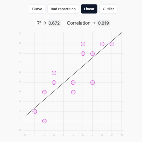
Scatterplot with r2, linear regression and draggable circles
What does r2 mean? Check this draggable linear regression to find out
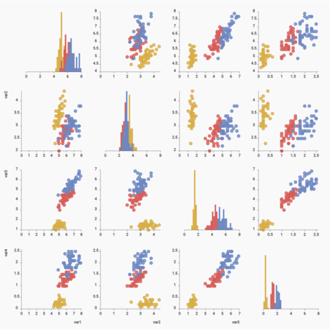
Basic correlogram
Learn how to build a correlogram with react and d3
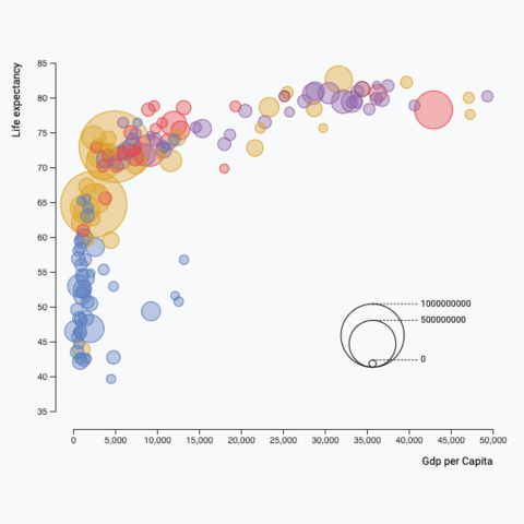
Bubble plot
Learn how to build a bubble plot with react and d3.js
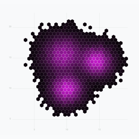
Hexbin chart
A hexbin chart split the figure in hexagons to show a 2d density
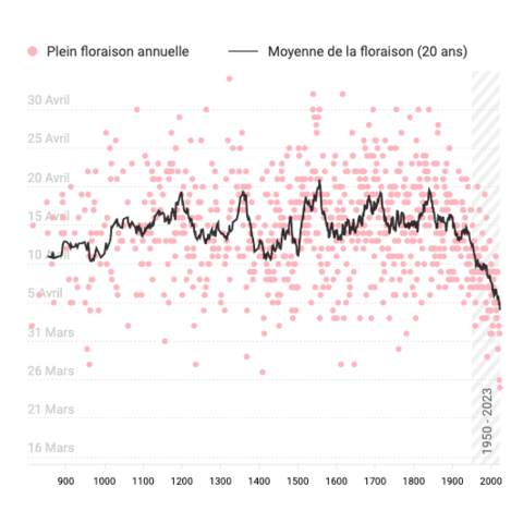
Timeseries with moving average
A scatterplot used for timeseries, with the moving average shown as a line chart on top.
Useful links
The following links have been useful to create this page:
- Building axes in d3.js and the scatterplot section from the d3 graph gallery
- Official doc about scales.
- Using React with D3.js on Amelia Wattenberger's blog.
- This stack overflow discussion about react component's size.
Contact
👋 Hey, I'm Yan and I'm currently working on this project!
Feedback is welcome ❤️. You can fill an issue on Github, drop me a message on LinkedIn, or even send me an email pasting yan.holtz.data with gmail.com. You can also subscribe to the newsletter to know when I publish more content!
