The Economist Barplot Reproduction

This tutorial is a variation around the general introduction to barplot with react and d3.js.
It shows how to transform the very basic default examples in a real life chart published by The Economist. You'll learn how to make a good looking chart, deal with inline labels, add title and footnotes.
A code sandbox is provided for the final result, but explanations target what's different compared to an usual barplot.
Plot and code
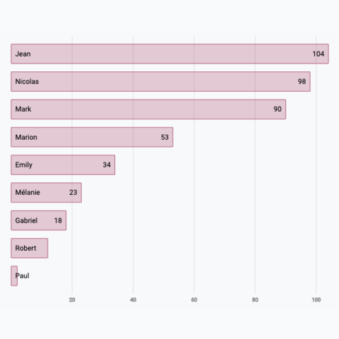
Here is a reproduction of a barplot made by the Economist. Once you understood how to build a basic barplot, it is just a matter of styling.
The only additional logic is for bar labels that have a dynamic position, and for the title, subtitle and footnotes that have been added.
Number of laboratory-acquired infections, 1970-2021
The Economist
Reproduction of a barplot made by the economist.
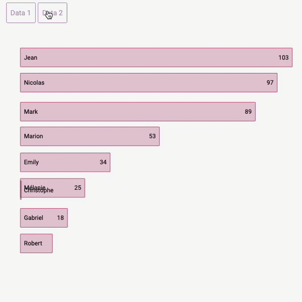
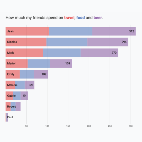
Variation
Check those other barplot and stacked barplot that can interest you:


Contact
👋 Hey, I'm Yan and I'm currently working on this project!
Feedback is welcome ❤️. You can fill an issue on Github, drop me a message on LinkedIn, or even send me an email pasting yan.holtz.data with gmail.com. You can also subscribe to the newsletter to know when I publish more content!
