Finally master dataviz:
Learn D3.js.
D3.js is the ultimate data visualization tool, but it's hard to learn. This course combines it with React and AI so you can build anything you can imagine.
Taught by Yan Holtz
So good. So painful.
D3.js is the gold standard for data visualization on the web. Unlike ggplot2, Matplotlib, or even Javascript charting libraries, D3 gives you complete control over every pixel.
But let's be honest: learning D3 is painful.
The API is vast. The documentation assumes you already know it. Tutorials are scattered, outdated, or riddled with anti-patterns. You end up copy-pasting code you don't understand, stitching together a fragile chart that breaks the moment you try to customize it.
Last but not least, most examples you’ll find online don’t use React, the standard library for building modern UIs that removes 99% of the friction.
Finally, make it click.
We're in an era where AI can scaffold 80% of your code. The barrier to entry has never been lower. So why settle for limited charting libraries when you can finally master the real thing?
This course gives you what scattered tutorials never could: a clear mental model of how interactive charts actually work. You'll learn the D3 + React combo from the ground up—the modern way.
You won't just build a scatterplot or a bar chart. You'll understand the underlying principles—so you can create any visualization you can imagine.
By the end, you'll have AI as your copilot and the skills to steer it. The only limit will be your creativity.
Welcome to the best way to learn data visualization on the web. It's called:

React leads UI. D3 leads dataviz.
Learn how they work together.
⚡️ Master D3.js, step by step
You'll start with the fundamentals of front-end development, then learn D3.js and React one concept at a time, until you can build virtually anything.
Web Foundation
What you need to know before jumping into d3.js
Main Course
11 modules to master D3.js and React
Foundation
No web development experience? No problem. These two modules cover everything you need to get started.
WebDev Foundation
Before diving into React and D3.js, you need a solid foundation in web development basics.
This module covers everything from HTML and CSS to JavaScript, version control, and essential developer tools.
React Foundation
React revolutionized how we build user interfaces by introducing reusable components.
This module teaches you React fundamentals from the ground up, along with the modern tools that make React development a breeze.
Main Course
Eleven modules with plenty of hands-on exercises and a real-world, data-driven project to ensure you can apply everything directly at work.
Introduction
What is D3.js? Why is it so powerful? And why do most tutorials make it harder than it needs to be?
This module cuts through the confusion and shows you the modern, simpler way to use D3 with React.
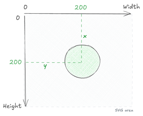

SVG
A chart is essentially a collection of shapes rendered on the screen.
In the browser, the most common way to draw those shapes is with SVG.
By the end of this module, you’ll understand what SVG is, how to draw anything with it, and how d3.js can dramatically simplify the process.
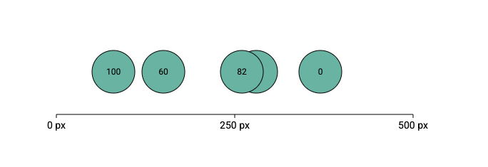
Scales
Building a chart means converting data values into pixels, colors, and sizes.
Scales handle this transformation. They are a core concept in d3.js.
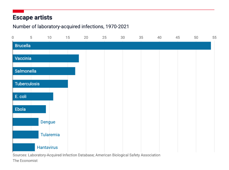
By the end of this module, you’ll master all d3 scales and recreate a chart from The Economist.
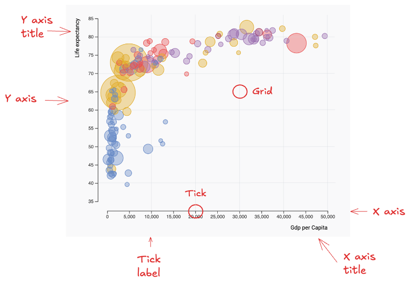
Axes
Most charts rely on axes to give meaning to marker positions.
In this module, you’ll learn how to efficiently translate scales into axes using React.
You’ll also walk away with reusable, production-ready components for your next project.
Responsiveness
Modern charts must work across desktops, tablets, and mobile screens.
You’ll learn proven patterns to make any d3 chart automatically adapt to its container.
By the end of this module, you’ll have a ready-to-use template and best practices you can reuse in every project.
Hover effect
Let’s bring your charts to life.
This module shows how to create hover interactions using CSS and JavaScript.
You’ll build a clear mental model of the main use cases and learn how to implement each one cleanly.
Tooltip
Tooltips add context without cluttering the chart.
In this module, you’ll learn how to design and implement effective tooltips using d3 and React.
You’ll cover positioning, formatting, and interaction patterns, and leave with a reusable tooltip component.
Data fetching
Every chart starts with data.
In this module, you’ll learn how to load data from local files like CSV and JSON, and how to fetch it from a remote endpoint when needed.
You’ll also learn how to handle loading states cleanly, using a loader when data is still being fetched.
Animation
Smooth animations make data updates easier to perceive and understand.
You’ll learn how to use react-motion to build spring animations for chart transitions.
You’ll implement clean patterns to animate position, size, and color changes across updates.
Performance
A chart that feels instant with 100 points can crawl with 100,000.
This final module is about performance: how to find what is slowing your chart down, and the ladder of fixes that goes from cheap React tweaks all the way to rendering with canvas.
By the end you will know when to reach for each technique, and how to draw, interact with, and animate a canvas chart with d3 and React.
You’ll build stunning charts
By the end of the course, you’ll have the skills to build virtually anything. Each module ends with a real project, and you can share your work in the #share-your-viz Discord channel.
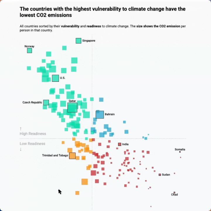
Real life use-case
Reproduction of a data wrapper chart representing countries CO2 data
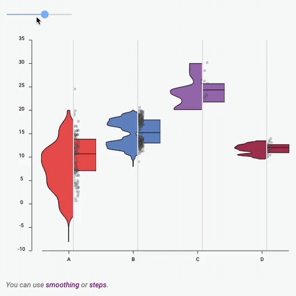
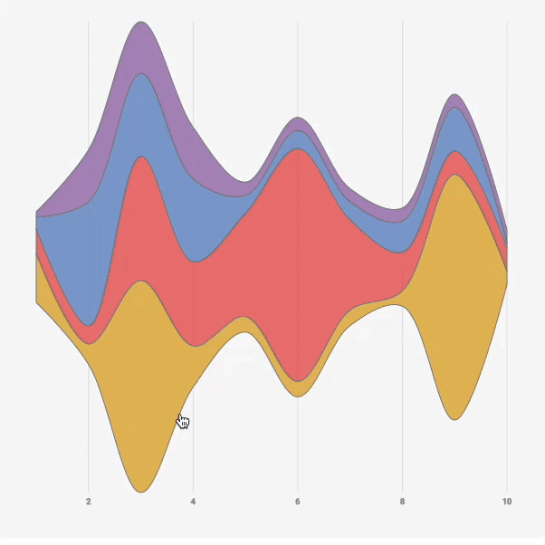
Boxplot to Violin plot
Interactive example showing the difference between a boxplot and a violin
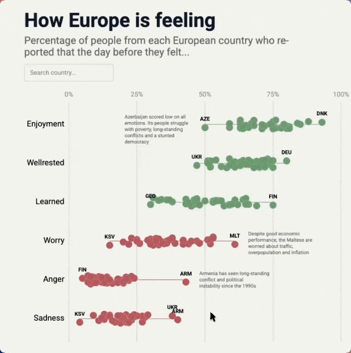
Interactive Beeswarm
Interactive Beeswarm with hover effect, annotation and search bar.
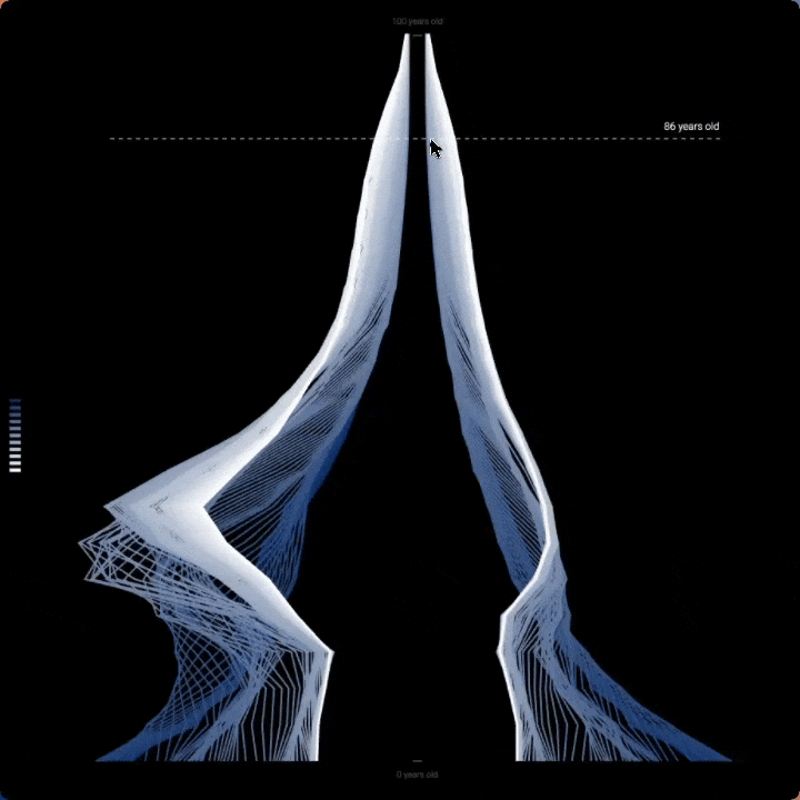
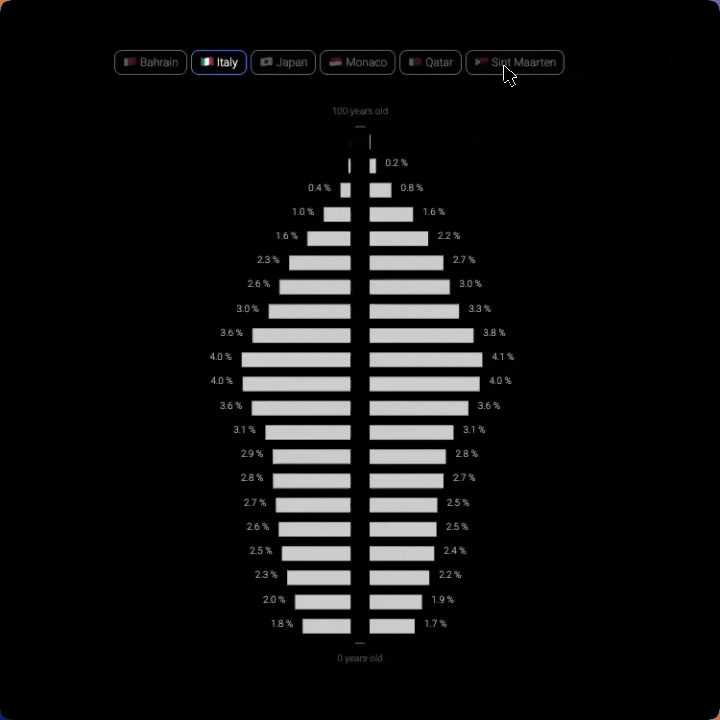
Population Pyramid
A very customized version of a population pyramid
Population Pyramid
A very customized version of a population pyramid
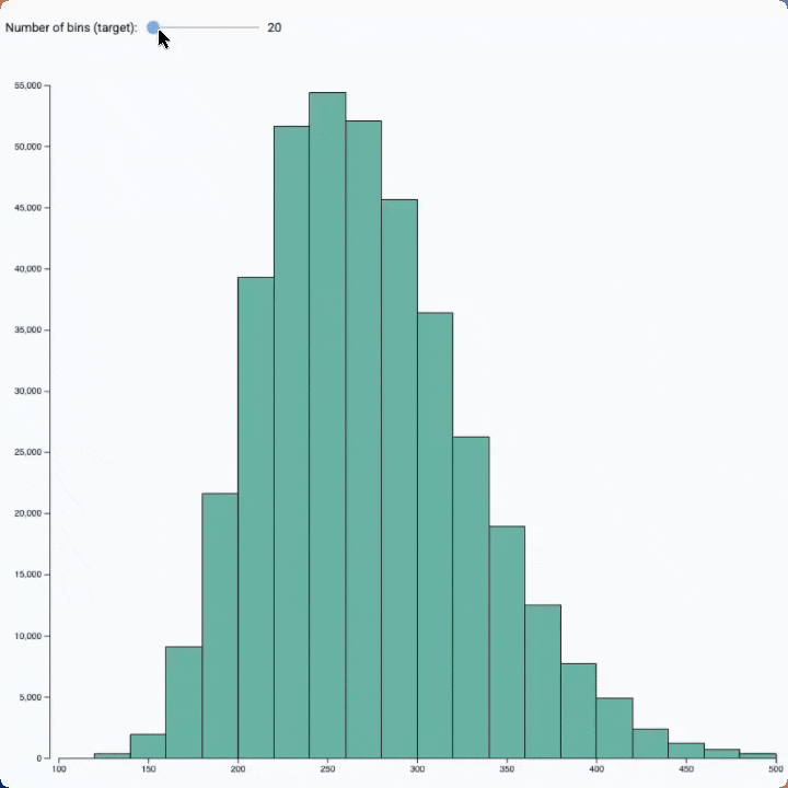
Bin size slider
See the effect of bin size on a histogram with this interactive example
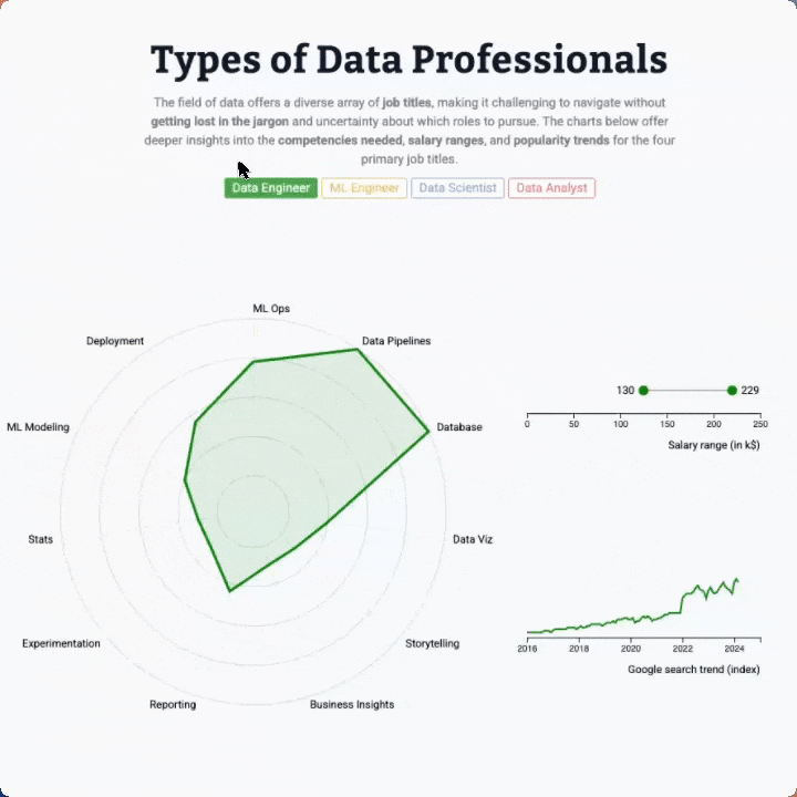
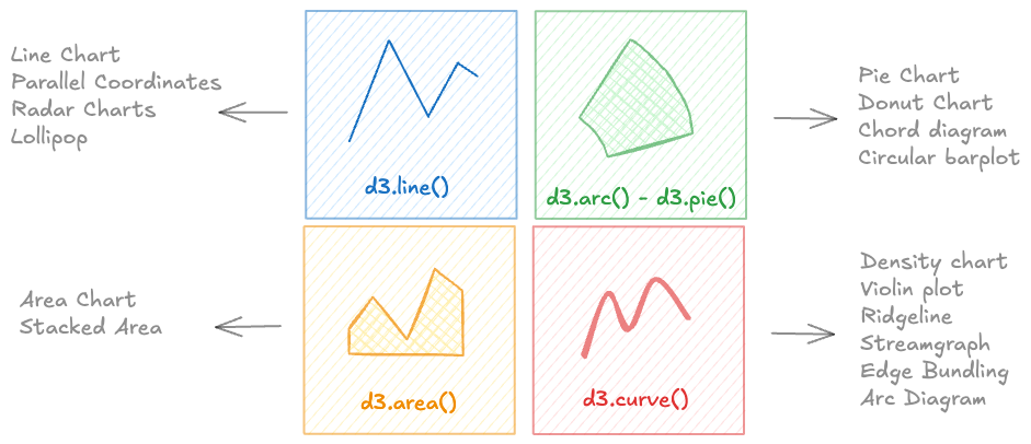
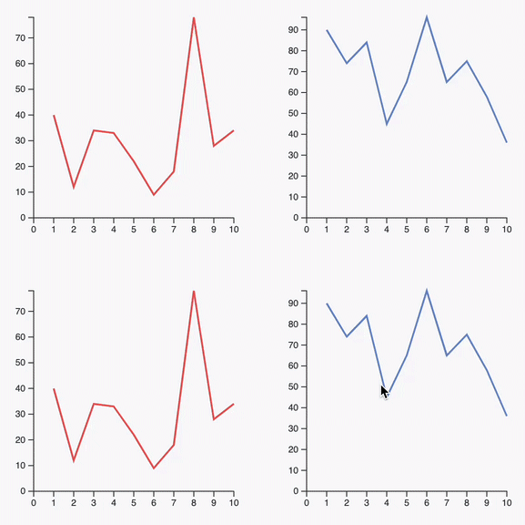
Radar chart, line chart an lollipop with animated transition
Three charts connected to same buttons, with smooth, synchronized animation when a button is clicked
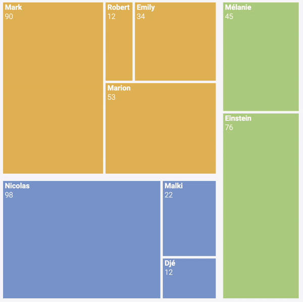
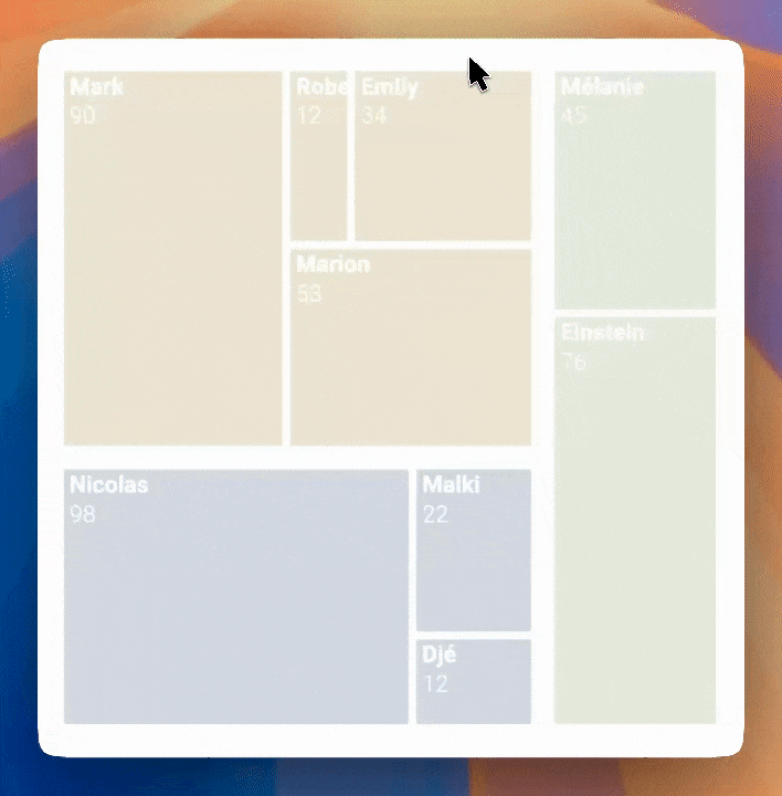
Hover effect
Treemap with hover effect to highlight a group
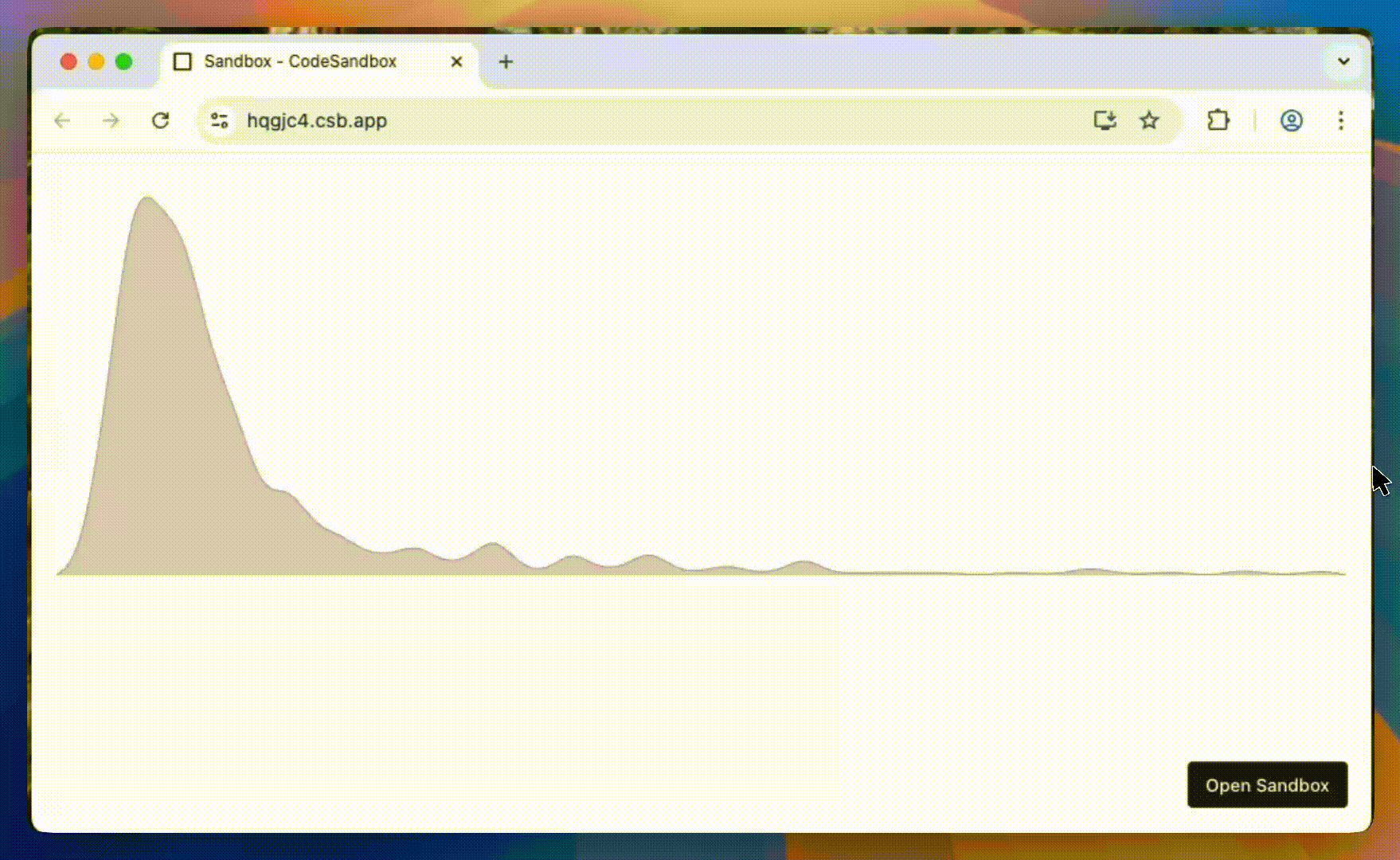
Streamgraph application
Streamgraph with a slider to zoom on a time stamp and with interactive inline legends
Who is this for?
Anyone into dataviz would love this course. But you will especially love it if:
You need stunning, custom visuals
D3 is the only tool that lets you build anything. No limits, no compromises—just full creative control.
You've tried D3 and hit a wall
You've copy-pasted code you didn't understand, and your chart broke the moment you tried to customize it.
You've outgrown charting libraries
Shiny, Streamlit, Recharts, Chart.js, or Plotly got you started... but you want to reach the next level.
You want to level up your React skills
You know React, but adding D3 expertise will set you apart and open doors to specialized roles.
No HTML or JavaScript experience? No problem. The first two modules teach the foundations.
👋 Hi! I'm Yan Holtz.
Senior Software Engineer in ❤️ with educational content.

For the past 5 years, I’ve worked at Datadog, building interactive, production-grade charts full time—so I know what works in the real world.
I’ve also taught programming and data visualization to over 2,000 students through my other courses, sharing the patterns and mental models that make complex topics approachable.
You might know me from the R, Python, D3.js, and React Graph Galleries, or from my award-winning platforms Data-to-Viz.com and Dataviz-Inspiration.com.
This course is my step-by-step approach to mastering interactive, production-ready visualizations with D3.js and React, combining real-world patterns, mental models, and hands-on projects.
Join me, and in just a few hours, you’ll gain skills and confidence that will make building complex, dynamic charts feel natural 🔥.
What People Are Saying
The first cohort welcomed more than 300 students, who all built bespoke, interactive charts. A bunch of them were kind enough to leave a testimonial. Here's what they're saying:

Yan delivered an exceptional talk on Data Visualization at our MIT research centre, and we gained a tremendous amount of insight from his expertise!
His tools, workshops, and training resources are invaluable for anyone looking to enhance their data visualization skills, and we highly recommend exploring them.

I attended both of other Yan's courses, productive-r-workflow and matplotlib-journey, and they were excellent.
Clear, well-structured, and highly insightful. I highly recommend them and can't wait to follow this one too!

Yan has done an exceptional job to create an efficient course that still manages to help you understand how to approach creating custom visualization with D3.js while also keeping it fun 😄

This course has been one of the most helpful resources I've found for learning D3 with React.
Even though I sometimes had to refer to the solutions, the process taught me a lot. The balance between theory and practice is great, and I especially appreciate how the exercises build intuition rather than just memorization.

I attended a 2-day training with Yan on D3 and React.
Thanks to his attentiveness, he suggested an approach that was well suited to my skill level and business needs. Combining theory with (a lot of!) practice, he explains complex topics with great clarity.
I now have a solid foundation to continue learning, and I leave with many tips and directions to make my future work easier.

The React Graph Gallery has been an invaluable resource in my journey of learning interactive web-based data visualization.
The course is clear, concise, and straight to the point. The chart templates are simple, elegant, visually appealing, and are incredibly useful for quickly getting started with a given visualization.
I highly recommend it to anyone looking to elevate their data visualization skills!

Yan is genuinely one of the best teachers I've come across for data viz. The React + D3 course is structured really well, with bite-sized lessons that actually build on each other.
I'm halfway through and already have real projects to show. The community aspect makes it even better. Highly recommend.

I loove the course so much so far 😭😭😭 Everything is so nicely explained, parts I struggled to understand fall just into the right place. I feel actually guided and empowered to learn 🥹
And the text is so well-written and so human in this era of AI! Thank you for that, maybe my excitement is too early, but right now this course feels like a true gem.

I was really excited to join the D3 loves React course and learn first-hand from a great DataViz designer like Yan. And the course fully met my expectations: great content, a clear course structure, comprehensive sandboxed lessons, and engaging practice projects that made me actually create something from scratch on my machine and publish it to GitHub, a real-world learning experience that many courses lack.
And if there is ever a problem during the course journey, Yan is very present and there to support.

I was up until 1am last night because I was having such a good time tweaking and learning the ins and outs of React. Thanks Yan for putting this course together and I'm excited to keep learning!!

I like how practical it is and appreciate all the support you give to the students.
I'm someone who tried to learn D3 in the past and gave it up 🙈. Your course is different league 😉

I love it!
I can't believe how much I've learned already and it's been very satisfying. It's like finally having a door to a world I didn't know how to get into.
The format is perfect, very smart, on point. Thanks again for putting it together!

Highly recommended. The course is going beyond a learning experience. Yan provides the right dose of theory and practice for learning not only the fundamentals but also the advanced concepts.
From the beginning you are able to put into practice what you learn and start building stunning stuff, increasing your engagement with the course. All this accompanied with a very collaborative framework where other students and Yan himself keep very helpful and responsive.

The course is absolutely amazing!!! I love it! 😻 One of the best courses I've taken! It was exactly what I was hoping for and there is so much to learn and endless design possibilities. 🙂
I'm applying the things I've learnt on a personal project. It's so much fun. Yesterday I was sitting on the computer the whole day until midnight 😅 Time flies!
Thank you so much for building this course and sharing your knowledge. ❤️. It opened a new world for me!

I've followed Yan's posts about data viz for years. I knew he had courses on data viz using R and Python but early in 2026 I noticed he had created a course using D3 combined with React for data viz. I'd been trying to learn D3 properly for years after having used other libraries like DC.js with some small success. I never really felt like I could successfully build anything with D3. Then I started Yan's course…
The course begins with a great overview of the fundamental technology of web development and React. If you've never seen any of this before it could be a steep learning curve but Yan has created dozens of small quizzes to help embed the learning from each section.
You'll then work through different sections, each culminating in a mini assignment to build a particular data viz. It's a great way to see yourself actually building something tangible. Part of my struggle in the past has been crippling procrastination, but I found that these smaller exercises and assignments made it easier to push through that and get to a point where I understood enough to get something built.
I still have lots to learn, but one of the great things about this course is that you have access to the materials forever after you enrol.
This is, without a doubt, the best course on D3 that I've ever completed and I thoroughly recommend it to anyone who wants to learn D3.

Yan Holtz has created an amazing online D3 course that I'm following right now. Besides the super easy-to-follow lessons, there's also a Discord community so you don't feel lonely during the process, plus Yan is incredibly proactive about answering questions and hosts two live Q&As every Friday.

Lately, I've been exploring D3 and React through Yan Holtz's course, and I'm enjoying it a lot. It's very well-structured and carefully thought through, which has already given us a solid high-level understanding of how web creation works and how things are built.

The course D3 ♥️ React is what I would wish from an online programming course: well-structured, very applied, with feedback and community.
The possibility to access the course flexibly and life-long was a clear advantage for me as a working professional and a busy parent. One more point for me to choose it was that the certificate of completion is provided.
I enjoy building something real, and Yan's knowledge and expertise enable this.

This course has a rare quality: it makes you curious. It has opened my eyes to what is possible.
I came in knowing nothing about D3.JS and React, and while I'm still working through the material, I already find myself being less afraid and more confident in taking my visuals to the next level. Yan does a terrific job of demystifying the magic behind the visuals that seemed beyond my reach before taking this course.

I have tried to learn D3 for years, with limited success. Browsing the D3 and Observable documentation never really clicked with me, and I always found it a bit confusing, until I found the D3 ❤️ React course.
This course takes you from fundamentals to building stunning web based data visualisations in no time. Not only do you get to grips with D3, but you are also presented with a tech stack built for the modern age. I strongly recommend this course to anyone interested in D3 and modern web app development!

I'm really happy about both the quantity and quality of the whole course. It's clear that Yan knows what he is talking about (and he is always there to help). It is truly worth the price!

This course is a true investment. It took me from zero knowledge, to understanding all key elements I need to build the kind of interactive data visualizations I envision, with the confidence that I know what I (and an AI) am doing.

The course is extremely well structured, the pace is adequate, and the Discord group a definite plus. The key aspects are all well explained and the learning environment that has been created definitely maximises the experience. I do not hesitate to recommend this to anyone wanting to learn more.

Your course has been one of the best resources I've found for learning D3 and React in a practical way. As someone working with football analytics and data science, I was looking for a course that would help me move beyond static charts and build more custom, interactive visualizations for the web.
What I like most is that the course does not just show how to reproduce charts. It explains the logic behind each step, with a clear structure and practical exercises that make the concepts really stick.
I would definitely recommend it to anyone who wants to build a solid foundation in modern web-based data visualization.

The D3 React course has been excellent! Yan is a great teacher and very encouraging. The course modules are very clear and educational, breaking down concepts very well for a smooth learning process.

This is an amazing course! Yes, it is D3 + React, but Yan doesn't assume that everyone is an advanced coder and provides a preliminary review of web design, node.js, and more, making the course accessible.
And he isn't just teaching the code. Yan is teaching a mental model of how to write data viz apps that scales!

I'm a statistical programmer working in clinical trials, and this D3.js course series by Yan is simply the best online course I've taken this year.
From foundational concepts to hands-on examples and clear professional explanations, Yan makes D3.js, which normally has a steep learning curve, much easier to understand and apply in real work.
In the clinical trials field, we typically work with a limited set of chart types. But after taking this course, I feel much more capable of turning data into meaningful visuals, with far fewer limitations than before.
Thank you, Yan, for putting so much care and effort into this. This is truly a must-take course that I wouldn't want anyone to miss!

It's very comprehensive, and I like that the exercises make sure the lessons never feel one-sided. Some topics can feel intimidating, but there are plenty of resources within each lesson that help me push through.
I also love looking at the projects other students have built and taking inspiration from them to create my own.

I really recommend this course to anyone looking to improve their data viz (or even creative skills!). As someone who wanted to develop her skills from static to interactive viz, I was initially intimidated by the many languages and packages I needed to learn.
But the opposite can be said about joining this course: Yan was able to consolidate the essentials of D3 and React and present them in a way that is not only easily digestible but also fun to learn.

I'm really enjoying the course so far. It flows very smoothly, and it's great that there are so many exercises to work through. I expected it to be difficult, but with the help of AI it's nowhere near as hard as I thought.
I'm honestly super excited to continue! 😁 I've been following Yan's data viz work for a long time, and it's so impressive.

I've always loved data visualization and wanted to explore interactivity, but building interactive charts can be complex. That's why I chose Yan's d3-loves-react course, which makes the process much more approachable through a component-based, reusable approach.
The bite-sized lessons and carefully crafted exercises really help me understand the underlying principles. Plus, lifetime access, an inspiring student gallery, and an active Discord community make it a great learning experience. I highly recommend this course to anyone looking to level up their visualization skills!

The D3 course by Yan was one of the best investments in the data visualization domain. Building and deploying Shiny web dashboards using Python had always been challenging, particularly when it came to personalizing the frontend.
The interactive D3 course, which also covered the fundamentals of web development, provided a deeper understanding of how charts are organized, rendered, and can be interactive on web browsers. These newfound skills opened up a whole new range of design possibilities that had never been imagined before. Super recommended.

D3.js, known for its steep learning curve, remains the gold standard for anyone interested in creating data visualizations. By the end of the course, whether you have a technical background or not, everyone is able to take full advantage of this powerful library.
The technical aspects are, of course, covered, but the diverse community and Yan's advice are just as valuable for improving your skills and data literacy.

I had been trying to learn D3 for over a year, but the learning curve felt steep, and I often found myself overwhelmed by the many resources available online. When I saw that Yan had launched a D3 + React course, I enrolled immediately and it has been one of the best learning investments I have made. The course is thoughtfully structured, well-paced, and each concept is explained with remarkable clarity.
I especially enjoyed the hands-on projects at the end of each lesson, which helped reinforce my understanding and build confidence in applying what I learned. The energy within the Discord community is infectious, and Yan is always incredibly responsive and helpful whenever questions come up.

I absolutely love Yan sir's courses (I am also a student of his Matplotlib and Data Viz. with R courses), and this D3 course is no exception. Yan Holtz is an exceptional teacher and mentor. The way he has structured the curriculum into small, digestible chapters makes what could otherwise feel overwhelming both approachable and enjoyable.
Despite having little prior knowledge of JavaScript, React, or web development fundamentals, I was able to follow the course comfortably. The dedicated introductory modules provide exactly the foundation needed to tackle the more advanced chapters with confidence.
To anyone considering learning D3.js: don't let the unconventional format (primarily written content complemented by weekly live sessions) make you question the quality of the course. In my opinion, this is hands down the best D3 course available today.

As someone who doesn't have a developer background, this course was incredibly helpful. It strikes the perfect balance between AI use and making you understand what each line of code does. Also focuses on why best practices are so important, countless tips and tricks, how the different web elements interact, and of course great data visualizations. I can't recommend this enough!

I had really high expectations for this course because of how eager I've been to reproduce similar visual content as the charts I see on the web, in science communication content and in scientific journals. And I have to say that I've not been disappointed!
I had literally 0 experience in web development before taking this course, but thanks to Yan great introductions to the basics of the web it was a very smooth experience to learn everything needed. And only after a 4-5 weeks, I was already able to reproduce great inspiring charts such as the ones I saw in the Economist journal, or that I can see in energy and climate reports, and that also include interaction features. I highly recommend the course!

Thanks to this course I was finally able to build a chart I had wanted to create for a long time.
Excellent teaching methodology and an excellent course overall. Thank you very much!

This was an exceptionally well-designed and well-thought-through training. From its design to its delivery, I absolutely enjoyed it. Despite it being an online programme, having direct access to Yan for questions was invaluable.
Being able to engage with other participants, learn from their approaches, and see the incredible visualisations my "classmates" prepared was highly motivating. Driven by that energy, I managed to work on two separate projects during the training and gained dozens of new connections on LinkedIn. D3.js + React are permanently part of my CV now and I can't recommend this course enough.

I first came across Yan Holtz's work through his R Graph Gallery during my grad cert studies in 2023 – an inspirational resource, with its breadth of examples, richness of information and code, and how generously it was all shared for open use. So it's been a real pleasure to experience those same qualities first-hand in the D3 Loves React course.
Everything Yan brings to the gallery, he brings to the course: knowledge shared clearly and generously, material that's well-structured and full of personal tips, and a genuine commitment to encouraging all his students, inspiring community along the way.
The course itself is a lot of fun with regular projects that help form the basis of a personal and varied portfolio website. And already, I've been able to apply and adapt my learnings beyond data viz and into web application design more broadly, both front and backend.
From that first gallery to this course, the same generosity runs all the way through – thank you, Yan.

Yan's React + D3 course has been incredibly valuable for us. It gave us the practical skills and confidence to develop truly advanced, interactive data visualisation at the highest current standard.
As a direct result, we've significantly improved our services as a company and now offer advanced data visualisation as part of our core offering in health economics and real-world evidence. If you're interested, you can see some examples on our website: Explore our advanced data visualisation work.

When it comes to learning a new language, or anything that feels intimidating—the right teacher and the right course format can make all the difference. They can leave you either loving the subject or feeling intimidated by it for years.
Thanks to you, I genuinely enjoyed learning D3.js. Thank you for designing such a thoughtful, engaging, and efficient course. I haven't finished it yet, but I know I'll come back to it because you made the whole learning process so approachable and fun.
Buying this course has genuinely been one of the best decisions I made.

I had been looking for a good data visualisation tool for my personal projects, but I don't have a programming background and nothing really clicked. Then I randomly joined one of Yan's webinars and realised this was exactly what I was looking for.
Yan really cares about his students, and the uni student discount was a nice touch. I'm still taking the course, but I'm already excited about what I'll be able to build.

This course felt like getting a vaccine against the disease while being exposed: my new job that I started forced me to work with React in different ways and degrees - already for production.
And even though Claude did all the heavy lifting - who but me would point it to the exact components to amend? Who would've thought, it's so much faster to fix UI elements by hand instead than merely writing a prompt: "make that chip at the topright corner of the red button smaller but not too much just a bit... ... ..." :D
Expecting this to become the case was my motivation to enroll - and it was proven to be worth it.
I really, really appreciated all the work and love that you've put into the course: the lovely color scheme, the Discord server with a lot of talented and supportive people, how you always were there to address the feedback and to help the students.

I'm a (mostly static) information designer, not a developer. Yan's course matches that perfectly: the content is dense but structured so well that you always know where you are and where you're going. And if you're not familiar with coding yet, you can genuinely start from zero.
What surprised me most is how well it works with AI tools in the loop. So instead of memorizing syntax, you learn the concepts well enough to direct AI that writes the boilerplate. For a non-coder, that's a game-changer.
Highly recommend it if you want to actually understand what you're building, rather than just copy-paste it.

I started this course with basically no JS, React or D3 experience, so I was honestly expecting a pretty steep learning curve. The course is structured in a way that made it completely manageable, starting from the web (HTML & CSS basics) and React foundations before moving into D3 concepts. What I liked most is that the course teaches you how things work, not just how to recreate a specific chart and end up with a collection of demos.
And the bonus part was that I didn't stop at course projects. Within a few months, my team integrated D3 visuals into our own data product, Embedsy Studio, where users can now build D3 charts on top of their Power BI semantic models. That's something I definitely wasn't expecting when I enrolled.
Thanks, Yan!

I'm a data journalist and have been creating charts with code for years. Tools like Observable Plot worked well for me, but they had their limitations. Not everything I envisioned could be built with them. D3 offered the flexibility I needed, but it was too difficult to learn.
AI has changed that—and Yan's training course gave me the foundation I needed to get started. Now the possibilities are virtually limitless: everything can be customized, hover effects can be fine-tuned however I like, and elements can be animated with ease.
For bespoke data visualizations, I now rely on D3, React, and AI in my day-to-day work.
Join the waitlist!
The first cohort is full with 300 students currently learning! Join the waitlist to be notified when doors reopen for cohort 2.
349€
599€
First cohort price
Join the waitlist to get early access when doors reopen.
💸 Discounts
Why this will work
Most D3 tutorials throw complex examples at you and hope something sticks. This course is built on how people actually learn.
Learn by Doing
Tons of exercises with increasing complexity. Reading docs never made anyone good at D3. Building things does.
Back to the Basics
2 full modules on web fundamentals—SVG, JavaScript, React basics. No hand-waving. No "you should already know this."
Bite-Sized Lessons
Short, focused lessons you can squeeze into your day. 15 minutes here, 20 minutes there. No 2-hour marathons.
Progressive Complexity
Start simple. Build confidence. Then tackle the hard stuff. You won't drown in a sea of complex examples from day one.
I'm Sitting Next to You
Live Office Hours every Friday. Ask questions, get unstuck, and learn from what others are building.
The Modern Stack
React + D3, not ancient vanilla JS patterns. Write code you'd actually ship today, not copy-paste artifacts from 2015.
100+ Interactive Examples
Every concept comes with a CodeSandbox you can fork and break. From "hello world" to production-ready patterns.
A Real Community
A Discord where you share your work and get real feedback. Not a ghost town—an active group learning together.
Bonus: A ready-to-go template for data storytelling with all the right libraries pre-installed.
⏰ You Won't Fall Asleep!
This course is NOT a collection of long, dull, unrefined videos. You'll seamlessly switch between concise text, engaging videos, quizzes, and hands-on exercises using our interactive embedded sandboxes!
Check the code on the left.
Can you turn the bars red?