Ridgeline chart
A ridgeline chart is a chart type that shows the distribution of a numeric variable for several groups, stacked one of top of each other. This page is a step-by-step guide on how to build your own histogram for the web, using React and D3.js.
It starts by describing how the data should be organized and how to initialize the ridgeline component. It then quickly recalls how to compute and draw a kernel density, and shows how to stack this information for several groups of a dataset. 🙇♂️.
The Data
To build a ridgeline chart, the input dataset must provide a set ofnumeric values for several groups.
The best way to format this kind of information is with an array of object. Each object represents a group. Agroup property provides the group name, and a values property provides the values.
Here is a minimal example of the data structure:
export const data = [
  {
    group: "A",
    values: [0, 0, 2, 2, 2, 0, 0, 1],
  },
  {
    group: "B",
    values: [19, 20, 19, 18, 18],
  }
];
Component skeleton
The goal here is to create a Ridgeline component that will be stored in a Ridgeline.tsx file. This component requires 3 props to render: a width, a height, and some data.
The shape of the data is described above. The width and height will be used to render an svg element in the DOM, in which we will insert the histogram.
To put it in a nutshell, that's the skeleton of our Ridgeline component:
import * as d3 from "d3"; // we will need d3.js

type RidgelineProps = {
  width: number;
  height: number;
  data: number[];
};

export const Ridgeline = ({ width, height, data }: RidgelineProps) => {

  // read the data
  // build the scales
  // compute kernel densities for each group
  // build all shapes

  return (
    <div>
      <svg width={width} height={height}>
        // render all the shapes
      </svg>
    </div>
  );
};
It's fundamental to understand that with this code organization, d3.js will be used to prepare the SVG circle, but it's React that will render them in the return() statement. We won't use d3 methods like append that you can find in usual d3.js examples.
Computing and plotting a density
A ridgeline chart is a set of density plots, stacked one on top of each other. It is thus important to start by learning how to compute a kernel density, and how to transform it in a SVG path rendered with react.
The density chart section of the gallery thoroughly explains how to compute this density estimation for a set of numeric values.
This is how the result looks like:
A ridgeline chart is a set of densities stacked one on top of each other. This minimal example shows how to compute and plot this density for a single group.
Stacking the densities
→ Two Y scales
It's important to understand that 2 Y scales are necessary to compute a ridgeline chart.
The first one is used many times, to compute each density. It's a scaleLinear scale.
The second is used once to shift each group baseline and create the slight overlap. It's a scaleBand: each band of the Y axis is dedicated to a group.
You can read more about scales and axes.
→ Axis
It's important to display a X axis to understand what we are looking at. In the example below the axisBottom imperative method of d3 is used in a useEffect hook, but you can definitely create the axis using react like suggested here.
For the Y axis labels, I suggest to add them using some text svg elements.
A ridgeline chart showing how various probability related words are perceived by humans. (more)
Responsive Ridgeline with react
The component above is not responsive. It expects 2 props called width and height and will render a Ridgeline of those dimensions.
Making the Ridgeline responsive requires adding a wrapper component that gets the dimension of the parent div, and listening to a potential dimension change. This is possible thanks to a hook called useDimensions that will do the job for us.
useDimensions: a hook to make your viz responsive
export const useDimensions = (targetRef: React.RefObject<HTMLDivElement>) => {

  const getDimensions = () => {
    return {
      width: targetRef.current ? targetRef.current.offsetWidth : 0,
      height: targetRef.current ? targetRef.current.offsetHeight : 0
    };
  };

  const [dimensions, setDimensions] = useState(getDimensions);

  const handleResize = () => {
    setDimensions(getDimensions());
  };

  useEffect(() => {
    window.addEventListener("resize", handleResize);
    return () => window.removeEventListener("resize", handleResize);
  }, []);

  useLayoutEffect(() => {
    handleResize();
  }, []);

  return dimensions;
}Responsiveness is a deep topic.
The responsiveness module covers it in depth: the
useDimensions hook, the wrapper pattern, and the common pitfalls to avoid.Ridgeline inspiration
If you're looking for inspiration to create your next Ridgeline, note that dataviz-inspiration.com showcases many examples. Definitely the best place to get ... inspiration!
dataviz-inspiration.com showcases hundreds of stunning dataviz projects. Have a look to get some ideas on how to make your Ridgeline looks good!
visitVariations
Ridgeline charts are not the only way to compare the distribution of several groups in a dataset. Boxplots, violins, histograms and densities are variations that could interst you in order to solve this goal. Check the examples below to get the code.
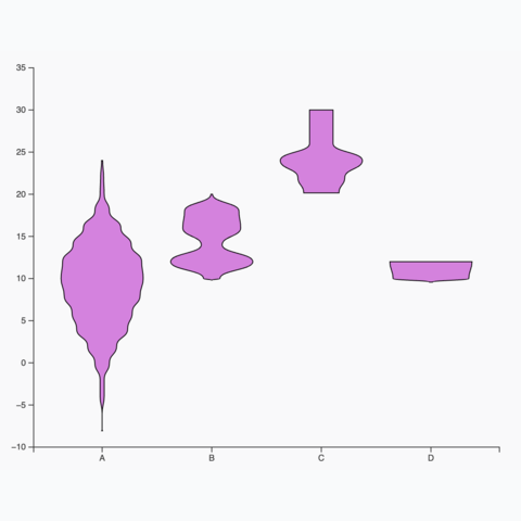
Basic violin plot
Learn how to build a basic violin chart with d3 and react
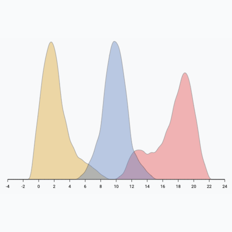
Density plot with multiple groups
How to add several groups on the same density plot
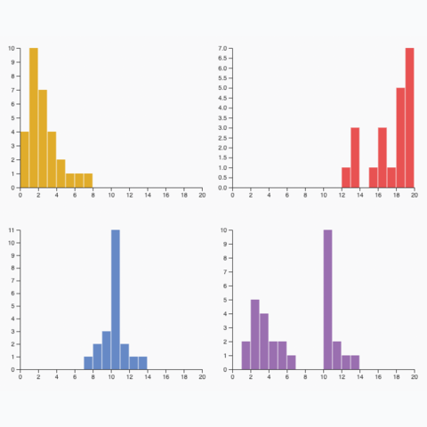
Small multiple
Create one panel per group to show its distribution separately
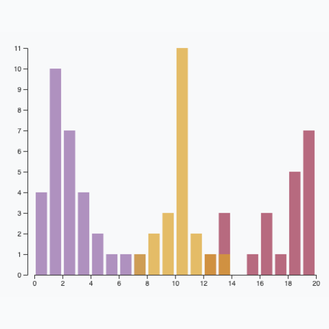
Multiple groups
A histogram with <b>multiple</b> groups displayed on the same axis.
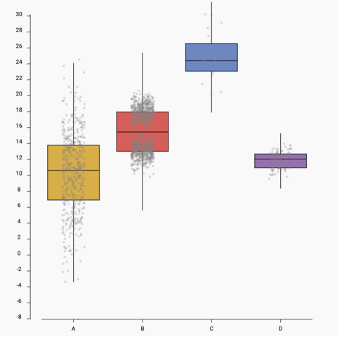
Boxplot with jitter
Add individual data points using jitter on top of the boxplot
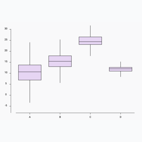
Basic boxplot
How to build a basic boxplot with react


Contact
👋 Hey, I'm Yan and I'm currently working on this project!
Feedback is welcome ❤️. You can fill an issue on Github, drop me a message on LinkedIn, or even send me an email pasting yan.holtz.data with gmail.com. You can also subscribe to the newsletter to know when I publish more content!
