Radar Chart

A radar or spider or web chart is a two-dimensional chart type designed to plot one or more series of values over multiple quantitative variables. Each variable has its own axis, all axes are joined in the center of the figure.
This page is a step-by-step guide on how to build your own radar chart for the web, using React (for rendering) and D3.js (to compute the axis, and shape coordinates).
It starts by describing how the data should be organized and how to initialize the Radar component. It then explains how to compute axis dynamically, and plot the lines and axis. Once this is done, it shows how to deal with scaling and how to add an interactive legend. 🙇♂️.
The Data
The dataset provides several numeric values for a set of data items.
The suggested data structure is an array of object, where each object is a data item. It can have as many numeric properties as needed. It also has a name property that identifies the data item.
Here is a minimal example of the data structure:
const data = [
  {var1: 5.1, var2: 3.5, ..., name: 'Mark'},
  {var1: 4.9, var2: 3.0, ..., name: 'Rosa'},
  ...
]
Note: this is the same data format as for a correlogram or for a parralel chart.
Component skeleton
The goal here is to create a Radar component that will be stored in a Radar.tsx file. This component requires 4 props to render: a width, a height, some data and an array providing the name of the variables to display.
The shape of the data is described above. The width and height will be used to render an svg element in the DOM, in which we will insert the radar chart.
To put it in a nutshell, that's the skeleton of our Radar component:
import * as d3 from "d3"; // we will need d3.js

type DataItem = {
  [variable: string]: number;
} & { name: string };


type RadarProps = {
  width: number;
  height: number;
  data: DataItem[];
  variables: string[]
};

export const Radar = ({ width, height, data, variables }: RadarProps) => {

  // read the data & get a list of groups
  // build X scale
  // build Y scales: 1 per variable
  // build color scales
  // loop through variables to add axes
  // loop through data items and through variables to draw lines

  return (
    <div>
      <svg width={width} height={height}>
        // render all the <lines>
      </svg>
    </div>
  );
};
It's fundamental to understand that with this code organization, d3.js will be used to prepare the SVG path, but it's React that will render them in the return() statement. We won't use d3 methods like append that you can find in usual d3.js examples.
Scales
Building a radar chart requires several scales and axes. Understanding how those scales work and how to draw the background grid using polar coordinates is probably the trickiest part or the radar chart creation.
D3.js comes with a handful set of predefined scales. scaleBand and scaleRadial are the ones we are going to use here.
→ X Scale
We need only 1 X scale. This scale is gonna allocate an angle for each variable name of the dataset. The first variable will be directed to the top of the figure, the second a few more radians clock-wise and so on.
This is how the scale is defined:
const allVariableNames = axisConfig.map((axis) => axis.name);

// The x scale provides an angle for each variable of the dataset
const xScale = d3
  .scaleBand()
  .domain(allVariableNames)
  .range([0, 2 * Math.PI]);
→ Y Scales
Several Y scales are required, one per variable in the dataset. The corresponding axes will be drawn from the center of the figure to the outer part, with an angle determined by the xScale.
The y scales are computed using the scaleRadial() function as follow. They are all stored in a yScales object.
// Compute the y scales: 1 scale per variable.
// Provides the distance to the center.
let yScales: { [name: string]: YScale } = {};

axisConfig.forEach((axis) => {
  yScales[axis.name] = d3
    .scaleRadial()
    .domain([0, axis.max])
    .range([INNER_RADIUS, outerRadius]);
});
Radar chart background grid
Once those scales are available, we need to draw the background grid of the radar chart.
A bunch of options exist for this. Here I suggest to loop through the axisConfig to draw the axes, and add some concentric circles to create a grid.
Since the code is a bit long to create this grid, I strongly advise to place it in a separate component (RadarGrid here).
Background grid of a radar chart built with react and d3.js. 6 Variables are represented using 6 axes with polar coordinates
Note that placing the labels requires to translate some polar coordinates to cartesian coordinates. This can be done using the following function:
export const polarToCartesian = (angle: number, distance: number) => {
  const x = distance * Math.cos(angle);
  const y = distance * Math.sin(angle);
  return { x, y };
};
Radar chart with 1 group
Finally! ✨
We can now map through the data array and draw a path per item thanks to the scales computed above.
What's tricky here is that we are dealing with polar coordinates. We have a set of points that are defined by an angle (x scale) and by a distance to the center of the figure (y scale).
Fortunately, the lineRadial() function of d3 is here to help. We can define a radial line generator using the following statement:
// Create a radial line generator
const lineGenerator = d3.lineRadial();
It works pretty much the same as the classic line() function of d3, but expects an angle and a distance instead of a x and a y position.
// Use the radial line generator
const path = lineGenerator([
  [0, 100], // first data point, 0 is its angle, 100 is its distance to the center
  [Math.PI / 2, 50], // second data point = second variable
  [Math.PI, 10],
]);

// Result is a path that you can pass to the d argument of a SVG <path>
// console.log(path)
// M0,-100 L50,-3.06 L1.2246,10
Note that in order to close the shape, we need to add the first data point again after reaching the last data point, to close the loop.
A first basic radar chart with only 1 group represented. Made with React and d3.js
Responsive Spider / Radar with react
The component above is not responsive. It expects 2 props called width and height and will render a Spider / Radar of those dimensions.
Making the Spider / Radar responsive requires adding a wrapper component that gets the dimension of the parent div, and listening to a potential dimension change. This is possible thanks to a hook called useDimensions that will do the job for us.
useDimensions: a hook to make your viz responsive
export const useDimensions = (targetRef: React.RefObject<HTMLDivElement>) => {

  const getDimensions = () => {
    return {
      width: targetRef.current ? targetRef.current.offsetWidth : 0,
      height: targetRef.current ? targetRef.current.offsetHeight : 0
    };
  };

  const [dimensions, setDimensions] = useState(getDimensions);

  const handleResize = () => {
    setDimensions(getDimensions());
  };

  useEffect(() => {
    window.addEventListener("resize", handleResize);
    return () => window.removeEventListener("resize", handleResize);
  }, []);

  useLayoutEffect(() => {
    handleResize();
  }, []);

  return dimensions;
}Responsiveness is a deep topic.
The responsiveness module covers it in depth: the
useDimensions hook, the wrapper pattern, and the common pitfalls to avoid.Spider / Radar inspiration
If you're looking for inspiration to create your next Spider / Radar, note that dataviz-inspiration.com showcases many examples. Definitely the best place to get ... inspiration!
dataviz-inspiration.com showcases hundreds of stunning dataviz projects. Have a look to get some ideas on how to make your Spider / Radar looks good!
visitRadar chart with several groups
The process to get a radar chart with several groups is very similar to the previous example.
We just need to create a color scale and add a shape for each item of the dataset through a loop. Do not try to add too many groups on the same figure, it make it totally unreadable.
A radar chart with several groups displayed on the same figure. Made with React and d3.js
ToDospider chart with small multiple to make it more readable
Animation
It is common to have a radar chart that is updated when a button is clicked on the application. It is possible to implement a smooth, animated transition between states thanks to the react-spring library.
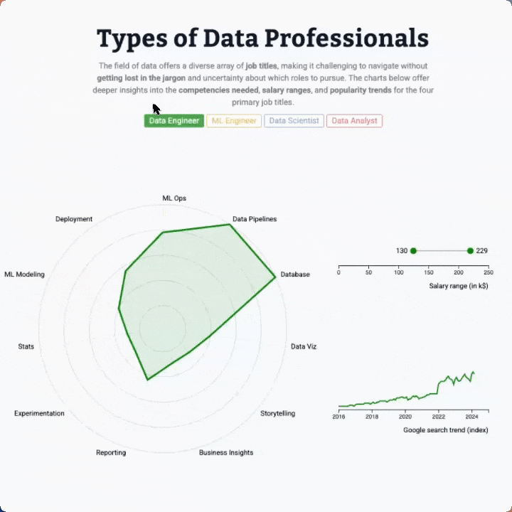
The following example illustrates this with a real world example. The radar chart is animated, together with a line chart and a lollipop.


Contact
👋 Hey, I'm Yan and I'm currently working on this project!
Feedback is welcome ❤️. You can fill an issue on Github, drop me a message on LinkedIn, or even send me an email pasting yan.holtz.data with gmail.com. You can also subscribe to the newsletter to know when I publish more content!
