Correlogram

In this blog post, we will be exploring how to build a correlogram with React and D3.js. A correlogram is a graphical representation of the correlation matrix for a given dataset. It is a useful tool for visualizing the relationships between different variables in a dataset, and can help identify potential correlations that may not be immediately obvious.
Building a correlogram with React and D3.js allows us to create a highly interactive and customizable visualization. We will be able to use React's powerful component-based approach to build our visualization, while leveraging the flexibility and power of D3.js to create a dynamic and engaging visual representation of our data.
Correlogram = scatter plot + histogram
A correlogram uses histograms to show the distribution of each numeric variable on the diagonal of the matrix. It uses scatter plots to show the relationship of each pair of variable on every other cells.
As a result, it is required to understand how to build a histogram and a scatter plot component using React and d3.js! In this post, we will just show how to leverage those reusable components to build a correlogram.
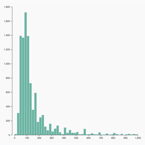
Histogram
Learn how to build a histogram with react and d3.js
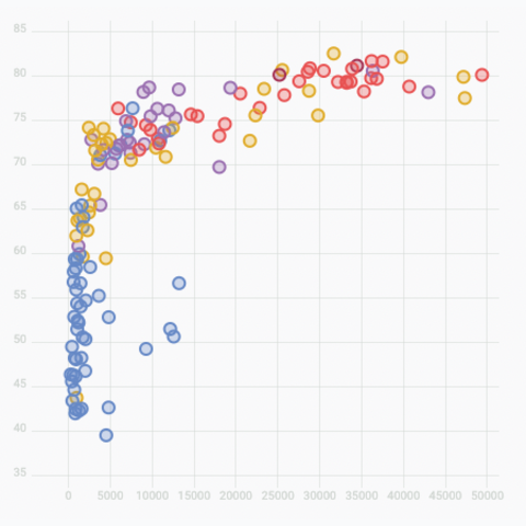
Scatter plot
Learn how to build a scatter plot with react and d3.js
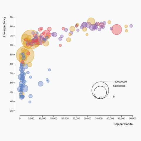
Bubble plot
Learn how to build a bubble plot with react and d3.js
The Data
The dataset provides several numeric values for a set of data points. It can also add some categorical variables that can be added to customize the marker colors.
The suggested data structure is an array of object, where each object is a data point. It can have as many numeric properties as needed.
Here is a minimal example of the data structure:
const data = [
  {var1: 5.1, var2: 3.5, ..., group: 'setosa'},
  {var1: 4.9, var2: 3.0, ..., group: 'setosa'},
  ...
]
Basic correlogram
Once the 2 Histogram and ScatterPlot components are available, it's just a matter of using them for each pair of variable in the dataset.
We can list the variable in a allVariables array, and map twice on it. We need to render a distribution for the diagonal, and a scatterplot otherwise. Something like:
const allGraphs = allVariables.map((yVar, i) => {
  return allVariables.map((xVar, j) => {

    // If x and y variables are the same (diagonal), use a distribution.
    if (xVar === yVar) {
      const distributionData = ... // build distribution data

      return (
        <Histogram
          width={graphWidth}
          height={graphHeight}
          data={distributionData}
          limits={[0, 8]}
        />
      );
    }

    // Scatterplot dataset
    const scatterData = ... // build scatter data

    return (
      <Scatterplot
        width={graphWidth}
        height={graphHeight}
        data={scatterData}
      />
    );
  });
});
Note that graphWidth and graphHeight can easily be computed from the total width and height, once we know how many variables there are.
Once the list of react nodes with all the individual charts is available (allGraphs), it just a matter of rendering them in a div with a grid display.
return (
  <div
    style={{
      width,
      height,
    }}
  >
    <div
      style={{
        width: boundsWidth,
        height: boundsHeight,
        display: "grid",
        gridTemplateColumns: "1fr ".repeat(allVariables.length),
        transform: ...,
      }}
    >
      {allGraphs}
    </div>
  </div>
);
And voilà, a first decent correlogram for your data analysis pipeline 😊. It's not perfect yet. You probably want to give more love to axes and labels, add hover effect and tooltips. But hopefully that's a good template to get started.
A correlogram built with react and d3.js. It shows the relationship between the 4 numeric variables of the famous iris dataset.
Note: You can compare this code with the pure d3 alternative. I find it much more readable.


Contact
👋 Hey, I'm Yan and I'm currently working on this project!
Feedback is welcome ❤️. You can fill an issue on Github, drop me a message on LinkedIn, or even send me an email pasting yan.holtz.data with gmail.com. You can also subscribe to the newsletter to know when I publish more content!
