Density chart
A density plot is a chart type that shows the distribution of a numeric variable. This page is a step-by-step guide on how to build your own density plot for the web, using React and D3.js.
It starts by describing how the data should be organized and how to initialize the density component. It then explains how to compute a kernel density. Once this is done, it shows how to render the density shape and suggests a few variations. 🙇♂️.
The Data
Building a density chart only requires a set of numeric values.
As a result, the dataset is pretty simple: just an array of number.
Here is a minimal example of the data structure:
export const data = [
  75.0,
  104.0,
  369.0,
  300.0,
  92.0
]
Component skeleton
The goal here is to create a Density component that will be stored in a Density.tsx file. This component requires 3 props to render: a width, a height, and some data.
The shape of the data is described above. The width and height will be used to render an svg element in the DOM, in which we will insert the histogram.
To put it in a nutshell, that's the skeleton of our Density component:
import * as d3 from "d3"; // we will need d3.js

type DensityProps = {
  width: number;
  height: number;
  data: number[];
};

export const Density = ({ width, height, data }: DensityProps) => {

  // read the data
  // Compute kernel density
  // build the scales
  // draw the shape

  return (
    <div>
      <svg width={width} height={height}>
        // render the shape
      </svg>
    </div>
  );
};
It's fundamental to understand that with this code organization, d3.js will be used to prepare the SVG circle, but it's React that will render them in the return() statement. We won't use d3 methods like append that you can find in usual d3.js examples.
Kernel density
→ Definition
Kernel density estimation is a method of estimating the probability distribution of a random variable based on a random sample.
Density is a bit like constructing a histogram, but with a smoothing step.
With the correct choice of bandwidth, important features of the distribution can be seen, while an incorrect choice results in undersmoothing or oversmoothing and obscured features.
→ Implementation
The implementation I'm using here comes from this block by Mike Bostock.
Here is how the formulas look like:
function kernelDensityEstimator(kernel, X) {
  return function(V) {
    return X.map(function(x) {
      return [x, d3.mean(V, function(v) { return kernel(x - v); })];
    });
  };
}

function kernelEpanechnikov(k) {
  return function(v) {
    return Math.abs(v /= k) <= 1 ? 0.75 * (1 - v * v) / k : 0;
  };
}
→ Computing the density
You don't have to understand each row of this code, but you have to understand how to use it.
Everything starts with a set of numeric values (the data we want to study) and a set of buckets. The more buckets you create, the smoother the density will be.
const data = [11, 22, 21, 33, 43, 49, 2, 4, 5, 1, 6];
const buckets = [0, 10, 20, 30, 40, 50];
We can now create a function that computes a density from a dataset, given some buckets:
const computeKde = kernelDensityEstimator(kernelEpanechnikov(7), buckets);And finally compute the density for our dataset:
const density = computeKde(data);Note that 2 parameters have an impact on the estimate’s smoothness.bucketsis the array of tresholds.7is an arbitrary bandwidth. I'm not sure how to optimize those values yet.
→ Density object format
The result is an array of arrays. Its length is the same length as the number of bucket + 1. In our example it looks like:
[
  [0, 0.03],
  [10, 0.02],
  [20, 0.01],
  [30, 0.00],
  [40, 0.00],
  [50, 0.00]
]
The first item of each array is the lower bound of the bucket. We will use it for the X axis. The second item is the value of the density in this bucket. It will be used for the Y axis.
First density plot
Now that the density coordinates are available, it's just a matter of creating the path of a svg shape.
Fortunately, d3 comes with the handy d3.line() function that allows to go from a set of coordinates to a path easily. In order to keep the smoothing, you can use the .curve() attribute as described in the code below:
const lineGenerator = d3
    .line()
    .x((d) => xScale(d[0]))
    .y((d) => yScale(d[1]))
    .curve(d3.curveBasis);

const path = lineGenerator(density);
This path is a string that can be passed to the d attribute of a svg element:
<svg width={width} height={height}>
  <path
    d={path}
    fill="#9a6fb0"
    ...
  />
</svg>
And that's it, a first density chart is now available:
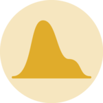
Most basic density chart made with react and d3.js. Almost there, we just miss the axes here.
Axis
The density chart above is pretty useless since we have no clue on what the X and Y axes represent. We need to display the bucket values of the X axis to make the chart insightful. The Y axis does not matter that much, since it just provides the kernel density value of the bucket which is not insightful.
There are several ways to add axes to charts in React. The process is extensively described in this axes dedicated post. To put it in a nutshell, some margins need to be added around the plot area, a scaleLinear is built with d3 and a custom AxisBottom component is used to draw the axis from the scale.
That's the result, a first reusable density plot component:
Adding a X axis with d3 makes the chart much more insightful.
Responsive Density with react
The component above is not responsive. It expects 2 props called width and height and will render a Density of those dimensions.
Making the Density responsive requires adding a wrapper component that gets the dimension of the parent div, and listening to a potential dimension change. This is possible thanks to a hook called useDimensions that will do the job for us.
useDimensions: a hook to make your viz responsive
export const useDimensions = (targetRef: React.RefObject<HTMLDivElement>) => {

  const getDimensions = () => {
    return {
      width: targetRef.current ? targetRef.current.offsetWidth : 0,
      height: targetRef.current ? targetRef.current.offsetHeight : 0
    };
  };

  const [dimensions, setDimensions] = useState(getDimensions);

  const handleResize = () => {
    setDimensions(getDimensions());
  };

  useEffect(() => {
    window.addEventListener("resize", handleResize);
    return () => window.removeEventListener("resize", handleResize);
  }, []);

  useLayoutEffect(() => {
    handleResize();
  }, []);

  return dimensions;
}Responsiveness is a deep topic.
The responsiveness module covers it in depth: the
useDimensions hook, the wrapper pattern, and the common pitfalls to avoid.Density inspiration
If you're looking for inspiration to create your next Density, note that dataviz-inspiration.com showcases many examples. Definitely the best place to get ... inspiration!
dataviz-inspiration.com showcases hundreds of stunning dataviz projects. Have a look to get some ideas on how to make your Density looks good!
visitVariations
Once you've understood how to build a basic density chart with d3 and React, it opens an infinite world of customization.
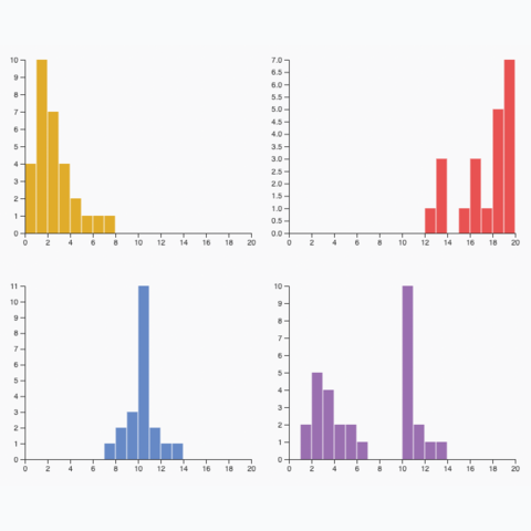
Here is an example showing how to plot several distributions on the same figure, allowing to compare several groups.
Using small multiple to visualize the distribution of several groups in 1 figure, avoiding overlapping.
Note that an alternative could be to use small multiple. See this histogram example that you should be able to adapt quickly.
Other set of potentially useful examples:


Contact
👋 Hey, I'm Yan and I'm currently working on this project!
Feedback is welcome ❤️. You can fill an issue on Github, drop me a message on LinkedIn, or even send me an email pasting yan.holtz.data with gmail.com. You can also subscribe to the newsletter to know when I publish more content!
