Timeseries with moving average

In this tutorial, we'll explore the art of plotting time series data, incorporating a dynamic moving average line chart overlaid on the primary plot.
Inspired by a visualization featured in the renowned French newspaper Le Monde, depicting the blooming patterns of cherry trees over time, we'll recreate this compelling chart.
With readily available code and straightforward explanations, you'll witness the prowess of React in seamlessly stacking multiple layers of rendering – from scatterplots to line charts and annotations.
🇯🇵 Poetry in Data
Amidst the myriad visualizations of global warming, one stands out for its poetic resonance – an unexpected gem found within the pages of a French newspaper: the flourishing timelines of cherry trees in Japan.
Intriguingly, Yasuyuki Aono delved into ancient texts dating back to the 800s to unearth this data. Thanks to the meticulous efforts of Our World in Data in cleaning and refining the dataset, we're now presented with a captivating portrayal of our changing world.
Here is the chart we're learning to build today:
Prerequisite
This graph combines elements of both a scatterplot and a line chart, making it essential to grasp the fundamentals of each chart type before diving in.
Good news, the react graph gallery has some very basic examples to illustrate those concepts!
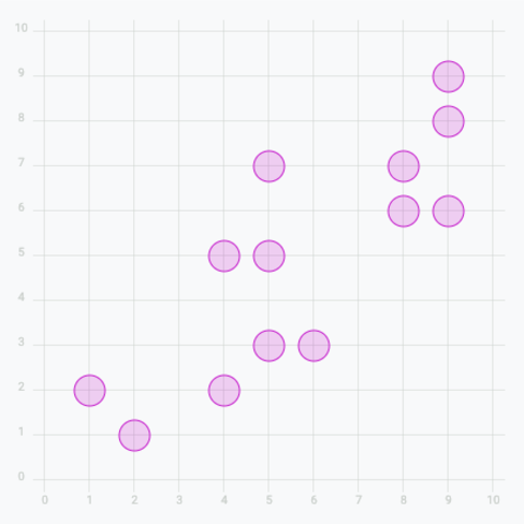
Basic scatter plot
Add circles to get a basic scatter plot
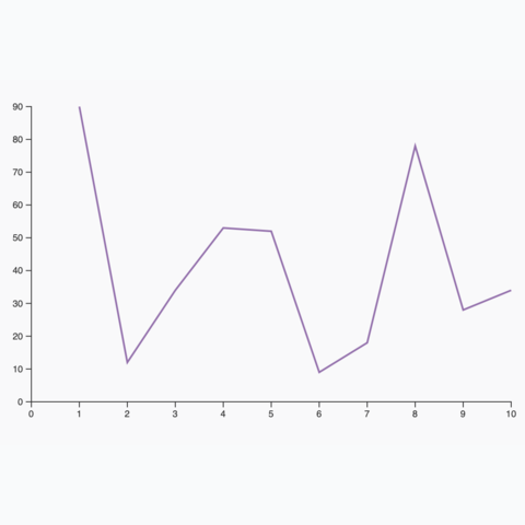
Most basic line chart
The most basic line chart one can make using d3 and react
Annotation
The deepest layer of this chart is the annotation that says 1950 - 2023. It uses stripes in the background. Stripes can be build in SVG as follow:
<defs>
  <pattern
    id="pattern_annotation"
    patternUnits="userSpaceOnUse"
    width="9.5"
    height="2.5"
    patternTransform="rotate(41)"
  >
    <line x1="0" y="0" x2="0" y2="9.5" stroke="#f2f2f2" strokeWidth="9" />
  </pattern>
</defs>
<rect
  x={xScale(1950)}
  width={xScale(2023) - xScale(1950)}
  y={0}
  height={boundsHeight}
  fill="url(#pattern_annotation)"
  opacity="1"
/>
There is nothing too complicated here thanks to the pattern element. But it's always a bit comsuming to make this manually so hopefully this code snippet can help!
Axes
The axes are highly customized to fit the style of the original newspaper.
In this case, I prefer to use custom AxisLeft and AxisBottom components instead of using the pre-made d3.jsfunctions.
Here is how the rendering part of the axis component looks like.
return (
  <>
    {/* Ticks and labels */}
    {ticks.map(({ value, yOffset }) => (
      <g key={value} transform={"translate(0, yOffset"}>
        <line
          x1={0}
          x2={width}
          stroke="#D2D7D3"
          strokeWidth={0.5}
          shapeRendering={'crispEdges'}
          stroke-dasharray="2,2"
        />
        <text
          key={value}
          style={{
            fontSize: '13px',
            textAnchor: 'start',
            transform: 'translateY(-5px)',
            fill: '#D2D7D3',
          }}
        >
          {getDateFromDayOfYear(value)}
        </text>
      </g>
    ))}
  </>
);
Full code
Let's wrap this up!
The full code for this chart is available below. Click the Show Code button.
Reproduction of a chart published in the newspaper Le Monde.
Going further
This graph looks pretty good. A few potential improvements:


Contact
👋 Hey, I'm Yan and I'm currently working on this project!
Feedback is welcome ❤️. You can fill an issue on Github, drop me a message on LinkedIn, or even send me an email pasting yan.holtz.data with gmail.com. You can also subscribe to the newsletter to know when I publish more content!
