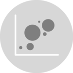
2d density chart
A 2D density chart is a graphical representation of data that uses color to show the concentration of data points in a given area. It shows the combined distribution of two quantitative variables. 2D density charts are often used in statistical analysis and data mining to identify trends, patterns, and correlations in the data.
In this tutorial, we will use the d3.js and React libraries to build a 2D density chart. It starts by describing how the data should be organized and how to initialize the Density2d component. It then explains how to prepare the data and compute bins. Once this is done, it shows how to render the shapes and suggests a few variations. 🙇♂️.
The Data
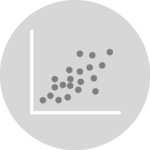
A 2d density chart is basically a variation of the scatterplot, useful when the amount of data points is huge. As a result, it shares the same data structure.
The data is an array of object. For each object, at least 2 properties are required: x and y. The value of x is the position of the datapoint on the horizontal axis. The value of y is linked with the vertical axis.
const data = [
  {
    x: 2,
    y: 4
  },
  {
    x: 8,
    y: 5
  }
]
Two dimensional density charts are useful with big datasets. Switch to a scatterplot if you have few data points!
Component skeleton
The goal here is to create a Density2d component that will be stored in a Density2d.tsx file. This component requires 3 props to render: a width, a height, and some data.
The shape of the data is described above. The width and height will be used to render an svg element in the DOM, in which we will insert the histogram.
To put it in a nutshell, that's the skeleton of our Density2d component:
import * as d3 from "d3"; // we will need d3.js

type Density2dProps = {
  width: number;
  height: number;
  data: number[];
};

export const Density2d = ({ width, height, data }: Density2dProps) => {

  // read the data
  // build the scales
  // use the hexbin plugin to compute hexagons from the dataset
  // draw the hexagons

  return (
    <div>
      <svg width={width} height={height}>
        // render all the hexagons
      </svg>
    </div>
  );
};
It's fundamental to understand that with this code organization, d3.js will be used to prepare the SVG circle, but it's React that will render them in the return() statement. We won't use d3 methods like append that you can find in usual d3.js examples.
Scales and axes
Scales and axes are computed and rendered exactly as for a scatterplot or a bubble chart. Please refer to the according sections.
Scales and axes are recurring topics in data visualization.
The scales module and the axis module cover them in depth.
How to build a bottom axis and a left axis component using React, used to render a d3 scale.
Compute hexagons with the d3-hexbin library
We have a set of points distributed on a 2d coordinate space. We want to split this space in hexagons, and compute the number of points in each hexagon.
Fortunately, the d3-hexbin library has everything we need to do so. This lib is not part of the main d3 bundle, install it with:
npm install d3-hexbin→ The hexagon generator
The d3-hexbin plugin comes with a hexbin() function that returns a hexagon generator. This hexagon generator is a function. You give it some data, it computes the hexagons.
const hexbinGenerator = hexbin()
  .radius(BIN_SIZE) // hexagon size in px
  .extent([
    [0, 0],
    [boundsWidth, boundsHeight],
]);
Two arguments are passed to the hexbin() function:
radiusis the size of each hexagonextentis an array providing the x and y limits of our chart
→ Hexagon format
The hexagonGenerator expects some data as input. The data must be an array where each item provides the x and y coordinates of a data point in the 2d space.
You can provide this data using the following code:
const hexbinData = hexbinGenerator(
  data.map((item) => [xScale(item.x), yScale(item.y)])
);
The result is an array of arrays. Each item represents a hexagon. Each hexagon is composed of all the values assigned to this hexagon. So its length is useful to compute the hexagon color.
Each bin has two additional attributes: x and y being the coordinates of the hexagon on the 2d space.
[
  [[1,1], [1,2], [2,2], x: 1.5, y: 1.5],
  [[12,14], [11,16], [9,12], x: 12, y: 12],
  ...
]
Let's draw those hexagons 🙇♂️!
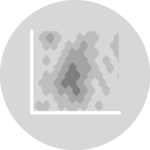
Drawing the hexagons
Finally! ✨
We can now map through the hexbinData array and draw a hexagon per item.
Fortunately, the hexbinGenerator built above comes with a hexagon() method that builds the shape of a hexagon for us. It's thus a breeze to render it in a path svg element:
const allShapes = hexbinData.map((d, i) => {
  return (
    <path
      key={i}
      d={hexbinGenerator.hexagon()}
      transform={"translate(" + d.x + "," + d.y + ")"}
      fill={colorScale(d.length)}
      ...
    />
  );
});
Note that transform is used to translate a hexagon to its correct position.
A hexbin density chart built with d3.js and React.
Responsive 2D Density with react
The component above is not responsive. It expects 2 props called width and height and will render a 2D Density of those dimensions.
Making the 2D Density responsive requires adding a wrapper component that gets the dimension of the parent div, and listening to a potential dimension change. This is possible thanks to a hook called useDimensions that will do the job for us.
useDimensions: a hook to make your viz responsive
export const useDimensions = (targetRef: React.RefObject<HTMLDivElement>) => {

  const getDimensions = () => {
    return {
      width: targetRef.current ? targetRef.current.offsetWidth : 0,
      height: targetRef.current ? targetRef.current.offsetHeight : 0
    };
  };

  const [dimensions, setDimensions] = useState(getDimensions);

  const handleResize = () => {
    setDimensions(getDimensions());
  };

  useEffect(() => {
    window.addEventListener("resize", handleResize);
    return () => window.removeEventListener("resize", handleResize);
  }, []);

  useLayoutEffect(() => {
    handleResize();
  }, []);

  return dimensions;
}Responsiveness is a deep topic.
The responsiveness module covers it in depth: the
useDimensions hook, the wrapper pattern, and the common pitfalls to avoid.2D Density inspiration
If you're looking for inspiration to create your next 2D Density, note that dataviz-inspiration.com showcases many examples. Definitely the best place to get ... inspiration!
dataviz-inspiration.com showcases hundreds of stunning dataviz projects. Have a look to get some ideas on how to make your 2D Density looks good!
visitVariations
The hexbin representation above is just one member of a family of graphics allowing to study the combined distribution of two quantitative variables. You can read more about the existing variations in the data to viz project.
To put it in a nutshell, 2d histogram, Gaussian KDE, 2d density and Contour charts are the most common variations. It is of course possible to build them all using react and d3.js.
Here is an example with a contounr chart based on the same dataset than the previous example.
Contour chart made with React and D3.js.
ToDomake the contour chart above looks better
ToDoadd examples for 2d histograms and other variations
ToDoAdd example with a zoom feature implemented
Contact
👋 Hey, I'm Yan and I'm currently working on this project!
Feedback is welcome ❤️. You can fill an issue on Github, drop me a message on LinkedIn, or even send me an email pasting yan.holtz.data with gmail.com. You can also subscribe to the newsletter to know when I publish more content!
