Barplot

A barplot displays a numeric value for several groups of a dataset using rectangles. This page is a step-by-step guide on how to build your own barplot for the web, using React and D3.js.
It starts with very basic concepts like data structure, scales and svg rectangle rendering. It then shows how to add interactivity to the chart with hover effects. Last but not least it explains how to build variations like the stacked barplot.
The Data
The dataset required to build a barplot is usually an array where each item is an object providing the name and the value of the group.
Here is a minimal example
const data = [
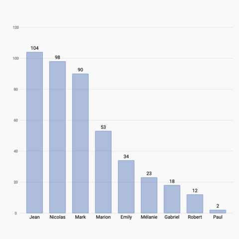
{name:"Mark", value: 90},
{name:"Robert", value: 12},
{name:"Emily", value: 34},
{name:"Marion", value: 53},
{name:"Nicolas", value: 98},
]Note: if your data is in .csv format, you can translate it thanks to the d3.csv() function as suggested here.
Component skeleton
The goal here is to create a Barplot component that will be stored in a Barplot.tsx file. This component requires 3 props to render: a width, a height, and some data.
The shape of the data is described above. The width and height will be used to rendering a svg element in the DOM, in which we will insert the barplot.
To put it in a nutshell, that's the skeleton of our Barplot component:
import * as d3 from "d3"; // we will need d3.js

type BarplotProps = {
  width: number;
  height: number;
  data: { name: string; y: number }[];
};

export const Barplot = ({ width, height, data }: BarplotProps) => {

  // read the data
  // do some stuff with d3
  // compute all the <rect>

  return (
    <div>
      <svg width={width} height={height}>
        // render all the <rect>
      </svg>
    </div>
  );
};
It's fundamental to understand that with this code organization, d3.js will be used to prepare the svg circle, but it's react that will render them in the return() statement. We won't use d3 methods like append that you can find in usual d3.js examples.
Scales
A scale is a function that transforms a dimension (like our value or our group name) in a position in pixels.
Building a barplot requires 2 scales of 2 kinds. The first will transform the group value in a bar length. The second will transform the group name in a position.
→ Linear scale for the bar length
D3.js comes with a handful set of predefined scales. scaleLinear is what we need for the bar length. Here is a quick overview on how to build and use a linear scale:
const scale = d3.scaleLinear()
  .domain([0, 10]) // data goes from 0 to 10
  .range([0, 200]); // axis goes from 0 to 200

scale(0); // 0 -> item with a value of 0 will have a bar of length 0
scale(5); // 100 -> bar of length 100
scale(10); // 200 -> bar of length 200
Since we are building a horizontal barplot here, this scale will be used by the X axis.
To dig more into d3 scales, visit this dedicated page. It's a crucial concept that will be used everywhere in this website.
→ Band scale for the group position
A band scale will be used to control the position of each rectangle on the Y axis. It is computed with the scaleBand() function of d3.js. It attributes a band of pixels to each group.
For instance, calling the band scale with yScale("A") will return 0, and yScale.bandwidth() will return the width of the band (e.g. 11px).
Note: the padding argument controls the space between bars.
const yScale = d3
    .scaleBand()
    .range([0, boundsHeight])
    .domain(allGroups)
    .padding(0.01);

// yScale("A") -> 0
// yScale.bandwidth() -> 11
Basic barplot
We now have all the ingredients to build a basic barplot with react, all being pretty close to the d3-only examples.
For each item in the dataset, create a SVG rect element. Its vertical position can be retrieved from the group name thanks to the band scale. It's size is retrieved using the xScale and its value.
Note that using the same amount of information it is straightforward to add a label for the name and one for the value.
Most basic barplot built with d3.js for scales, and react for rendering
Responsive Barplot with react
The component above is not responsive. It expects 2 props called width and height and will render a Barplot of those dimensions.
Making the Barplot responsive requires adding a wrapper component that gets the dimension of the parent div, and listening to a potential dimension change. This is possible thanks to a hook called useDimensions that will do the job for us.
useDimensions: a hook to make your viz responsive
export const useDimensions = (targetRef: React.RefObject<HTMLDivElement>) => {

  const getDimensions = () => {
    return {
      width: targetRef.current ? targetRef.current.offsetWidth : 0,
      height: targetRef.current ? targetRef.current.offsetHeight : 0
    };
  };

  const [dimensions, setDimensions] = useState(getDimensions);

  const handleResize = () => {
    setDimensions(getDimensions());
  };

  useEffect(() => {
    window.addEventListener("resize", handleResize);
    return () => window.removeEventListener("resize", handleResize);
  }, []);

  useLayoutEffect(() => {
    handleResize();
  }, []);

  return dimensions;
}Responsiveness is a deep topic.
The responsiveness module covers it in depth: the
useDimensions hook, the wrapper pattern, and the common pitfalls to avoid.Transition
When the dataset updates, it adds a nice touch to smoothly animate the transition. In the example below, changing the dataset will update the bar sizes and their positions on the Y axis to keep the ranking accurate.
Animation is a complicated topic in dataviz. We have to deal with updates (an element changes its features), enter (a new element appears) and exit (an element is not present anymore) patterns.
I suggest to rely on the react-spring library to help here. Please check this dedicated blogpost to get explanations about the code of this example.
Most basic barplot built with d3.js for scales, and react for rendering
Stacking
A stacked barplot is a variation of a barplot where an additional level of grouping is represented. Each bar represent the value of a group, for instance how much each my friend spent in the last month. Each bar is then subdivided, each part representing the value of a subgroup, for instance the category of expense.
D3 comes with a very handy stack() function. The 2 tutorials below explain how this function works, and how to use it to render a clean stacked barplot.
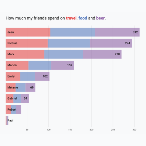
Horizontal Stacked Barplot
Represent group and subgroup values by stacking the data
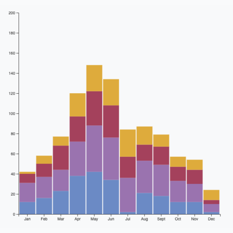
Vertical Stacked Barplot
Represent group and subgroup values by stacking the data
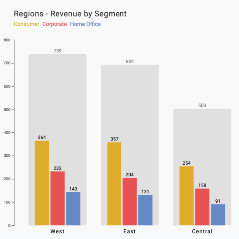
Stacked Barplot Alternative
An alternative to the stacked barplot: grouped barplot plus background for total
Vertical barplot
The vertical option is less common since it makes is much harder to read the labels. But if you really need it, it is just a matter of swaping the X and Y axes of the previous example.
Here is a sandbox if you just need the code, but please read the dedicated tutorial for more explanations.
Basic vertical barplot made with React and D3.js
Hover effect
There are several strategies to implement a hover effect. If you're not exactly sure what you're doing, I highly recommend reading the hover effect section of the gallery first.
This example uses strategy #4: connecting two charts through a shared internal state.
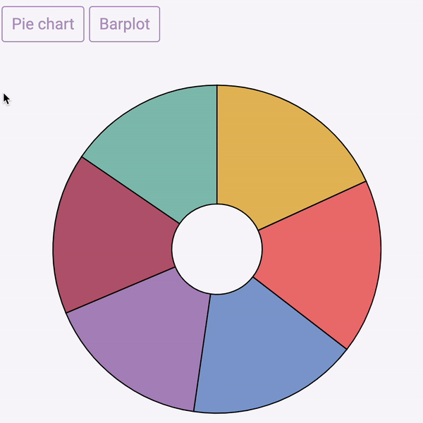
Variations
Let's go beyond the basic barcharts. Click on the overview images below to get details and code.


Contact
👋 Hey, I'm Yan and I'm currently working on this project!
Feedback is welcome ❤️. You can fill an issue on Github, drop me a message on LinkedIn, or even send me an email pasting yan.holtz.data with gmail.com. You can also subscribe to the newsletter to know when I publish more content!
