Bubble plot

A bubble plot is an extension of a scatterplot, where each circle has its size proportional to a numeric value. This page is a step-by-step guide on how to build your own bubble chart for the web, using React and D3.js.
This page focuses on the implementation of features that are different from the scatterplot that has its dedicated section. It describes how the dataset differs, how the circle size can be mapped to a numeric value, and how to explicit it using a legend. Last but not least it explains how to add interactivity: hover effect, tooltip, and dataset transition. 🙇♂️.
The Data
The dataset used to build a bubble plot is usually an array of objects where each object is a data point. For each object, at least 3 properties are required.
Two properties are used for the X and Y axis, the third one is used for the circle size.
Note that you can add more properties to the object. For instance, a name can be displayed in the tooltip, and a group can be used to color the bubbles.
const data = [
  {
    "x": 43.828,
    "y": 31889923,
    "size": 974.5803384
    "name": "Afghanistan",
    "group": "Asia",
  },
  {
    "x": 76.423,
    "y": 3600523,
    "size": 5937.029526
    "name": "Albania",
    "group": "Europe",
  },
  ...
]Note: this post is mainly based on the gapminder dataset that provides some info like the life expectancy and the population for every country.
Extending the scatter plot
A bubble chart is just an extension of a scatter plot. The only difference is that a third numeric variable is represented, mapped to the circle size.
As a result, please start by visiting the dedicated scatter plot page that explains how to draw axes and circles, and shows how to add basic interactions like hover effects and tooltips.
Scales and axes
How to map your data in a 2d space, and how to draw the axes
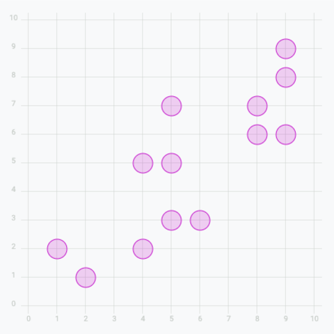
Basic scatter plot
Add circles to get a basic scatter plot
Add tooltip
Get more details about each datapoint by adding a tooltip on hover
Add a hover effect
Highlight a specific group on hover
Real life use-case
Reproduction of a data wrapper chart representing countries CO2 data
Once you understand those fundamental concepts, you're ready to browse the following examples to build a bubble chart.
Control the circle sizes to make bubbles
We need to make the circle size proportional to a numeric value. Note that it is the area that must be proportional, not the radius.
To do so, d3.js offers a scaleSqrt() function that constructs a new continuous power scale: exactly the transformation we need. It is one of the other scale types covered in the course. Building the scale looks like this:
return d3
  .scaleSqrt()
  .domain([min, max])
  .range([BUBBLE_MIN_SIZE, BUBBLE_MAX_SIZE]);
This scale provides the radius that we must use for each circle based on its numeric value. We can use it in the r attribute of each circlelike this:
<circle
  cx={xScale(d.gdpPercap)}
  cy={yScale(d.lifeExp)}
  r={sizeScale(d.pop)}
  ...
  />
Note that a bubble chart often has circle overlaps. It's strongly advised to use transparency and to sort the data: draw the big bubbles below and the small ones on top.
A clean bubble chart built with d3.js in a react context. A color scale is used to represent a categorical variable.
Note: The above example uses the d3.js imperative style to build the axes. This can also be done building your own axis component like here. The axis module compares both approaches in depth.
This is starting to look not too bad, but we need a legend here, to understand what the size and color of each circle mean.
Adding a legend
There are many different ways to add a legend to a d3.js graph. What we mainly need here is to make sense of the bubble size. I suggest using a set of nested bubbles, showing a few of the bubble sizes used on the chart with their respective values.
A legend to make sense of circle size, based on a d3 scale.
This legend is implemented in a BubbleLegend component that expects 2 props:
scale: the size scale that we described above, built with thescaleSqrtfunction.tickNumber: the number of circles to show on the legend.
Note that tickNumber is a target. The legend component uses the tick() function with this value, which returns a smart number of circle to approximate the goal while keeping some nice, smart values.
You can check the complete implementation of the legend here:
BubbleLegend: a component to build a legend for circle sizes
type BubbleLegendProps = {
  scale: d3.ScaleLinear<number, number, never>;
  tickNumber: number;
};

export const BubbleLegend = ({ scale, tickNumber }: BubbleLegendProps) => {
  const ticks = scale.ticks(tickNumber);
  const maxValue = ticks[ticks.length - 1];

  const diameter = scale(maxValue) * 2; // diameter of the biggest circle

  const dashWidth = diameter / 2 + 10;

  const allCircles = ticks.map((tick, i) => {
    const xCenter = diameter / 2;
    const yCircleTop = diameter - 2 * scale(tick);
    const yCircleCenter = diameter - scale(tick);

    return (
      <g key={i}>
        <circle
          cx={xCenter}
          cy={yCircleCenter}
          r={scale(tick)}
          fill="none"
          stroke="black"
        />
        <line
          x1={xCenter}
          x2={xCenter + dashWidth}
          y1={yCircleTop}
          y2={yCircleTop}
          stroke="black"
          strokeDasharray={"2,2"}
        />
        <text
          x={xCenter + dashWidth + 4}
          y={yCircleTop}
          fontSize={10}
          alignmentBaseline="middle"
        >
          {tick}
        </text>
      </g>
    );
  });

  return (
    <svg width={diameter} height={diameter} overflow="visible">
      {allCircles}
    </svg>
  );
};
It's important to note that the component does not expect any dimension as prop. The width and height of the SVG element that is created will be computed from the scale that is provided.
As a result, you only need to think about the position of the legend on your chart. Here is an example of adding it at the bottom right of the chart.
Adding a legend to make sense of the bubble size. Legend is hand made, adding svg shapes with React.
Smooth dataset transition
How can we smoothly animate the transition between 2 datasets on a bubble chart? The chart used in this blog post can be drawn for several different years. You can use the select button on top to select the year, and the bubbles will animate to their new position.
This is possible thanks to the motion library. Basically, instead of rendering usual circle elements, the library provides a motion.circle element. You pass the target position and radius to its animate prop, and motion springs the values to their new state whenever the data changes.
This is what the Circle component I use looks like:
Circle: a component that animates the transition of a circle
import { motion } from "motion/react";

type CircleProps = {
  color: string;
  r: number;
  cx: number;
  cy: number;
};

export const Circle = (props: CircleProps) => {
  const { cx, cy, r, color } = props;

  const transition = { type: "spring" as const, damping: 20, stiffness: 80 };

  return (
    <motion.circle
      opacity={0.7}
      stroke={color}
      fill={color}
      fillOpacity={0.3}
      strokeWidth={1}
      initial={{ cx, cy, r: 0 }} // grow in on mount
      animate={{ cx, cy, r }} // spring to the new position and size
      transition={transition}
    />
  );
};A bubble chart component that smoothly animates changes between datasets.
Animation in dataviz with React is a big topic.
The animation module covers it in depth: spring transitions, animating a whole chart, and the enter, update, exit pattern.
Real-life application
Let's apply the concepts learned above to a real-life example.
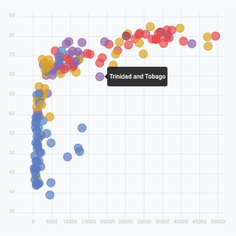
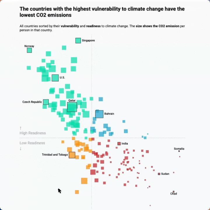
I like this scatterplot originally published on the data wrapper blog. It shows a strong correlation between vulnerability to climate change and CO2 emissions.
The chart has several features that are interesting to reproduce from a technical point of view:
- Custom annotation: only a fraction of the country names are written
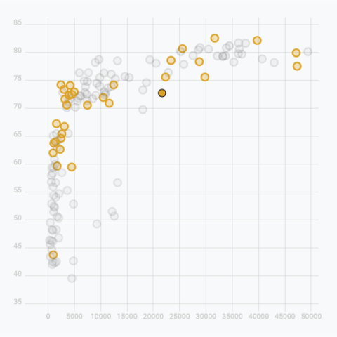
- Hover effect: the hovered country is highlighted with a black stroke. After a short delay, countries of other groups are dimmed. Note that the effect is triggered once the mouse approaches the marker, no need to be perfectly on top.
- Tooltip: highly customized and linked to the mouse position
The countries with the highest vulnerability to climate change have the lowest CO2 emissions
All countries sorted by their vulnerability and readiness to climate change. The size shows the CO2 emission per person in that country.
Reproduction of a chart originally published by Data Wrapper using react and d3.js.
Variations
Once you've understood how to build a basic bubble chart with d3 and react, it opens an infinite world of customization. Here are a few examples using the same concepts.
Click on the overview below to get details and code.
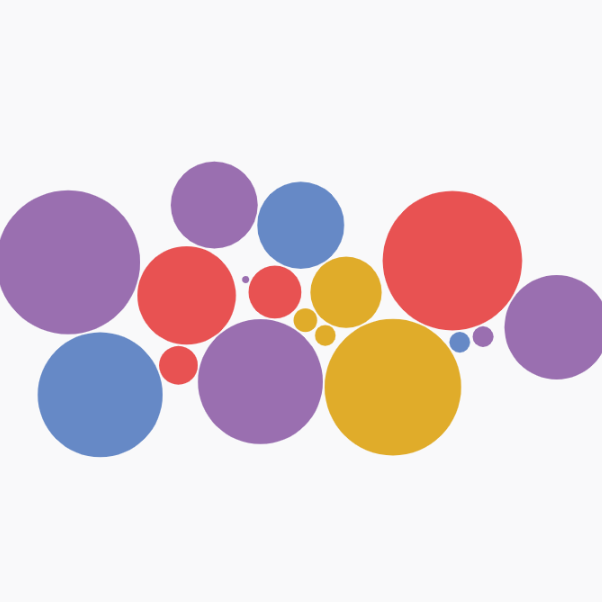
Real life use-case
Reproduction of a data wrapper chart representing countries CO2 data
Circle Pack with d3-force
Another approach to build a circle packing chart using physical forces to compute node positions.


Contact
👋 Hey, I'm Yan and I'm currently working on this project!
Feedback is welcome ❤️. You can fill an issue on Github, drop me a message on LinkedIn, or even send me an email pasting yan.holtz.data with gmail.com. You can also subscribe to the newsletter to know when I publish more content!
