Boxplot

A boxplot summarizes the distribution of a numeric variable, often for several groups of a dataset. This page is a step-by-step guide on how to build a reusable boxplot component for the web using React and D3.js.
It starts by describing how to format the dataset and how to initialize the boxplot component. It then explains how to create a Box component that displays a single box. Finally, it shows how to render the boxplot and suggests a few variations. 🙇♂️.
The Data 💾
The dataset used to build a boxplot is usually an array of objects. For each object, a name property provides the group name, and a value property provides the numeric value. It looks like this:
const data = [
  { name: "A", value: 10.7577 },
  { name: "A", value: 19.9273 },
  { name: "B", value: 13.8917 },
  { name: "B", value: 0.5102 },
  { name: "C", value: 10.5524 },
  ...
]
Summary statistics 🔨
A boxplot is based on summary statistics. For a set of values it displays:
- the median: central line of the box
- the first and third quartiles: upper and lower lines of the box
- the min and max values excluding outliers
Let's build a util function called getSummaryStats that computes this from an array of numeric values:
export const getSummaryStats = (data: number[]) => {
  const sortedData = data.sort(function(a, b){return a - b});

  const q1 = d3.quantile(sortedData, .25)
  const median = d3.quantile(sortedData, .5)
  const q3 = d3.quantile(sortedData, .75)

  if(!q3 || !q1 || !median){
      return
  }

  const interQuantileRange = q3 - q1
  const min = q1 - 1.5 * interQuantileRange
  const max = q3 + 1.5 * interQuantileRange

  return {min, q1, median, q3, max}
}
This function is going to be handy. Now we want to draw a box representing those values.
A reusable box component 📦
With the output of the getSummaryStats() function above we need to draw a box in SVG. Let's create a VerticalBox component that does this for us.
There is nothing fancy here. A rect is used for the main box. Some line are used for the rest.
const VerticalBox = ({
  min,
  q1,
  median,
  q3,
  max,
  width,
  stroke,
  fill,
}) => {
  return (
    <>
      <line
        x1={width / 2}
        x2={width / 2}
        y1={min}
        y2={max}
        stroke={stroke}
        width={STROKE_WIDTH}
      />
      <rect
        x={0}
        y={q3}
        width={width}
        height={q1 - q3}
        stroke={stroke}
        fill={fill}
      />
      <line
        x1={0}
        x2={width}
        y1={median}
        y2={median}
        stroke={stroke}
        width={STROKE_WIDTH}
      />
    </>
  );
};
This component can be called using the following statement:
<svg width={200} height={300}>
  <VerticalBox
    width={100}
    min={280}
    q1={200}
    median={100}
    q3={80}
    max={10}
    stroke="black"
    fill={"#ead4f5"}
  />
</svg>
Bringing this result:
The VerticalBox component allows to draw a vertical box displaying the summary statistics of a set of numeric values
Component skeleton
The goal here is to create a Boxplot component that will be stored in a Boxplot.tsx file. This component requires 3 props to render: a width, a height, and some data.
The shape of the data is described above. The width and height will be used to render an svg element in the DOM, in which we will insert the histogram.
To put it in a nutshell, that's the skeleton of our Histogram component:
import * as d3 from "d3"; // we will need d3.js

type BoxplotProps = {
  width: number;
  height: number;
  data: { name: string, value: number }[];
};

export const Boxplot = ({ width, height, data }: BoxplotProps) => {

  // read the data
  // compute summary statistics for each group
  // compute scales
  // build the boxes

  return (
    <div>
      <svg width={width} height={height}>
        // render all the boxes
        // draw the axes
      </svg>
    </div>
  );
};
It's fundamental to understand that with this code organization, d3.js will be used to prepare the SVG circle, but it's React that will render them in the return() statement. We won't use d3 methods like append that you can find in usual d3.js examples.
Scales and axes
→ Scales
Building a boxplot requires transforming a dimension (e.g. a numeric variable or a group name) in a position in pixels. This is done using a fundamental dataviz concept called scale.
D3.js comes with a handful set of predefined scales.
scaleLinearis what we need for the Y axis. It transforms a numeric value in a positionscaleBandis what we need for the X axis. It transforms a categoric variable (the groupnamehere) in a position
const scale = d3.scaleLinear()
  .domain([0, 10]) // data goes from 0 to 10
  .range([0, 200]); // axis goes from 0 to 200 pixels

scale(0); // 0 -> item with a value of 0 will be at the extreme left of the axis
scale(5); // 100 -> middle of the axis
scale(10); // 200 -> extreme rightconst xScale = useMemo(() => {
return d3
.scaleBand()
.range([0, boundsWidth])
.domain(allXGroups)
.padding(0.01);
}, [data, width]);
// xScale("A") -> 0
// xScale.bandwidth() -> 11To dig more into d3 scales, visit this dedicated page. It's a crucial concept that will be used everywhere in this website.
→ Axes
Axes are rather complicated elements. They are composed of the main segment, several ticks that each have a label, and are often decorated with a title.
Here I suggest creating the axes from scratch and storing them in 2 react components called AxisBottom and AxisLeft. Those components expect a d3 scale as input and do all the SVG drawings for us.
Compute scales to map numeric values to a 2d canvas. Use custom react components to render axes with react from this scales.
The code for the Y axis component is provided below. The following examples will show how straightforward it is to tweak them to reach other chart styles.
code for the Y axis react component
import { useMemo } from "react";
import { ScaleLinear } from "d3";

type AxisLeftProps = {
  yScale: ScaleLinear<number, number>;
  pixelsPerTick: number;
  width: number;
};

const TICK_LENGTH = 10;

export const AxisLeft = ({ yScale, pixelsPerTick, width }: AxisLeftProps) => {
  const range = yScale.range();

  const ticks = useMemo(() => {
    const height = range[0] - range[1];
    const numberOfTicksTarget = Math.floor(height / pixelsPerTick);

    return yScale.ticks(numberOfTicksTarget).map((value) => ({
      value,
      yOffset: yScale(value),
    }));
  }, [yScale]);

  return (
    <>
      {/* Ticks and labels */}
      {ticks.map(({ value, yOffset }) => (
        <g
          key={value}
          transform={"translate(0, {yOffset})"} // TODO struggling with back ticks
          shapeRendering={"crispEdges"}
        >
          <line
            x1={-TICK_LENGTH}
            x2={width + TICK_LENGTH}
            stroke="#D2D7D3"
            strokeWidth={0.5}
          />
          <text
            key={value}
            style={{
              fontSize: "10px",
              textAnchor: "middle",
              transform: "translateX(-20px)",
              fill: "#D2D7D3",
            }}
          >
            {value}
          </text>
        </g>
      ))}
    </>
  );
};
The X axis implementation is very similar. Check the code of the chart below to read it.
Basic boxplot with React
We now have all the ingredients to cook the final recipe. We have everything to compute the summary statistics for each group of the dataset, and plot the result with several boxes. We also know how to compute scales and add some axes to the chart.
So it is just a matter of looping through all the groups of the dataset and drawing a box for each.
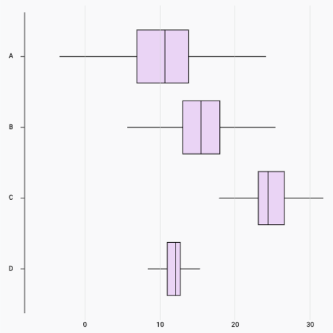
Here is the final result:
Most basic boxplot built with d3.js and React. D3 is used to compute summary statistics and scales. React is used for rendering.
Responsive Boxplot with react
The component above is not responsive. It expects 2 props called width and height and will render a Boxplot of those dimensions.
Making the Boxplot responsive requires adding a wrapper component that gets the dimension of the parent div, and listening to a potential dimension change. This is possible thanks to a hook called useDimensions that will do the job for us.
useDimensions: a hook to make your viz responsive
export const useDimensions = (targetRef: React.RefObject<HTMLDivElement>) => {

  const getDimensions = () => {
    return {
      width: targetRef.current ? targetRef.current.offsetWidth : 0,
      height: targetRef.current ? targetRef.current.offsetHeight : 0
    };
  };

  const [dimensions, setDimensions] = useState(getDimensions);

  const handleResize = () => {
    setDimensions(getDimensions());
  };

  useEffect(() => {
    window.addEventListener("resize", handleResize);
    return () => window.removeEventListener("resize", handleResize);
  }, []);

  useLayoutEffect(() => {
    handleResize();
  }, []);

  return dimensions;
}Responsiveness is a deep topic.
The responsiveness module covers it in depth: the
useDimensions hook, the wrapper pattern, and the common pitfalls to avoid.Boxplot inspiration
If you're looking for inspiration to create your next Boxplot, note that dataviz-inspiration.com showcases many examples. Definitely the best place to get ... inspiration!
dataviz-inspiration.com showcases hundreds of stunning dataviz projects. Have a look to get some ideas on how to make your Boxplot looks good!
visitBoxplot variations
Even if powerful to summarize the distribution of a numeric variable, the boxplot has flaws.
It indeed hides the underlying distribution. For instance, a low sample size or a bi-modal distribution is impossible to detect by reading the boxes only.
Jittering is a good workaround. Add all individual data points with low size, low opacity, and some random shift to the right or the left (jitter). The underlying distribution becomes instantly available.
Note that another good alternative is the violin plot, especially for a high sample size.
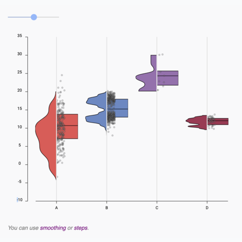
Violin to Boxplot transition
Using shape morphism to smoothly transition from a boxplot to a violin and reverse
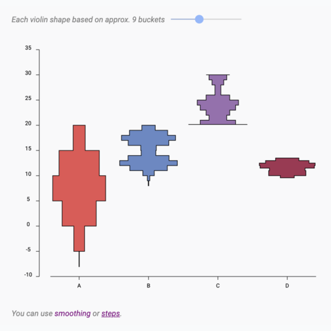
Violin with variable bucket size
A violin plot with a slider to change the bucket size in use
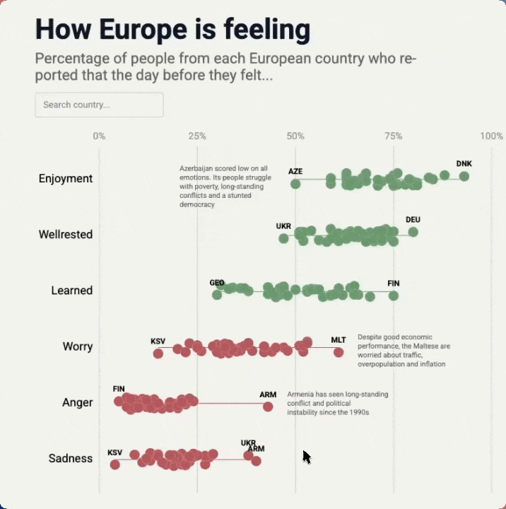
Interactive Beeswarm
Interactive Beeswarm with hover effect, annotation and search bar.
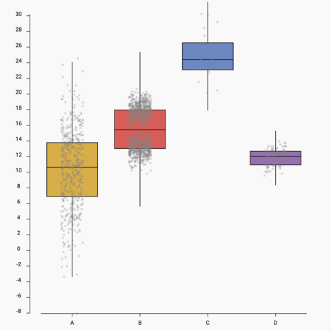
Boxplot with jitter
Add individual data points using jitter on top of the boxplot
Horizontal boxplot
How to build a horizontal boxplot with react
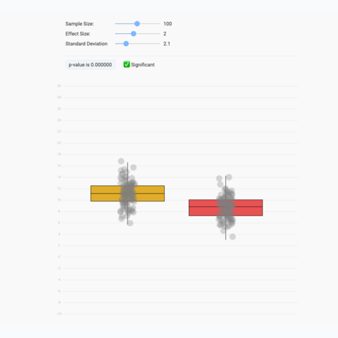
Stop chasing the p-value
A playground to compute a t-test in real time. Stop trusting the p-value only!


Contact
👋 Hey, I'm Yan and I'm currently working on this project!
Feedback is welcome ❤️. You can fill an issue on Github, drop me a message on LinkedIn, or even send me an email pasting yan.holtz.data with gmail.com. You can also subscribe to the newsletter to know when I publish more content!
