Histogram

A histogram is a chart type that shows the distribution of a numeric variable. This page is a step-by-step guide on how to build your own histogram for the web, using React and D3.js.
It starts by describing how the data should be organized and how to initialize the histogram component. It then explains how to compute the buckets composing the histogram. Once this is done, it shows how to render the bars and suggests a few variations. 🙇♂️.
The Data
Building a histogram only requires a set of numeric values.
As a result, the dataset is pretty simple: an array of numbers.
Here is a minimal example of the data structure:
const data = [1, 2, 2, 2, 3, 4, 5, 6, 6, 6, 9]Component skeleton
The goal here is to create a Histogram component that will be stored in a Histogram.tsx file. This component requires 3 props to render: a width, a height, and some data.
The shape of the data is described above. The width and height will be used to render an svg element in the DOM, in which we will insert the histogram.
To put it in a nutshell, that's the skeleton of our Histogram component:
import * as d3 from "d3"; // we will need d3.js

type HistogramProps = {
  width: number;
  height: number;
  data: number[];
};

export const Histogram = ({ width, height, data }: HistogramProps) => {

  // read the data
  // build buckets from the dataset
  // build the scales
  // build the rectangles

  return (
    <div>
      <svg width={width} height={height}>
        // render all the <rect>
      </svg>
    </div>
  );
};
It's fundamental to understand that with this code organization, d3.js will be used to prepare the SVG circle, but it's React that will render them in the return() statement. We won't use d3 methods like append that you can find in usual d3.js examples.
Computing the histogram buckets
→ What is a bin / bucket?
To build a histogram we have to split the data values into a set of buckets. For each bucket, we will count the number of items in it.
This process is called binning. Binning groups discrete samples into a smaller number of consecutive, non-overlapping intervals.
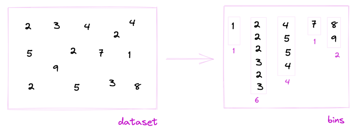
Binning is the process of dividing the range of values in a dataset into intervals, and then counting the number of values that fall into each interval.
→ The bin generator
Fortunately, d3.js has a handy bin() function for this task. (See the doc.)
The bin() function returns a function that is a bin generator. Example:
const bucketGenerator = d3
  .bin()
  .value((d) => d)
  .domain([0, 10])
  .thresholds([0, 2, 4, 6, 8, 10]);
3 arguments are passed to the bin() function:
valueis the accessor function. For each item of the array, we will pass to thebucketGenerator, this is how to get the numeric value of interest.domainis the lower and upper bounds of the histogram.thresholdsis an array with the limits of each bucket. Note that it can be easily computed from a usualscaleLinear.
→ Bucket format
The bucketGenerator can be applied to our dummy dataset:
bucketGenerator(data)The result is an array of arrays. Each item represents a bucket. Each bucket is composed of all the values assigned to this bucket. Its length is the bucket size, i.e. the future bar height.
Each bin has two additional attributes: x0 and x1 being the lower (inclusive) and upper (exclusive) bounds of the bin.
[
  [x0: 0, x1: 2],
  [2, 2, 2, 3, x0: 2, x1: 4],
  [4, 5, x0: 4, x1: 6],
  [6, 6, 6, x0: 6, x1: 8],
  [x0: 8, x1: 10],
  [x0: 10, x1: 10],
]
Let's transform those buckets in bars 🙇♂️!
Scales
The data wrangling part is done, but we're not ready to draw our bars yet 😢.
Building a histogram requires transforming dimensions (the number of items per bucket and the bucket limits) in positions in pixels. This is done using a fundamental dataviz concept called scale.
D3.js comes with a handful set of predefined scales. scaleLinear is what we need for the X and Y axis.
→ X Scale
The X scale is displayed horizontally. It covers the width of the svg container, and its domain goes from the min to the max of the dataset.
const xScale = d3
  .scaleLinear()
  .domain([0, 10])
  .range([0, width]);

// xScale(0) -> 0 (the left hand side position of the first bin)
// xScale(10) -> width (the right hand side position of the last bin)
→ Y Scale
The Y scale is displayed vertically. It shows how many items are available in each bin. To compute it you need to find the bucket with the highest number of items. Something like:
const yScale = useMemo(() => {

  const max = Math.max(...buckets.map((bucket) => bucket?.length));

  return d3.scaleLinear()
    .range([height, 0])
    .domain([0, max]);

  }, [data, height]);
Drawing the bars
Finally! ✨
We can now map through the bucket object and draw a rectangle per bucket thanks to the scales computed above.
The code looks like this:
const allRects = buckets.map((bucket, i) => {
  return (
    <rect
      key={i}
      fill="#69b3a2"
      stroke="black"
      x={xScale(bucket.x0)}
      width={xScale(bucket.x1) - xScale(bucket.x0)}
      y={yScale(bucket.length)}
      height={height - yScale(bucket.length)}
    />
  );
});
Remember that the x and y attributes of the svg rect element provide the x and y position of the top left corner of the rectangle (see doc). This is why the rectangle height is computed by subtracting yScale(bucket.length) from the total height.
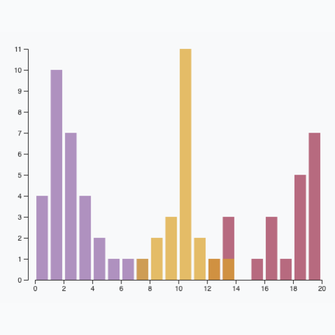
Values of the dataset as distributed into bins. Bins are represented as rectangles. Data wrangling is made with d3.js, rendering with react.
Axes
The last step to get a decent chart is to add 2 axes. Otherwise, the bucket bounds are not available, removing all potential insight into the chart.
There are 2 main strategies to add axes to a react chart made with d3.js. This process is extensively described in the axis section.
In the example below, I chose to use the d3 way to render both axes. Note also that a real dataset is used this time, showing the distribution of AirBnB prices on the french riviera.
Adding a X axis with d3 makes the chart much more insightful.
Responsive Histogram with react
The component above is not responsive. It expects 2 props called width and height and will render a Histogram of those dimensions.
Making the Histogram responsive requires adding a wrapper component that gets the dimension of the parent div, and listening to a potential dimension change. This is possible thanks to a hook called useDimensions that will do the job for us.
useDimensions: a hook to make your viz responsive
export const useDimensions = (targetRef: React.RefObject<HTMLDivElement>) => {

  const getDimensions = () => {
    return {
      width: targetRef.current ? targetRef.current.offsetWidth : 0,
      height: targetRef.current ? targetRef.current.offsetHeight : 0
    };
  };

  const [dimensions, setDimensions] = useState(getDimensions);

  const handleResize = () => {
    setDimensions(getDimensions());
  };

  useEffect(() => {
    window.addEventListener("resize", handleResize);
    return () => window.removeEventListener("resize", handleResize);
  }, []);

  useLayoutEffect(() => {
    handleResize();
  }, []);

  return dimensions;
}Responsiveness is a deep topic.
The responsiveness module covers it in depth: the
useDimensions hook, the wrapper pattern, and the common pitfalls to avoid.Histogram inspiration
If you're looking for inspiration to create your next Histogram, note that dataviz-inspiration.com showcases many examples. Definitely the best place to get ... inspiration!
dataviz-inspiration.com showcases hundreds of stunning dataviz projects. Have a look to get some ideas on how to make your Histogram looks good!
visitVariations
Once you've understood how to build a basic histogram with d3 and react, it opens an infinite world of customization. Here are a few examples showing how to add several groups on the same axis or how to use small multiple with histograms to compare distributions.
Click on the overview below to get details and code.
Population Pyramid
A very customized version of a population pyramid
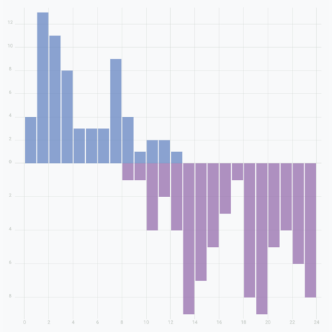
Mirror histogram
Create a mirror histogram to compare the distribution of 2 groups in a dataset
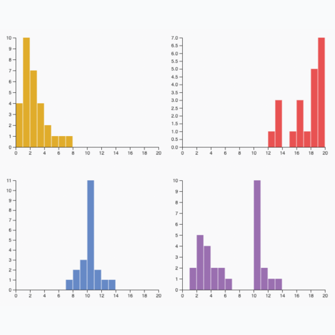
Small multiple
Create one panel per group to show its distribution separately
Multiple groups
A histogram with <b>multiple</b> groups displayed on the same axis.
Dataset transition
The last step needed for a powerful histogram React component is a proper way to transition between various datasets. When the data prop updates, we need a stunning way to transition to the new values.
There are many different strategies to approach this problem. I suggest to rely on the react-spring library that has everything we need to compute spring animations.
Instead of rendering usual rect elements, the library provides a animated.rect element, that is linked to a useSpringhook.
A histogram that smoothly transition from 1 dataset to another
This is how the Rectangle component I use looks like:
Rectangle: a component that animates the transition of a rect
import { useSpring, animated } from "@react-spring/web";

type RectangleProps = {
  width: number;
  height: number;
  x: number;
  y: number;
};

export const Rectangle = (props: RectangleProps) => {
  const { x, y, width, height } = props;

  const springProps = useSpring({
    to: { x, y, width, height },
    config: {
      friction: 30,
    },
    delay: x,
  });

  if (y === undefined) {
    return null;
  }

  return (
    <animated.rect
      x={springProps.x}
      y={springProps.y}
      width={springProps.width}
      height={springProps.height}
      opacity={0.7}
      stroke="#9d174d"
      fill="#9d174d"
      fillOpacity={0.3}
      strokeWidth={1}
      rx={1}
    />
  );
};
Animation in dataviz using React is a big topic. It's impossible to go in depth here! I will publish a dedicated blog post on the topic soon. Please subscribe to the newsletter if you want to be notified.
Mind the bin size
When creating a histogram, remember that bin size plays a crucial role in shaping the story your data tells.
For example, the histogram below displays the finish times of 400,000 marathoners. With smaller bins, patterns around 3h, 3:30h, and 4h emerge. However, using larger bins can obscure these details entirely!
A histogram with a slider that controls the bin size. With big bins, the breaks in the distribution are completely hidden.


Contact
👋 Hey, I'm Yan and I'm currently working on this project!
Feedback is welcome ❤️. You can fill an issue on Github, drop me a message on LinkedIn, or even send me an email pasting yan.holtz.data with gmail.com. You can also subscribe to the newsletter to know when I publish more content!
