Heatmap
A heat map (or heatmap) is a chart type that shows the magnitude of a numeric variable as a color in two dimensions. This page is a step-by-step guide on how to build your own heatmap for the web, using React and D3.js.
It starts by describing how the data should be organized and potentially normalized. It then shows how to initialize the heatmap component, build band scales and add rectangles to get a first heatmap. Last but not least, responsiveness and the tooltip are described in depth and a real dataset is used to get a heatmap application. 🙇♂️.
The Data
The dataset is usually an array where each item provides information for a cell of the heatmap.
Each item is an object that requires at least a value property that is a number. This number will be used to color the cell.
Each item also requires an x and a y property, providing the position of the cell in the 2-d space. Note that those values are strings since anything can be used. We are dealing with ordinal scales here.
Note that you can add any kind of information to those cell objects. Such information can be included in tooltips later on.
Here is a minimal example of the data structure:
const data = [
  { x: 'A', y: 'A', value: 12 },
  { x: 'B', y: 'A', value: 2 },
  { x: 'C', y: 'A', value: 9 }
];
Component skeleton
The goal here is to create a Heatmap component that will be stored in a Heatmap.tsx file. This component requires 3 props to render: a width, a height, and some data.
The shape of the data is described above. The width and height will be used to render an svg element in the DOM, in which we will insert the heatmap.
To put it in a nutshell, that's the skeleton of our Heatmap component:
import * as d3 from "d3"; // we will need d3.js

type HeatmapProps = {
  width: number;
  height: number;
  data: { x: string; y: string, value: value: number | null }[];
};

export const Heatmap = ({ width, height, data }: HeatmapProps) => {

  // read the data
  // do some stuff with d3 like building scales
  // compute all the <rect>

  return (
    <div>
      <svg width={width} height={height}>
        // render all the <rect>
      </svg>
    </div>
  );
};
It's fundamental to understand that with this code organization, d3.js will be used to prepare the svg rect, but it's react that will render them in the return() statement. We won't use d3 methods like append that you can find in usual d3.js examples.
Scales
We need a way to translate a group name (e.g. group A) in a coordinate on the X axis (e.g. x=103px). Same for the Y axis. We also need to transform a numeric value in a color. This is a concept called scaling.
→ Data wrangling
Building those scales requires an exhaustive list of all groups displayed on the X and Y axes. We also need to compute the min and max of the value property to compute the color scale.
As always, don't forget to wrap that kind of work in a useMemo. You want to compute it only when the data changes. This is how the computation looks like:
// List of unique items that will appear on the heatmap Y axis
const allYGroups = useMemo(() => [...new Set(data.map((d) => d.y))], [data]);
→ X and Y Scales
The X and Y scale are band scales, computed with the scaleBand() function of d3.js. It means that a band of pixels is attributed to each group.
For instance, calling the x scale with xScale("A") will return 0, and xScale.bandwidth() will return the width of the band (e.g. 11px).
const xScale = useMemo(() => {
  return d3
    .scaleBand()
    .range([0, boundsWidth])
    .domain(allXGroups)
    .padding(0.01);
}, [data, width]);

// xScale("A") -> 0
// xScale.bandwidth() -> 11
The padding is the space assigned between each band (=between each cell).
You can learn more about scales here.
→ Color scale
The color scale of a heatmap is tricky to compute. We encode a numeric variable that can have any kind of distribution into a color, and that's not an easy step.
Fortunately, d3.js (as always) has some life-saving utils to help. For instance, a sequential color scale can be applied with scaleSequential() together with the inferno color palette. Many other options could make sense, but that deserves its own blog post.
const colorScale = d3
  .scaleSequential()
  .interpolator(d3.interpolateInferno)
  .domain([min, max]);

// colorScale(34) -> #d3a4e9
Add rectangles, get a basic react heatmap
Finally! 🤪
With the scales available, rendering is just a matter of mapping through the dataset and creating a set of svg rect for each cell.
Something like:
const allRects = data.map((d, i) => {
  if (d.value === null) {
    return;
  }
  return (
    <rect
      key={i}
      x={xScale(d.x)}
      y={yScale(d.y)}
      width={xScale.bandwidth()}
      height={yScale.bandwidth()}
      fill={colorScale(d.value)}
    />
  );
});
Note that for the X and Y axis labels, just adding a set of svg text element does a pretty good job, so no need to build complicated axis components as for a scatterplot.
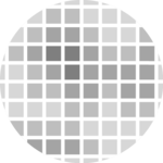
Most basic heatmap made with react and d3.js. d3 is used to compute scales, react for the rendering.
That's it, we have a first good looking heatmap!
The process used to build it with react is pretty close from building it with d3.js only. (Check the pure d3 implementation here).
Responsive Heatmap with react
The component above is not responsive. It expects 2 props called width and height and will render a Heatmap of those dimensions.
Making the Heatmap responsive requires adding a wrapper component that gets the dimension of the parent div, and listening to a potential dimension change. This is possible thanks to a hook called useDimensions that will do the job for us.
useDimensions: a hook to make your viz responsive
export const useDimensions = (targetRef: React.RefObject<HTMLDivElement>) => {

  const getDimensions = () => {
    return {
      width: targetRef.current ? targetRef.current.offsetWidth : 0,
      height: targetRef.current ? targetRef.current.offsetHeight : 0
    };
  };

  const [dimensions, setDimensions] = useState(getDimensions);

  const handleResize = () => {
    setDimensions(getDimensions());
  };

  useEffect(() => {
    window.addEventListener("resize", handleResize);
    return () => window.removeEventListener("resize", handleResize);
  }, []);

  useLayoutEffect(() => {
    handleResize();
  }, []);

  return dimensions;
}
I'm in the process of writing a complete blog post on the topic. Subscribe to the project to know when it's ready.
Tooltip
Adding a tooltip is an important improvement for a heatmap. It allows us to get as much detail as needed for each cell.
There are many different approaches to building tooltips, and I'm preparing a whole dedicated blog post on the topic.
In the example below I suggest using the same strategy as for scatterplots. So you probably want to read it there for an in-depth explanation.
→ Two layers: renderer and tooltip
The first task is to split the Heatmap component into 2 layers. The first layer called Renderer will render the cells as seen previously. The second is an absolute div put on top of the first one, used only to show the tooltip div.
This way, the x and y coordinates of cells in the first layer match with the coordinate of the second layer.
<div style={{ position: "relative" }}>
  <Renderer ..someProps />
  <Tooltip ..someProps />
</div>
→ A common state
On top of the 2 layers, we need a state that stores information about the cell being hovered over. You can create it with a useState statement. I usually call it interactionData in this website.
This state is passed to the Tooltip layer. The function to update it (the "setter") is passed to the Renderer layer. When the user hovers over a cell, this setter is triggered to update the state and thus the tooltip.
const [hoveredCell, setHoveredCell] = useState<InteractionData | null>(null);→ Hover, update state, render tooltips
The heatmap cells listen to onMouseEnter events and update the tooltip state (hoveredCell) with accurate coordinates when it happens.
This state is passed to the Tooltip component. It renders a div at the right position thanks to the information. A bit of smart css is used to make it pretty and include a little arrow.
This heatmap has a tooltip. Hover over a cell to get its exact value.
There is much more to say about tooltips but hopefully that should get you started. Subscribe to the gallery, I'll post more on this topic soon.
Heatmap inspiration
If you're looking for inspiration to create your next Heatmap, note that dataviz-inspiration.com showcases many examples. Definitely the best place to get ... inspiration!
dataviz-inspiration.com showcases hundreds of stunning dataviz projects. Have a look to get some ideas on how to make your Heatmap looks good!
visitColor legend
A heatmap uses a color scale to encode a numeric value into a color. As a result, it is very much advised to add a color legend to explicit how this color scale works.
Let's consider a variable that goes from 0 to 100. We want to encode 0 in blue and 100 in purple. The color scale is built thanks to the scaleLinear() function of d3 as described above.
A color legend built with react, canvas and d3.
The trick here is to create a canvas element of the desired width and height. Then, loop from left to right and add one rectangle for each pixel with the corresponding color using the same color scale as the one used on the chart. It's important to do it in canvas: you don't want to add 300 elements in your DOM if your legend is 300px wide.
Once the canvas element is instantiated with a ref, you can draw the color scale thanks to a useEffect like this:
useEffect(() => {
  const canvas = canvasRef.current;
  const context = canvas?.getContext("2d");

  if (!context) {
    return;
  }

  // Loop on every pixels
  for (let i = 0; i < width; ++i) {
    context.fillStyle = colorScale((max * i) / width); // max is the last value of the domain of the color scale
    context.fillRect(i, 0, 1, height);
  }
}, [width, height, colorScale]);
Then you probably want to add some ticks on top of the color graduation to make it insightful.
Fortunately, the d3 linearScale comes with a handy tick() function. Basically, calling xScale.ticks(4) will create an array with approximately 4 items, each providing everything you need to draw a smartly located tick.
Color Legend is a big topic. There is much more to say about it and I'll post a complete blog post on the topic soon. Subscribe to the gallery if interested!
Application to a real dataset
This is an application of the heatmap component described above to a real life dataset.
It's actually a recreation of this chart by Tynan DeBold and Dov Friedman. Data was available here. Chart was originally made with highcharts, original code being here.
It was necessary to tweak the color scale, switching to a square transformation with scaleSequentialSqrt. This allows to give less importance the extreme values that would absorb the variation otherwise.
Number of Measles infected people over 70-some years and across all 50 states. Can you guess when a vaccine was introduced?
Canvas heatmap
Let's use canvas to improve perf
Heatmap made using canvas instead of SVG.


Contact
👋 Hey, I'm Yan and I'm currently working on this project!
Feedback is welcome ❤️. You can fill an issue on Github, drop me a message on LinkedIn, or even send me an email pasting yan.holtz.data with gmail.com. You can also subscribe to the newsletter to know when I publish more content!
