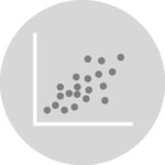
Scatterplot with Canvas
This tutorial is a variation around the general introduction to scatterplot with react and d3.js. You should probably understand the concepts described there before reading here.
Rendering a scatterplot using SVG can arm the performance of your webpage if the number of data points is high. A common workaround is to draw the circles in canvas instead.
This post explains how to combine SVG for the axes and canvas for the scatterplot markers in React.
Why using canvas? 🤔
A scatterplot is a chart type that is commonly used to display a high amount of data points.
When you draw it in SVG, it means adding a bunch of circle elements. As a result, your DOM will quickly become really heavy. It can result in poor performances. If you want to add some animation on top of it, you are pretty sure to freeze the page.
When using canvas, you add only 1 node in your DOM, and benefit the very high speed of it. It is game changer for any viz type that requires good performances.
Scatterplot canvas implementation
The trick here is to use 2 layers of drawing:
- The first layer is for the axes. It is an SVG element that will add the X and Y axes using some usual
AxisLeftandAxisBottomcomponents. - The second layer is for the markers, it is the
canvaselement. It has aref. We can then call a function in auseEffecthook to draw inside this canvas element.
This is how the useEffect hook looks like, drawing our circles:
useEffect(() => {
  const canvas = canvasRef.current;

  if (!canvas) {
    return;
  }
  const ctx = canvas.getContext('2d');

  // Clear the canvas
  ctx.clearRect(0, 0, width, height);

  // Draw each data point as a circle
  data.forEach((point) => {
    ctx.beginPath();
    ctx.arc(xScale(point.x), yScale(point.y), CIRCLE_RADIUS, 0, 2 * Math.PI);
    ctx.globalAlpha = 0.5;
    ctx.fillStyle = '#cb1dd1';
    ctx.fill();
  });
}, [data, xScale, yScale, width, height]);
Here is a complete implementation of the scatterplot using this technique with 10000 data points:
A scatterplot made with React, using SVG for the axes and Canvas for the markers to improve performance.
Canvas is an important topic in data visualization for the web. I plan to write complete articles on the topic. You can know when it's ready by subscribing to the project.


Contact
👋 Hey, I'm Yan and I'm currently working on this project!
Feedback is welcome ❤️. You can fill an issue on Github, drop me a message on LinkedIn, or even send me an email pasting yan.holtz.data with gmail.com. You can also subscribe to the newsletter to know when I publish more content!
