Stacked Barplot Alternative

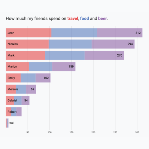
The stacked barplot is a widely used graph, but it has its flaws: reading the evolution of each subgroup is nearly impossible.
Recently, some members of the Tableau community proposed a variation: a grouped barplot with the total of each group represented as a grey rectangle.
I love the idea, so here’s how to create it with React and D3.js! ❤️
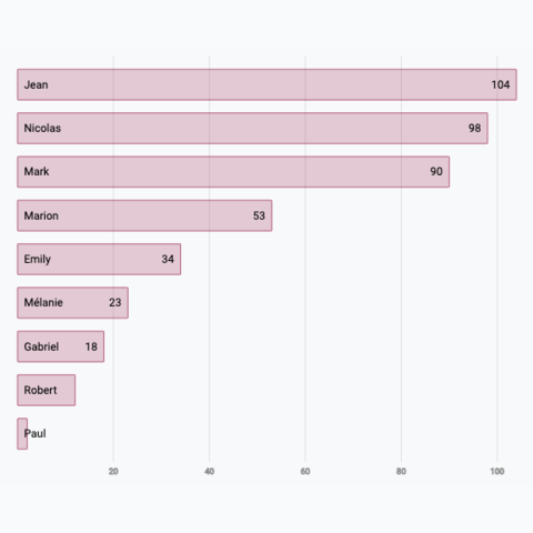
❌ Stacked Barplot: why not:
Stacked barplots lack a consistent baseline for comparing subgroups, except for the first one in each bar.
As each segment is stacked on top of the previous one, it becomes harder to visually compare the size of subgroups across different bars. Without a shared baseline, differences in segment sizes can be misleading, especially when subgroups vary in magnitude.
If you're interested in this topic, check this post about stacking!
Plot and code
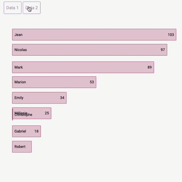
If you’re familiar with creating a basic barplot, making this variation should be straightforward. It’s essentially a set of barplots drawn within the bars of an initial barplot! 😋
There’s a touch of interactivity here: hovering over a segment name highlights it on the chart. This is achieved with the simplest approach: an internal state that controls the opacity of each segment. Check the hover effect module to learn more about this technique and other alternatives!
A variation to the usual stacked barplot built with d3.js and React.
Variation
Check those other barplot and stacked barplot that can interest you:


Contact
👋 Hey, I'm Yan and I'm currently working on this project!
Feedback is welcome ❤️. You can fill an issue on Github, drop me a message on LinkedIn, or even send me an email pasting yan.holtz.data with gmail.com. You can also subscribe to the newsletter to know when I publish more content!
