Circular Barplot

A circular barplot is a variation of a barplot where bars are displayed around a circle using polar coordinates. It is a less accurate representation of the data, but provides a strong eye-catching effect.
This page describes how to deal with radial coordinates with d3.js and react to build a circular barplot. It's a step by step tutorial with several interactive sandboxes.
The Data
The dataset required to build a circular barplot is usually an array where each item is an object providing the name and the value of the group.
Here is a minimal example
const data = [
  {name:"Mark", value: 90},
  {name:"Robert", value: 12},
  {name:"Emily", value: 34},
  {name:"Marion", value: 53},
  {name:"Nicolas", value: 98},
]
Note: if your data is in .csv format, you can translate it thanks to the d3.csv() function as suggested here.
Component skeleton
The goal here is to create a CircularBarplot component that will be stored in a CircularBarplot.tsx file. This component requires 3 props to render: a width, a height, and some data.
The shape of the data is described above. The width and height will be used to rendering a svg element in the DOM, in which we will insert the circular barplot.
To put it in a nutshell, that's the skeleton of our CircularBarplot component:
import * as d3 from "d3"; // we will need d3.js

type CircularBarplotProps = {
  width: number;
  height: number;
  data: { name: string; y: number }[];
};

export const CircularBarplot = ({ width, height, data }: CircularBarplotProps) => {

  // read the data
  // compute scales (including a radial scale)
  // compute all the shapes

  return (
    <div>
      <svg width={width} height={height}>
        // render all the shapes
      </svg>
    </div>
  );
};
It's fundamental to understand that with this code organization, d3.js will be used to prepare the svg circle, but it's react that will render them in the return() statement. We won't use d3 methods like append that you can find in usual d3.js examples.
Drawing circular bars
Even if the process to build a circular barplot is very different than for the common barplot, I strongly advise to have a good understanding of the common version first. Check it out.
Here is an overview of the main differences.
→ Radial coordinates
Do you remember your high school lectures about trigonometry? Me either 🙃. But we need it here. Using radial coordinates, each point in the 2d coordinate space is defined using an angle and its distance to the center of the chart.
- Angle is defined between
0(top) and2*Pi(top again). A value ofPiwill be at the bottom. - Distance to the center goes from
innerRadiustoouterRadius. The inner radius is arbitraty. Do not use something too small or your bars will be very distorded. The upper value is computed from the svg dimension to fill it properly.
Since I cannot seem to remember this, I thought you might have the same struggle and would enjoy this little schema:
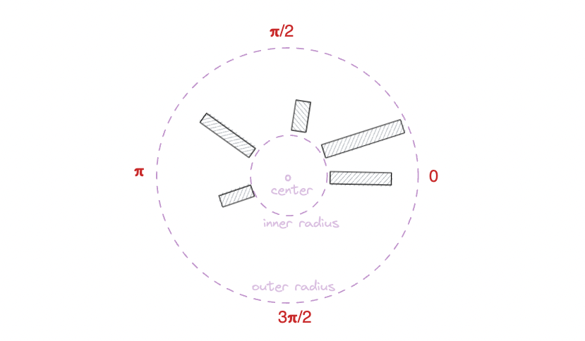
When dealing with radial coordinates, a position is defined by its angle and its distance from the center.
→ X Scale
The X scale (for the groups) is a scaleBand like for a common barplot, but it goes from 0 to 2*Pi instead of going from 0 to width.
const xScale = d3
      .scaleBand()
      .domain(groups)
      .range([0, 2 * Math.PI])
      .padding(BAR_PADDING)
→ Y Scale
The Y scale uses a very specific scaleRadial. Indeed, bars are wider at their top than at their bottom. This scaleRadial takes it into account and bring some sort of correction. Check the doc, or even this explanation for more.
At the end of the day, that's how our scales look like:
const yScale = d3
      .scaleRadial()
      .domain([0, max])
      .range([innerRadius, outerRadius])
→ Drawing with path, not rect.
We are not drawing rectangles here, so the svg rect element won't be helpful.
Instead, we are drawing fractions of a rings, called arcs.
Fortunately, d3.js has an arc() function that will generate the svg path for us. It's the same process that is used to create a pie chart or a donut chart.
Here is an idea on how the function can be used to generate all the svg shapes:
const arcPathGenerator = d3.arc();

const allShapes = data.map((group, i) => {
  const path = arcPathGenerator({
    innerRadius: innerRadius,
    outerRadius: yScale(group.value),
    startAngle: xScale(group.name),
    endAngle: xScale(group.name) + xScale.bandwidth(),
  });
})
→ Rendering
Not much to add. Just include the paths in a svg element. Remember that 0,0 is the center of the chart instead of being the top-left corner. So we need to apply a translate at some point.
Most basic circular barplot built with d3.js and react, using radial coordinates and path instead of rect.
That's a good start but it looks pretty much like a snail so far. Let's make it a real chart with labels and values.
Labels
It is necessary to add a text element to show the name of each bar.
We need those labels to be readable (like not written upside down). So a bit of logic is necessary to determine wether or not a label must be flipped, and how to position it properly.
To do so it is necessary to switch from radians (use for the xScale) to degrees (used for the transform property).
Please check the code below for full explanation.
Add some labels to each bar of the circular barchart to make it insightful
Circular Barplot inspiration
If you're looking for inspiration to create your next Circular Barplot, note that dataviz-inspiration.com showcases many examples. Definitely the best place to get ... inspiration!
dataviz-inspiration.com showcases hundreds of stunning dataviz projects. Have a look to get some ideas on how to make your Circular Barplot looks good!
visitStacking
Stacking is a process where a chart is broken up across more than one categoric variables which make up the whole.
d3 comes with some handy functions for stacking. The process is extensively described in this stacked barplot tutorial. There is nothing really different to make it circular and here is a working sandbox to discover the code.
Add some labels to each bar of the circular barchart to make it insightful


Contact
👋 Hey, I'm Yan and I'm currently working on this project!
Feedback is welcome ❤️. You can fill an issue on Github, drop me a message on LinkedIn, or even send me an email pasting yan.holtz.data with gmail.com. You can also subscribe to the newsletter to know when I publish more content!
