Pie chart

A pie chart is a type of graph used to visually represent data as a circular, segmented chart. The chart is divided into slices, where the size of each slice represents the proportion of data that falls within a particular category or group.
This post explains how to build a pie chart with react, using the pie() function of d3.js. It describes the expected data format, how the Pie component must be structured, how to compute the slice positions and how to render those slices. Last but not least, it provides the implementation for common use-cases like hover effect and data transition.
The Data
The dataset required to build a pie chart is pretty simple. It is an array where each item represents a group of the pie chart. Each item is an object with 2 properties. They provide the group name (name) and its value (value).
For instance, here is the dataset used for the simple pie chart below:
const data = [
  {name:"Mark", value: 90},
  {name:"Robert", value: 12},
  {name:"Emily", value: 34},
  {name:"Marion", value: 53},
  {name:"Nicolas", value: 98},
]
Component skeleton
The goal here is to create a PieChart component that will be stored in a PieChart.tsx file. This component requires 3 props to render: a width, a height, and some data.
The shape of the data is described above. The width and height will be used to render an svg element in the DOM, in which we will insert the pie chart.
To put it in a nutshell, that's the skeleton of our PieChart component:
import * as d3 from "d3"; // we will need d3.js

type PieChartProps = {
  width: number;
  height: number;
  data: {name: string, value: number}[];
};

export const PieChart = ({ width, height, data }: PieChartProps) => {

  // read the data
  // generate position of each slice with d3.pie()
  // build the arcs

  return (
    <div>
      <svg width={width} height={height}>
        // render all the arcs
      </svg>
    </div>
  );
};
It's fundamental to understand that with this code organization, d3.js will be used to prepare the SVG arcs, but it's React that will render them in the return() statement. We won't use d3 methods like append that you can find in usual d3.js examples.
From data to arcs
→ A pie chart is a set of arcs
A pie chart is actually a set of arcs. An arc is a slice of a ring. It is defined using 4 numbers:
- Start and end angle. An angle of 0 is at the very top. An angle of
Pi / 2is at the most right.Piis bottom. And so on. - Inner and outer radius. For a pie chart, the inner radius will be set to 0. This is what makes it different from a donut chart.
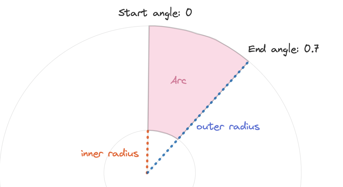
A pie chart is built from a set of arcs. An arc is a slice defined by its inner radius, outer radius, start angle and end angle.
→ use d3.pie() to get arc coordinates
The pie() function of d3 is here to transform the dataset in a set of arcs with their coordinates. It returns a function (called pieGenerator here) that is an arc generator.
You can pass the dataset described at the beginning of this tutorial to this generator, it will return an array where each item provides the coordinates of an arc:
// Compute a pie generator = a function that transforms a dataset in a list of arcs
const pieGenerator = d3.pie().value((d) => d.value);

// Use this pie generator on our initial dataset
const pie = pieGenerator(data);

/* Result looks like this:
[
  {
      "data": {"name": "Mark", "value": 90},
      "index": 1,
      "value": 90,
      "startAngle": 2.145477909768639,
      "endAngle": 4.115814765678614,
      "padAngle": 0
  }, .... same for other groups
]
*/
→ d3.arc() to compute the svg path
From those start and end angles we now need to build a proper string that we can pass as the d attribute of a path. This is pretty easy thanks to the arc() function of d3. This function must be applied to every item of the pie object created above.
// Compute an arc generator = a function that transforms arc coordinates in a svg path
const arcPathGenerator = d3.arc();

// For each arc, use the path generator
const arcs = pie.map((p) =>
      arcPathGenerator({
        innerRadius: 0,
        outerRadius: radius,
        startAngle: p.startAngle,
        endAngle: p.endAngle,
      })
    );

/* Result looks like:
[
  "M151,97 A180,180,0,0,1,-148,101 L0,0Z",
  .... other groups
]
*/
Basic pie chart
We now have a set of svg path that we need to draw! We just need to loop through all of them and render a path element in our svg area. Something like:
<g transform={..}>
    {arcs.map((arc, i) => {
      return <path key={i} d={arc} />;
    })}
</g>
The only unusual thing here is that we need to translate our svg element to put the 0,0 coordinate at the center of the figure (it is usually top left)
And that's it, we finally have the most basic pie chart built with react for rendering, and d3 for layout computation.
Most basic pie chart built with react (rendering) and d3.js (layout)
Warning
Now is a good time to remind you that pie charts have flaws. To put it in a nutshell, humans are pretty bad at reading angles, what makes pie charts pretty weak to compare values.
In the figure below, what trend can you spot in the dataset?
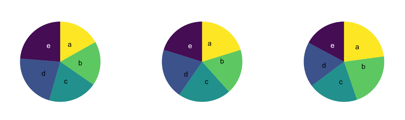
Three datasets visualized with pie charts. Can you spot the trend?
Hard to find out isn't it? Check this pie chart dedicated post to see it visualized as a barplot. You'll see why pie charts are weak (and will learn good alternatives).
If you're convinced you need a pie chart (there are some reason for this sometimes!), keep reading!
Legend
There is one very common caveat with pie charts: adding a legend on the side to link each color with a label. It's much better to label each slice directly next to it to ease the reading.
In the example below a little dot is located on each slice centroid. From there a first segment goes out of the slice, followed by a second horizontal segment that goes to the label.
The difficulty here is to get the position of the slice centroid and of the line inflexion point.
Fortunately the centroid() function of d3 is all we need for that. It gives the x and y coordinates of the centroid of an arc, arc that we used to build the donut slice anyway.
const sliceInfo = {
  innerRadius,
  outerRadius: radius,
  startAngle: start,
  endAngle: end,
};
const centroid = arcGenerator.centroid(sliceInfo); // [x,y] position of the centroid
const slicePath = arcGenerator(sliceInfo); // string: the path of the slice
The exact same technique is used to get the position of the inflexion point. An additional arc is computed, located out of the donut area, and with a thickness of 0. Its centroid is the inflexion point.
A pie chart with clean inline legend. Centroid are used for both the starting and inflexion points.
Hover effect
Adding a hover effect to your pie chart is a nice polish detail. Here I suggest to highlight the slice that is hovered over by dimming all the other slices.
There are several strategies available to implement such an effect. One can rely on css pseudo classes only, or add a css class using javascript and the onMouseEnter event. It's also possible to rely on an animation library like react-spring.
I'm preparing a full section on the topic. You can subscribe to my dataviz-universe newsletter to know when it will be ready. Meanwhile, there is a code sandbox waiting for you below to reveal the code of this example.
A pie chart with hover effect. Hover over a slice to highlight it and fade other groups.
Responsive Pie Chart with react
The component above is not responsive. It expects 2 props called width and height and will render a Pie Chart of those dimensions.
Making the Pie Chart responsive requires adding a wrapper component that gets the dimension of the parent div, and listening to a potential dimension change. This is possible thanks to a hook called useDimensions that will do the job for us.
useDimensions: a hook to make your viz responsive
export const useDimensions = (targetRef: React.RefObject<HTMLDivElement>) => {

  const getDimensions = () => {
    return {
      width: targetRef.current ? targetRef.current.offsetWidth : 0,
      height: targetRef.current ? targetRef.current.offsetHeight : 0
    };
  };

  const [dimensions, setDimensions] = useState(getDimensions);

  const handleResize = () => {
    setDimensions(getDimensions());
  };

  useEffect(() => {
    window.addEventListener("resize", handleResize);
    return () => window.removeEventListener("resize", handleResize);
  }, []);

  useLayoutEffect(() => {
    handleResize();
  }, []);

  return dimensions;
}Responsiveness is a deep topic.
The responsiveness module covers it in depth: the
useDimensions hook, the wrapper pattern, and the common pitfalls to avoid.Pie Chart inspiration
If you're looking for inspiration to create your next Pie Chart, note that dataviz-inspiration.com showcases many examples. Definitely the best place to get ... inspiration!
dataviz-inspiration.com showcases hundreds of stunning dataviz projects. Have a look to get some ideas on how to make your Pie Chart looks good!
visitData transition
The Pie component expects a data prop. What should we do when this data changes?
By default, the chart will update instantly, with no transition. Adding a smooth transition gives a nice polish touch to the graph. Try to switch between the 2 datasets below to see the animation in action.
The code below relies on the react-spring library. Instead of rendering a path for each slice, it uses a animated.path component that handles the spring animation for us.
The implementation is not trivial. I plan to publish a full tutorial on react-spring for data visualization soon. You can subscribe here to be notified when it is ready.
A donut chart with clean inline legends, built thanks to the centroid function of d3.js.
Note: check the blue group that appears / disappears between dataset. This kind of enter/exit pattern is something to keep in mind when building animations.
Pie chart to barplot
Pie charts are often criticized since angles are hard to read. Let's represent the same data using a pie chart or a barplot, to see what's the most insightful 🤷♂️.
Note that here we animate the transition between different shape types: each arc becomes a rectangle and reciprocally. This is made possible thanks to the flubber library, used in coordination with react-spring.
Once more, a full tutorial is needed here. You can subscribe here to be notified when it is ready. In the meanwhile, the code of this specific example is provided below.
Transition from a pie chart to a barplot with a smooth animation using the buttons on top.
Part Of A Whole


Contact
👋 Hey, I'm Yan and I'm currently working on this project!
Feedback is welcome ❤️. You can fill an issue on Github, drop me a message on LinkedIn, or even send me an email pasting yan.holtz.data with gmail.com. You can also subscribe to the newsletter to know when I publish more content!
