Dealing with negative values on a stacked barplot
Drawing a stacked barplot sounds like pretty basic task for somebody into dataviz. But it gets surprisingly tricky once the dataset includes negative values.
This post explains how to deal with it, suggesting several options coming together with some reproducible code examples.
🍔 Regular stacked barplot with positive values
Let's consider a company that has 3 employees: a, b and c. Each month those employees sell umbrellas and make money.
In January, they made 1, 1 and 2 dollars respectively. It's pretty easy to represent those sales as a stacked barplot!
There is even a bonus! The total height of those bars is 4. So is the value of the stack on the Y axis. We now know what's the total revenue of the company 🎉!
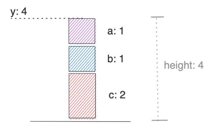
Stacking positive values is straightforward
Now let's follow the same process for the 12 months of the year. That makes a stacked area barplot built with react and d3.js. If you need explanations for the code, please refer to the d3.js gallery or to the barplot section of the react gallery.
A stacked area chart with positive values only. Built with react and d3.js
That's the end of the easy part. Now, let's say that sometimes employees spend more money than what they make.
We now have some negative values in the dataset 😳. How can we deal with it?
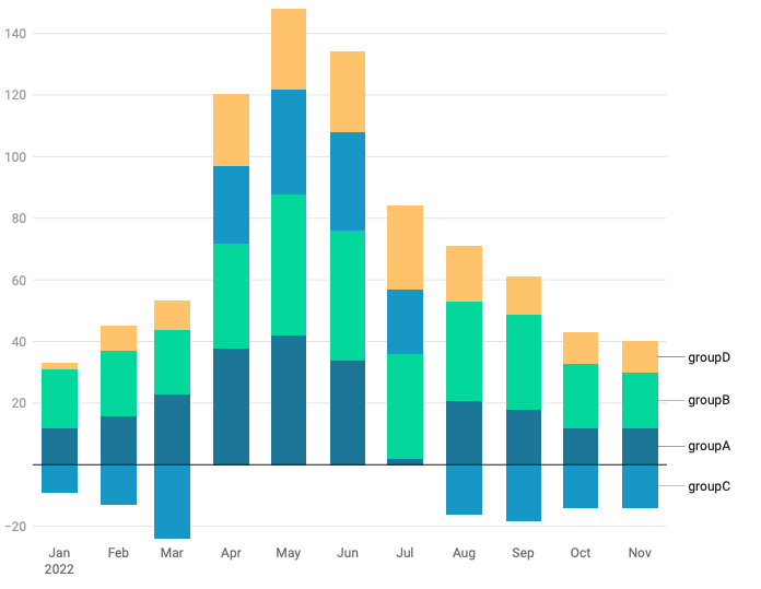
1️⃣ Stacked barplot with negative values: the diverging strategy
We are in January but this time, employee A lost 1$! 😥
To represent this on the stack, we can add all the positive values on top of the chart, and all the negative ones below the 0 axis.
It is still very easy to see how much each employee made in a glimpse!
However, it is now impossible to know what's the company revenue! Indeed, the total height of the bars is 4, the value on the y axis is 3, but the real revenue is 1 + 2 - 1 = 2!
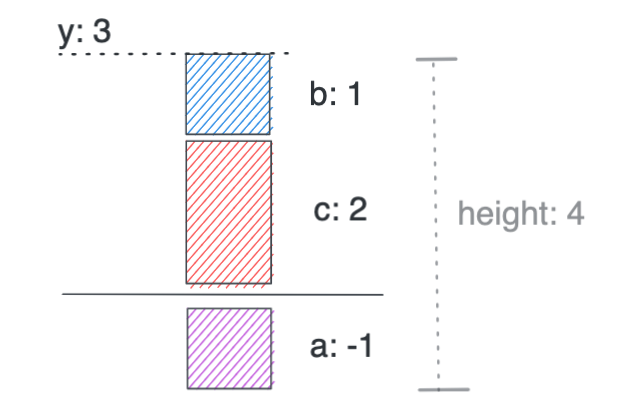
Stacking with negative values with all negative values below the 0 axis
Using almost the same code we can build the stacked barplot including those negative values. Note that when stacking the data with the stack() function of d3, the specific stackOffsetDiverging offset parameter must be passed, handling all the work for us (doc).
With the diverging strategy, all negative values are located under the 0 baseline.
Let's recap the pros and cons of this diverging option:
Pros
- Easy to read the value of each item
- Obvious what's negative and what's positive
Cons
- Impossible to know the total value of each stack
- A series can jump from the bottom to the top of the chart and is thus hard to follow
2️⃣ Stacked barplot with negative values: the overlapping strategy
Another strategy can be applied to stack the items including negative values.
Items can be added one by one, with rectangles going up when values are positive and going down when values are negative.
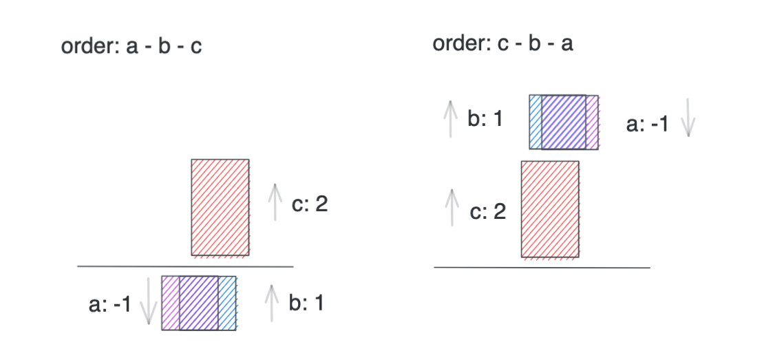
Stacking items by overlapping the items on top of each other.
It's important to understand that here, the item order is important. We will get very different results depending on the order since not all groups are visible.
With the overlapping strategy items are drawn successively, going up and down and overlapping if necessary
Let's recap the pros and cons of this diverging option:
Pros
- Depending on the group order, the Y value can reflect the sum of the items. But it's not guarantee.
Cons
- Groups overlap each other. Information is hidden. Chart is unreadable
Conclusion
In my opinion the first option (diverging) makes much more sense than the second one (overlapping). The cons are very limited:
- It is true that the net total value is not available. But if that's what interests you, you don't have to split the dataset by subgroups, just create a line chart with a single line!
- Having a group flipping from top to bottom is indeed annoying. However, the hover effect that is included allows to quickly see what happens for a specific group.
It's also important to note that most dataviz tools choosed this approach. Here is an example using the same dataset using the ggplot2library (left) and data wrapper (right).
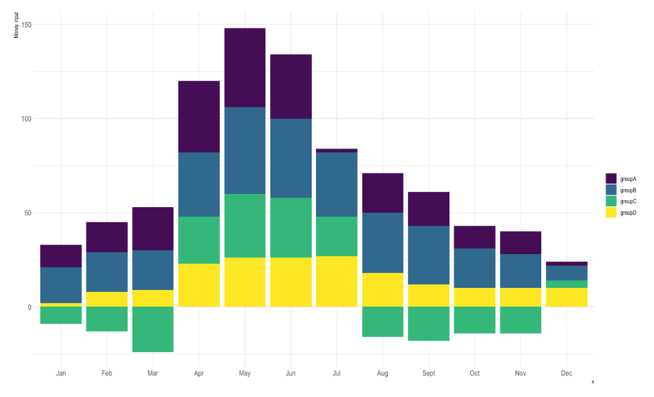
Same dataset that includes negative values plotted with ggplot2 (left) and data wrapper (right)
Last but not least, I really like this example by chartio that fixes the non available total issue by adding a line on top of the stacked barchart to show the total:
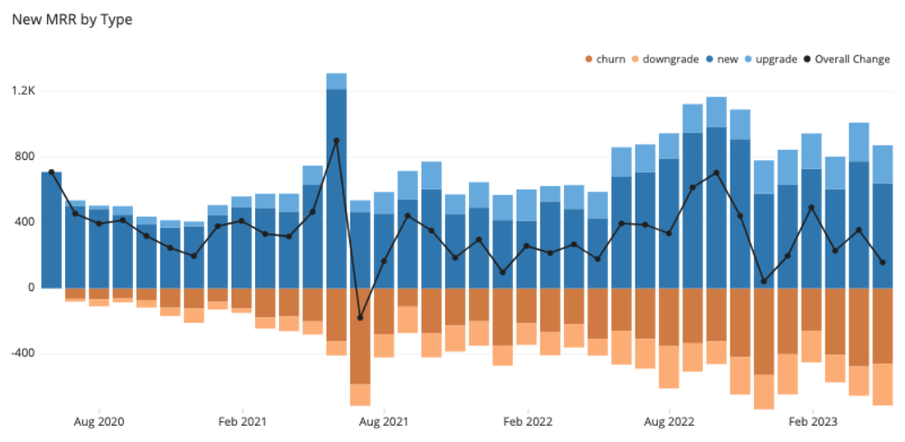
Chartio displays the total of each timestamp using a line chart on top of the stacked items.


Contact
👋 Hey, I'm Yan and I'm currently working on this project!
Feedback is welcome ❤️. You can fill an issue on Github, drop me a message on LinkedIn, or even send me an email pasting yan.holtz.data with gmail.com. You can also subscribe to the newsletter to know when I publish more content!
