Static to Interactive:
Dataviz Speedrun in the AI Era

I recently stumbled on a beeswarm chart by Yanika Borg and loved it. But it was frustrating: I wanted to know the country behind each dot!
So I wondered: how long would it take to make it hoverable and searchable using React, D3, and AI?
Turns out, 83 minutes. This post documents every step and why the AI era for dataviz is both scary and exciting.
📍 Original Chart
The original chart was found on LinkedIn, published by Yanika Borg. Thank you so much to her for sharing the data with me! 🙏
It's a beeswarm chart based on data from Gallup's Global Emotions Report. Basically, they call people around the world and asks them about their emotional state the day before. They ask questions like Did you feel enjoyment? or Did you feel worried?
The percentage of people answering "yes" in each country becomes a powerful indicator of national wellbeing, presented on the original chart below.
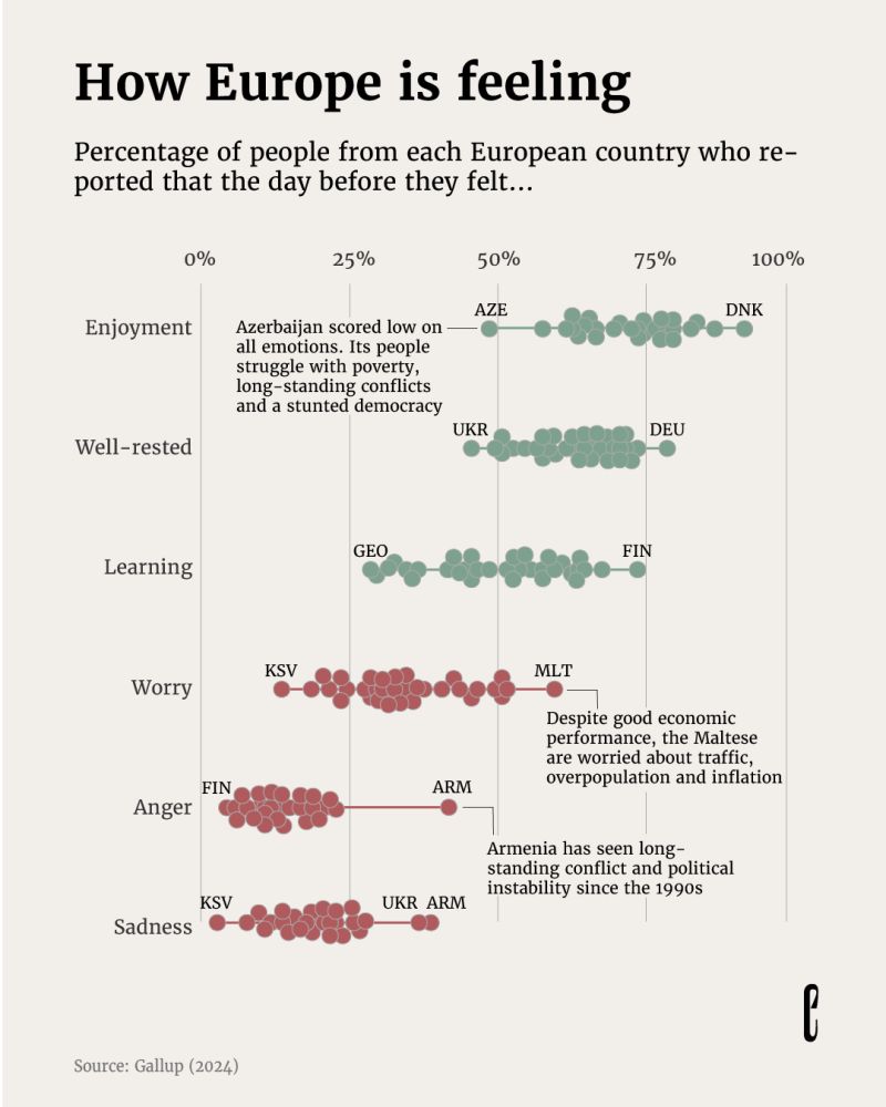
Original visualization by Yanika Borg for The European Correspondent. Data: Gallup (2024)
🤝 Problem & Solution
Charts with many markers share the same problem: you can't annotate them all. As a result, reader will inevitably get frustrated! What's that outlier? How's my country doing?
Interactivity solves this.
My version below mirrors Yanika's beautiful work, but hovering a circle reveals its country and highlights it across all sentiments. Moreover, a search bar lets you find specific countries. Give it a try!
ported that the day before they felt...
⚠️ Hover over the chart, it's interactive! Want to learn how to create stuff like this? I explain everything here.
⏱️ Speedrun
Building bespoke interactive graphs is the dream of anyone into dataviz, but it has always been hard. There's quite a lot of knowledge required.
Today, AI is completely changing this paradigm, making things much more accessible. I wanted to prove this point by timing myself during this reproduction.
Here's how long each step took:
| Time | Step | Human work |
|---|---|---|
| 0:00 | Start | — |
| 0:10 | Data is clean | Architect dataset structure |
| 0:12 | Pass data to component, create Y scale | Provide starting example |
| 0:18 | Create X scale + show dots | Reject AI's first attempt |
| 0:20 | Fix plotting syntax: flatMap was messy | Correct AI's strategy |
| 0:24 | Add jitter | — |
| 0:28 | Add grid | Tweak styling manually |
| 0:39 | Custom title styling | Manual positioning |
| 0:49 | First hover effect | Guide strategy, fix mouseEvent bug |
| 0:54 | Hover effect working well | — |
| 1:01 | Hover effect polished | Fine-tune appearance |
| 1:08 | Search feature works | — |
| 1:23 | Labels finalized. Done! | Position labels manually |
Note: I also answered a few messages concerning my course launch and made a few screenshots along the way.

Conclusion
That's fast!
I used Claude throughout, and I'm genuinely surprised by the result. This timing still feels unreal to me—this reproduction would have taken me about 5 hours just a few months ago.
What takes time
Some things are hard to speed up: data wrangling is always tedious and requires your brain to architect the dataset structure. Positioning annotations remains a manual task that requires trial and error.
Can AI do 100%?
No, at least not yet. I gave it an example from the React Graph Gallery as a starting point to ensure it follows good architecture. I gave it precise tasks, step by step, which really helps. And I had to correct its strategy 3 times.
The AI era is exciting
With minimal foundational knowledge about web development, React and D3.js finally become accessible. The learning curve is dramatically smoother than it was just months ago.
I suspect we'll see more and more bespoke interactive charts in the future, eliminating so much of the frustration we feel with static charts!
You too can do it!
I'm teaching everything, step by step, so that you can create stuff like this on your own!
Code
Below is my interactive reproduction of this chart. Hover over each dot to see which country it represents and its exact values.


Contact
👋 Hey, I'm Yan and I'm currently working on this project!
Feedback is welcome ❤️. You can fill an issue on Github, drop me a message on LinkedIn, or even send me an email pasting yan.holtz.data with gmail.com. You can also subscribe to the newsletter to know when I publish more content!
