Fixing the blurry canvas on retina screens
Drawing a chart on a canvas element instead of using svg elements can be a huge performance boost. However, it leads to a blurry and unreadable viz on retina screens if the resolution is not taken into account. Here is how to fix.
⬜ Pixel, Resolution and DPI
To understand why a canvas can get blurry on a retina screen, you first need to have some basic knowledge about how an image is displayed on a screen.
Screens are made up of thousands of tiny dots all bunched together called pixels. Each pixel has the ability to change its color. The total number of pixels on a screen differs from one monitor to another, we call it the screen resolution. If the screen has 1,024 pixels horizontally, and 768 vertically it has a 'resolution' of 1,024 x 768.
When you watch dataviz-inspiration.com on your screen, you actually watch thousands of pixels.
It's important to understand that 2 screens with the same physical size (let's say 30 inches) can have very different amount of pixels. The density of pixels on a screen is called DPI for dots per inch or ppi for pixels per inch.
Retina screens have a very high DPI, and it is where our troubbles begin
Physical vs CSS resolution
Let's say that you create a html element and give it a width of 100px using css. This is the css width. If you use a screen that has a very high resolution, pixels are very very small. As a result, your element of 100px would appear very small too on the screen.
To avoid this, each monitor applies a pixel ratio. On a retina screen this ratio equals 2. When you ask the monitor to draw an element of 100px, it will actually draw it with a length of 200px. This is the physical width.
In javascript, you can access this ratio with window.devicePixelRatio and here is the complete doc about it.
🐛 Canvas, High-DPI and the bug
Let's add a canvas element in our DOM, with a width of 100px. It is the equivalent of building an image, 100px wide, that we insert in the DOM.
If we display the result on a retina screen with a devicePixelRatio of 2, the image will be scaled up to 200px wide. The browser will interpolate pixels to make the image bigger, and it results in a blurry output.
To avoid this issue, we the canvas we're creating must be twice bigger on retina screen
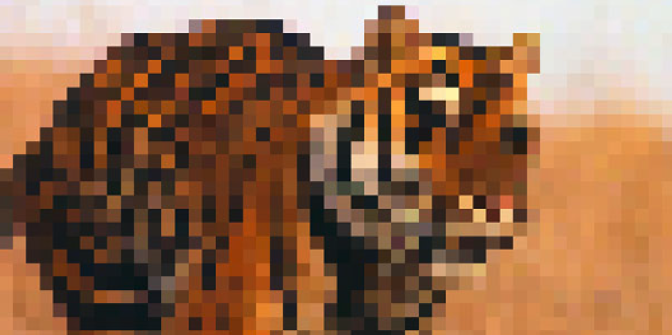
A small img or canvas on a retina screen will be scaled up, resulting in a pixelated / blurry output.
🤦♂️ The 2 dimensions of the canvas element
There are 2 different ways to control the dimension of a canvas element.
- width and height attributes: They control the size of the image that is created and inserted in the DOM.
Default to 300px and 150px so always specify them. - css style: the canvas element can be styled using CSS. As a result we can also pass a
widthand aheighthere. It controls the size of the element on the screen.
Here is a html code snippet illustrating this concept:
<canvas style="width:200px; height:200px;" width="100px" height="100px">Now, let's play with those 2 values to see what happens. In the examples below, a segment going from 0,0 (top left) to 100,100 is drawn.
→ Small image, big output
If I create a small image with my canvas (100x100) and output it in big (300x300), the browser has to scale it up to display it, resulting in a blurry output
<canvas style="width:300px; height:300px;" width="100px" height="100px">This is exactly what happens when you display a canvas on a retina screen 🙀.
→ Big image, small output
Now I create a big image with my canvas (200x200) and output it in small (100x100), the browser has to scale it down to display it, → crispy output!
<canvas style="width:100px; height:100px;" width="200px" height="200px">Much better. But my diagonal is now wrong since it goes to 100,100, which is half way to 200,200. Fortunately javascript is here to the rescue. I will just have to use the scale function to automatically correct those coordinates.
🔨 Fixing the Canvas and Retina screens issue
To finally fix the retina bug, we need to:
- Control the size of the canvas output using the css dimension
- Find the device pixel ratio using
window.devicePixelRatio - Create a bigger canvas image if the pixel ratio is over 1. This is done thanks to the
widthandheightattributes. - Use the
scale()function in our canvas context to correct our coordinates
Here are 2 examples. The first one does not apply the correction (left). The second does the correction (right)
On retina screens, the left shape is blurry when the right one is not.
To see the full code of those 2 examples, click the buttons below.
General Knowledge


Contact
👋 Hey, I'm Yan and I'm currently working on this project!
Feedback is welcome ❤️. You can fill an issue on Github, drop me a message on LinkedIn, or even send me an email pasting yan.holtz.data with gmail.com. You can also subscribe to the newsletter to know when I publish more content!
Contact
👋 Hey, I'm Yan and I'm currently working on this project!
Feedback is welcome ❤️. You can fill an issue on Github, drop me a message on LinkedIn, or even send me an email pasting yan.holtz.data with gmail.com. You can also subscribe to the newsletter to know when I publish more content!
