Introduction
In the previous module on scales, we learned how to position SVG shapes precisely, adding meaning to the growing graph we're constructing.
Now, it's time to provide context to these shape positions. For most chart types, this is achieved using axes.
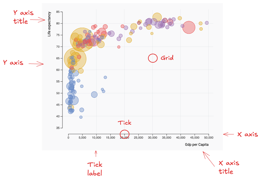
This module explains how to build axes like the one you can see at the bottom and on the left of this chart area.
Key Terminology
To work effectively with axes in data visualization, it's important to understand the key terms highlighted on the figure below.
Oh no! 😱
It seems like you haven't enrolled in the course yet!
This is a lesson from the D3 ❤️ React course, where you learn to create bespoke, interactive graphs with d3.js and React.
Enrollment is currently closed. Join the waitlist to be notified when doors reopen:
Or Login