Axis component variations
In the previous lesson we built a reusable AxisBottom component. The same approach applies to left, top, and right axes.
Let's build those variations, and explore grid lines, titles, and other style tweaks that make charts look polished.
The left axis
Good news: the left axis works exactly like the bottom axis from the previous lesson.
Instead of xScale, we pass a yScale — but it has the same domain(), range(), and ticks() methods, so the pattern is identical: one long line with a tick and label at each position.
Here's a complete example with both AxisBottom and AxisLeft:
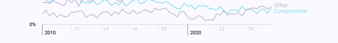
Axes rendered with React — no d3.js DOM manipulation.
Code for the AxisLeft component
// AxisLeft.jsx

// tick length
const TICK_LENGTH = 6;

export const AxisLeft = ({ yScale, pixelsPerTick }) => {
  const range = yScale.range();
  const height = range[0] - range[1];
  const numberOfTicksTarget = Math.floor(height / pixelsPerTick);

  return (
    <>
      {/* Main vertical line */}
      <path
        d={['M', 0, range[0], 'L', 0, range[1]].join(' ')}
        fill="none"
        stroke="currentColor"
      />

      {/* Ticks and labels */}
      {yScale.ticks(numberOfTicksTarget).map((value, i) => (
        <g key={value} transform={`translate(0, ${yScale(value)})`}>
          <line x2={-TICK_LENGTH} stroke="currentColor" />
          <text
            style={{
              fontSize: '10px',
              textAnchor: 'middle',
              transform: 'translateX(-20px)',
            }}
          >
            {value}
          </text>
        </g>
      ))}
    </>
  );
};
Grid lines belong in the axis
Grid lines might feel like a separate feature, but they're actually a natural extension of the axis component. Each grid line starts at a tick position and stretches across the chart area — so the axis already knows exactly where to draw them.
The trick is simple: inside the tick loop, add an extra line element that spans the full chart width (or height). Give it a low opacity so it doesn't compete with the data.
Open the AxisBottom.js and AxisLeft.js tabs below to see how it works — look for the lines marked "Grid line":
import { scaleLinear } from "d3";
import { AxisBottom } from "./AxisBottom";
import { AxisLeft } from "./AxisLeft";

const MARGIN = { top: 20, right: 20, bottom: 50, left: 50 };
const width = 500;
const height = 300;

export default function App() {
  const boundsWidth = width - MARGIN.left - MARGIN.right;
  const boundsHeight = height - MARGIN.top - MARGIN.bottom;

  const xScale = scaleLinear().domain([0, 100]).range([0, boundsWidth]);
  const yScale = scaleLinear().domain([0, 50]).range([boundsHeight, 0]);

  return (
    <svg width={width} height={height}>
      <g transform={`translate(${MARGIN.left}, ${MARGIN.top})`}>
        <g transform={`translate(0, ${boundsHeight})`}>
          <AxisBottom
            xScale={xScale}
            pixelsPerTick={60}
            boundsHeight={boundsHeight}
          />
        </g>
        <AxisLeft
          yScale={yScale}
          pixelsPerTick={40}
          boundsWidth={boundsWidth}
        />
      </g>
    </svg>
  );
}
This way, toggling grid lines on or off is just a matter of adding or removing a single line element inside your axis component. No extra logic needed.
By now you can see the pattern: top and right axes are just mirror images of the bottom and left ones — flip the translation and the tick direction and you're done.
The same goes for styling tweaks: removing the domain line, adjusting tick length, changing font sizes... Since you own the component code, every visual detail is yours to control. Adapt the axis to match your creative vision!
Axis titles
An axis without a label leaves the reader guessing. Adding a title is straightforward: place a text element next to the axis and center it.
A clean way to do this is to add a label prop to the axis component. When provided, it renders a centered title below the ticks (or beside them for a left axis):
import { scaleLinear } from "d3";
import { AxisBottom } from "./AxisBottom";
import { AxisLeft } from "./AxisLeft";

const MARGIN = { top: 20, right: 20, bottom: 60, left: 70 };
const width = 500;
const height = 300;

export default function App() {
  const boundsWidth = width - MARGIN.left - MARGIN.right;
  const boundsHeight = height - MARGIN.top - MARGIN.bottom;

  const xScale = scaleLinear().domain([0, 100]).range([0, boundsWidth]);
  const yScale = scaleLinear().domain([0, 50]).range([boundsHeight, 0]);

  return (
    <svg width={width} height={height}>
      <g transform={`translate(${MARGIN.left}, ${MARGIN.top})`}>
        <g transform={`translate(0, ${boundsHeight})`}>
          <AxisBottom
            xScale={xScale}
            pixelsPerTick={60}
            label="Temperature (°C)"
          />
        </g>
        <AxisLeft
          yScale={yScale}
          pixelsPerTick={40}
          label="Altitude (m)"
        />
      </g>
    </svg>
  );
}
The key is positioning: boundsWidth / 2 centers the bottom axis title horizontally, while a negative x with a rotate(-90) handles the left axis. The dominantBaseline and textAnchor attributes do the alignment work.
Band axis for categories
Everything so far has used scaleLinear — numbers in, positions out. But what about categorical data like country names, product types, or months?
That's where scaleBand comes in. Instead of a numeric domain, you pass an array of strings. The scale divides the available space into equal bands, one per category:
const xScale = d3.scaleBand()
  .domain(["A", "B", "C", "D"])
  .range([0, width])
  .padding(0.2);

xScale("B")           // → pixel position of band "B"
xScale.bandwidth()    // → width of each band
The good news: our axis component barely needs to change. The main difference is that scaleBand doesn't have a ticks() method — instead, you loop over xScale.domain() to get the category names:
import { scaleBand, scaleLinear } from "d3";
import { AxisBottom } from "./AxisBottom";
import { AxisLeft } from "./AxisLeft";

const data = [
  { name: "Oranges", value: 42 },
  { name: "Apples", value: 78 },
  { name: "Bananas", value: 55 },
  { name: "Grapes", value: 30 },
  { name: "Mangoes", value: 65 },
];

const MARGIN = { top: 20, right: 20, bottom: 50, left: 50 };
const width = 500;
const height = 300;

export default function App() {
  const boundsWidth = width - MARGIN.left - MARGIN.right;
  const boundsHeight = height - MARGIN.top - MARGIN.bottom;

  const xScale = scaleBand()
    .domain(data.map((d) => d.name))
    .range([0, boundsWidth])
    .padding(0.2);

  const yScale = scaleLinear()
    .domain([0, 100])
    .range([boundsHeight, 0]);

  return (
    <svg width={width} height={height}>
      <g transform={`translate(${MARGIN.left}, ${MARGIN.top})`}>
        {data.map((d) => (
          <rect
            key={d.name}
            x={xScale(d.name)}
            y={yScale(d.value)}
            width={xScale.bandwidth()}
            height={boundsHeight - yScale(d.value)}
            fill="teal"
            opacity={0.7}
          />
        ))}

        <g transform={`translate(0, ${boundsHeight})`}>
          <AxisBottom xScale={xScale} />
        </g>
        <AxisLeft yScale={yScale} pixelsPerTick={40} />
      </g>
    </svg>
  );
}
Notice how each tick label is a category name, and the bars use xScale.bandwidth() for their width. This is the foundation of every bar chart you'll build.
You're free!
Building the axis yourself as shown above gives you pixel-level control over every single element.
Want to dim minor ticks? Change the font of a specific label? Highlight a particular value? It's just JSX — you already know how to do it.
Tools like R, Python, or even D3's built-in axis helper lock you into pre-made styles. They're convenient, but the moment you need something custom, you're fighting the tool.
Use this freedom to declutter your charts. Here's a real before/after from a chart revamp:
Before

After
By lowering the opacity of non-round years and keeping only decades prominent, the axis becomes much easier to scan.
This kind of polish separates a quick prototype from a publication-ready chart — and it only takes a few lines of code.
Oh no! 😱
It seems like you haven't enrolled in the course yet!
This is a lesson from the D3 ❤️ React course, where you learn to create bespoke, interactive graphs with d3.js and React.
Enrollment is currently closed. Join the waitlist to be notified when doors reopen:
Or Login