Color Scales
Scales aren't just for positions: they're also essential for mapping data to colors, one of the most common tasks in data visualization.
Dealing with color is trickier than it looks. Let's see how D3 makes it straightforward.
Why Use Colors in Dataviz?
Color serves three essential purposes in data visualization: distinguishing groups, representing data values, and highlighting specific elements.
Understanding these use cases matters because the choice of colors and the method for building them vary significantly across these scenarios.
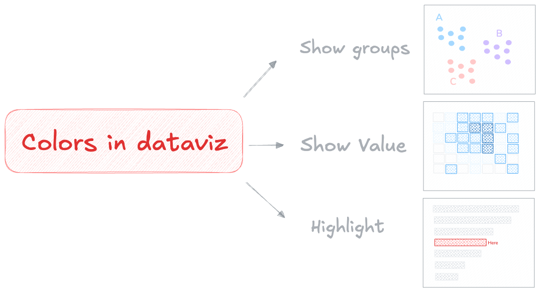
⚠️ The number one rule: colors are not here to make a chart "beautiful". They must be used only when they add meaning to the figure.
With this warning in mind, let's see how to handle these 3 use cases with the help of D3.js and its color scales.
1️⃣ Colors to show groups
We often use colors to distinguish discrete items on a chart. In this case, we need a qualitative color scale: a scale with a finite number of colors that are clearly distinct from one another and do not suggest any progression.
D3.js provides exactly this with its scaleOrdinal() function. It maps a set of discrete values to another set of discrete values → perfect for assigning a specific color to each group name.
The pattern is always the same: call the scale function (scaleOrdinal here), specify the groups in your data with domain(), and define the output colors with range().
const colorScale = d3.scaleOrdinal()
  .domain(["a", "b", "c"])            // 3 groups in the dataset
  .range(["red", "green", "blue"])    // 3 colors assigned to them

colorScale("a") // → red
colorScale("b") // → green
As usual, D3 handles the "math" part. Then, when we render shapes with React, we call colorScale() for each item to get its color based on its group.
Here is a scatterplot where each circle is colored based on its group in the data:
import { scaleLinear, scaleOrdinal } from "d3";

const data = [
  // Group A: top-left cluster
  { x: 10, y: 82, group: "A" },
  { x: 18, y: 75, group: "A" },
  { x: 25, y: 90, group: "A" },
  { x: 15, y: 68, group: "A" },
  // Group B: center-right cluster
  { x: 60, y: 45, group: "B" },
  { x: 70, y: 55, group: "B" },
  { x: 65, y: 38, group: "B" },
  { x: 75, y: 50, group: "B" },
  // Group C: bottom-right cluster
  { x: 80, y: 15, group: "C" },
  { x: 88, y: 22, group: "C" },
  { x: 92, y: 10, group: "C" },
];

const width = 500;
const height = 300;

export default function App() {
  const xScale = scaleLinear()
    .domain([0, 100])
    .range([0, width]);

  const yScale = scaleLinear()
    .domain([0, 100])
    .range([height, 0]);

  // Color scale: map each group to a color
  const colorScale = scaleOrdinal()
    .domain(["A", "B", "C"])
    .range(["#e63946", "#457b9d", "#2a9d8f"]);

  return (
    <svg width={width} height={height}>
      <rect width={width} height={height} fill="#f8f8f8" rx={4} />
      {data.map((d, i) => (
        <circle
          key={i}
          cx={xScale(d.x)}
          cy={yScale(d.y)}
          r={16}
          fill={colorScale(d.group)}
          opacity={0.8}
        />
      ))}
    </svg>
  );
}
→ Finding great colors
In the example above, the colors are hardcoded. That works! And if you know what you're doing, it's totally fine.
But picking good colors is surprisingly hard. Colorblindness, perceptual uniformity, and aesthetics are all easy to get wrong — and a bad color combination can make a chart misleading or unreadable.
That's why D3 ships with predefined color palettes designed by experts. You can use them directly in the range() instead of listing colors manually:
import { scaleLinear, scaleOrdinal, schemeTableau10 } from "d3";

const data = [
  // Group A: top-left cluster
  { x: 10, y: 82, group: "A" },
  { x: 18, y: 75, group: "A" },
  { x: 25, y: 90, group: "A" },
  { x: 15, y: 68, group: "A" },
  // Group B: center-right cluster
  { x: 60, y: 45, group: "B" },
  { x: 70, y: 55, group: "B" },
  { x: 65, y: 38, group: "B" },
  { x: 75, y: 50, group: "B" },
  // Group C: bottom-right cluster
  { x: 80, y: 15, group: "C" },
  { x: 88, y: 22, group: "C" },
  { x: 92, y: 10, group: "C" },
];

const width = 500;
const height = 300;

export default function App() {
  const xScale = scaleLinear()
    .domain([0, 100])
    .range([0, width]);

  const yScale = scaleLinear()
    .domain([0, 100])
    .range([height, 0]);

  const colorScale = scaleOrdinal()
    .domain(["A", "B", "C"])
    .range(schemeTableau10);

  return (
    <svg width={width} height={height}>
      <rect width={width} height={height} fill="#f8f8f8" rx={4} />
      {data.map((d, i) => (
        <circle
          key={i}
          cx={xScale(d.x)}
          cy={yScale(d.y)}
          r={16}
          fill={colorScale(d.group)}
          opacity={0.8}
        />
      ))}
    </svg>
  );
}
2️⃣ Colors to show values
Colors can also represent numeric values, such as temperature or population density. In this case, we need a sequential color scale: a scale that maps a number to a position along a color gradient.
D3 provides scaleSequential() for exactly this. It works very much like the scaleLinear() function from the previous lesson.
It expects two numeric values for the domain (the min and max in your data) and an interpolator function that defines the color gradient:
const colorScale = d3.scaleSequential()
  .domain([0, 100])                // input: data values
  .interpolator(d3.interpolateBlues);  // output: a blue gradient

colorScale(0)   // → light blue
colorScale(100) // → dark blue
colorScale(50)  // → medium blue
Under the hood, D3 handles the color interpolation for us — a task that looks easy but is actually very tricky.
Now is a good time to introduce a chart type that relies entirely on this kind of color scale: the heatmap. Each cell gets a color based on its value:
import { scaleSequential, scaleBand, interpolateBlues } from "d3";

const rows = ["Grp A", "Grp B", "Grp C", "Grp D", "Grp E", "Grp F", "Grp G", "Grp H", "Grp I"];
const cols = ["Mon", "Tue", "Wed", "Thu", "Fri", "Sat", "Sun"];

// Values form a gradient: high in the bottom-right corner
const values = [
  [ 2,  5,  8, 12, 15, 18, 22],
  [ 4,  8, 14, 18, 24, 28, 35],
  [ 7, 12, 20, 28, 35, 40, 48],
  [10, 18, 27, 36, 44, 52, 58],
  [14, 22, 34, 45, 55, 62, 70],
  [18, 28, 40, 52, 63, 72, 78],
  [22, 35, 48, 58, 70, 80, 86],
  [28, 40, 55, 65, 78, 87, 92],
  [35, 48, 62, 74, 85, 93, 98],
];

const data = rows.flatMap((row, ri) =>
  cols.map((col, ci) => ({ row, col, value: values[ri][ci] }))
);

const width = 500;
const height = 400;

export default function App() {
  const xScale = scaleBand()
    .domain(cols)
    .range([0, width])
    .padding(0.05);

  const yScale = scaleBand()
    .domain(rows)
    .range([0, height])
    .padding(0.05);

  // Sequential color scale: low values are light, high values are dark
  const colorScale = scaleSequential()
    .domain([0, 100])
    .interpolator(interpolateBlues);

  return (
    <svg width={width} height={height}>
      {data.map((d, i) => (
        <rect
          key={i}
          x={xScale(d.col)}
          y={yScale(d.row)}
          width={xScale.bandwidth()}
          height={yScale.bandwidth()}
          fill={colorScale(d.value)}
          rx={2}
        />
      ))}
    </svg>
  );
}
Just as with categorical colors, we strongly recommend using D3's built-in palettes rather than picking colors yourself. D3 ships with many sequential interpolators — try them below:
import { scaleSequential, scaleBand, interpolateBlues } from "d3";

const rows = ["Grp A", "Grp B", "Grp C", "Grp D", "Grp E", "Grp F", "Grp G", "Grp H", "Grp I"];
const cols = ["Mon", "Tue", "Wed", "Thu", "Fri", "Sat", "Sun"];

const values = [
  [ 2,  5,  8, 12, 15, 18, 22],
  [ 4,  8, 14, 18, 24, 28, 35],
  [ 7, 12, 20, 28, 35, 40, 48],
  [10, 18, 27, 36, 44, 52, 58],
  [14, 22, 34, 45, 55, 62, 70],
  [18, 28, 40, 52, 63, 72, 78],
  [22, 35, 48, 58, 70, 80, 86],
  [28, 40, 55, 65, 78, 87, 92],
  [35, 48, 62, 74, 85, 93, 98],
];

const data = rows.flatMap((row, ri) =>
  cols.map((col, ci) => ({ row, col, value: values[ri][ci] }))
);

const width = 500;
const height = 400;

export default function App() {
  const xScale = scaleBand()
    .domain(cols)
    .range([0, width])
    .padding(0.05);

  const yScale = scaleBand()
    .domain(rows)
    .range([0, height])
    .padding(0.05);

  const colorScale = scaleSequential()
    .domain([0, 100])
    .interpolator(interpolateBlues);

  return (
    <svg width={width} height={height}>
      {data.map((d, i) => (
        <rect
          key={i}
          x={xScale(d.col)}
          y={yScale(d.row)}
          width={xScale.bandwidth()}
          height={yScale.bandwidth()}
          fill={colorScale(d.value)}
          rx={2}
        />
      ))}
    </svg>
  );
}
→ Continuous or Discrete?
A continuous color scale uses a smooth gradient of colors to represent a range of values. The color transitions are seamless, that's the example above!
Alternatively, the dataset can be discretized. This involves grouping data into buckets, assigning each value to a specific bucket, and providing a distinct color for each bucket.
ContinuousDiscreteUsing D3.js, this is possible thanks to the scaleQuantize() function. It works just like the examples above, so let's jump straight into a working sandbox:
import { scaleQuantize, scaleBand, schemeBlues } from "d3";

const rows = ["Grp A", "Grp B", "Grp C", "Grp D", "Grp E", "Grp F", "Grp G", "Grp H", "Grp I"];
const cols = ["Mon", "Tue", "Wed", "Thu", "Fri", "Sat", "Sun"];

const values = [
  [ 2,  5,  8, 12, 15, 18, 22],
  [ 4,  8, 14, 18, 24, 28, 35],
  [ 7, 12, 20, 28, 35, 40, 48],
  [10, 18, 27, 36, 44, 52, 58],
  [14, 22, 34, 45, 55, 62, 70],
  [18, 28, 40, 52, 63, 72, 78],
  [22, 35, 48, 58, 70, 80, 86],
  [28, 40, 55, 65, 78, 87, 92],
  [35, 48, 62, 74, 85, 93, 98],
];

const data = rows.flatMap((row, ri) =>
  cols.map((col, ci) => ({ row, col, value: values[ri][ci] }))
);

const width = 500;
const height = 400;

export default function App() {
  const xScale = scaleBand()
    .domain(cols)
    .range([0, width])
    .padding(0.05);

  const yScale = scaleBand()
    .domain(rows)
    .range([0, height])
    .padding(0.05);

  const colorScale = scaleQuantize()
    .domain([0, 100])
    .range(schemeBlues[5]);

  return (
    <svg width={width} height={height}>
      {data.map((d, i) => (
        <rect
          key={i}
          x={xScale(d.col)}
          y={yScale(d.row)}
          width={xScale.bandwidth()}
          height={yScale.bandwidth()}
          fill={colorScale(d.value)}
          rx={2}
        />
      ))}
    </svg>
  );
}
Oh no! 😱
It seems like you haven't enrolled in the course yet!
This is a lesson from the D3 ❤️ React course, where you learn to create bespoke, interactive graphs with d3.js and React.
Enrollment is currently closed. Join the waitlist to be notified when doors reopen:
Or Login