Hover interaction on a chart with React
Interactivity is an important part of dataviz when working in the browser. Adding a hover effect can improve the user experience by highlighting a series on the chart. Here are a couple way to implement it, always keeping performances in mind.
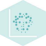
Experimenting with different highlight strategies on a scatterplot. From left to right: using a :hover pseudo class | using the pseudo class AND dimming.
-Using the :hover css pseudo class
A CSS pseudo-class is a keyword added to a selector that specifies a special y of the selected element(s) (mdn doc).
Basically, it means that you can add a class to each shape of a graph, and change its appearance when the user hover over it.
For instance, the scatterplot below is composed by a myriad of circle elements, each having a .scatterplotCircle class. In the css file, I can use .scatterplotCircle to style the circles, and .scatterplotCircle:hover to style the hovered circles. 🎉
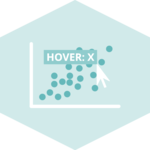
Scatterplot with hover highlight
Pro: This is the most basic strategy. It is very easy to implement and has good performances since there is nothing that needs to be redrawn expect the highlighted point.
Con: Not the best design: all the other circles are still very prominent so the highlight isn't strong.Works only to highlight the hovered circle. If the information of the circle to highlight comes as a prop, we need something else.
-Dim other groups, css only
More elegant in term of design. Requires to dim all series by adding a class to the parent div. Then highlight the hovered shape by removing it's dim.
Do it for treemap
.circle {
  fill-opacity: 1;
}
.svgArea:hover .circle {
  fill-opacity: .1;
}
.svgArea .circle:hover {
  fill-opacity: 1;
}Hover over a group on the treemap to see the other groups fading.
Pro: Better design. Easy to implement.
Con: If mouse enter chart area withouth hovering a circle, I'm still fading everything. I can highlight a circle that is below another. Perf issue if many dots?
-Dim other groups, toggle class in js
More elegant in term of design. Requires to dim all series by adding a class to the parent div. Then highlight the hovered shape by removing it's dim.
A donut chart with clean inline legends, built thanks to the centroid function of d3.js.
-Canvas and second layer for performances
Using the useDimensions hook described above is pretty straight-forward. You first need to create a ref using the react useRef()function:
Use dimming to highlight a specific point
General Knowledge


Contact
👋 Hey, I'm Yan and I'm currently working on this project!
Feedback is welcome ❤️. You can fill an issue on Github, drop me a message on Twitter, or even send me an email pasting yan.holtz.data with gmail.com. You can also subscribe to the newsletter to know when I publish more content!
Contact
👋 Hey, I'm Yan and I'm currently working on this project!
Feedback is welcome ❤️. You can fill an issue on Github, drop me a message on Twitter, or even send me an email pasting yan.holtz.data with gmail.com. You can also subscribe to the newsletter to know when I publish more content!