Line Chart Remake
I teach data visualization with R and Python, which means I review hundreds of charts from talented students. The same issues come up again and again.
This page takes a chart with a solid message and improves it step by step. It is a practical way to revisit the most common pitfalls and see the impact of each fix.
📍 Original Chart and Code
Reddit hosts an active channel called relationship_advice where people share their relationship struggles to get guidance. Recently, @GeorgeDaGreat123 used AI to analyze fifteen years of comments from this wild corner of the platform.
It sparked plenty of debate, but that is not the focus here. Instead, let's take a look at the original chart that's been published:
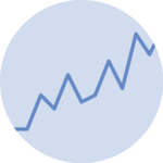
Everything starts with a pretty classic line chart. Each line shows the proportion of a group of comments.
The comments advising the break up the relationships are in red, the ones advising to communicate better in blue and so on.
From the graph style, I'm pretty sure it's been made using Python and Matplotlib.
My first step was to reproduce this graph using React and D3.js.
Not easy, as the underlying data is not available anywhere. In a perfect world everything would be hosted on Github together with the code but hey 🤷♂️
So I gave the chart to a LLM to extract approximate data. The result is quite close isn't it?
Now the fun starts.
The legend made readers constantly jump back and forth to interpret the lines.
This adds unnecessary cognitive load. If the story isn’t immediately clear, people will give up.
Direct labeling solves this!
A simple yet powerful improvement: removing the spine.
The spine—the surrounding box—adds clutter without conveying any information.
Surprisingly, many viz libraries add it by default. Now our chart has some breathing room, doesn’t it?
I’m not a big fan of dense grid lines.
In our decluttering mission, removing the horizontal ones is an easy win.
Time to improve the Y axis!
The axis title isn’t really needed. By simply adding a % next to the numbers, the chart becomes clearer and less cluttered.
Same principle applies: use less ink to convey the same information.
Now it’s clear the X axis could use some improvement. The number 20 appeared repeatedly: let’s show only what matters instead.
It’s also obvious that these are years, so the axis title isn’t really necessary.
The author label in the top right was distracting, competing with the most interesting part of the chart: the spike in the "end relationship" line.
Let’s move it to a caption instead and give it some subtle formatting.
The title and subtitle aren’t doing their job.
They describe instead of telling a story. Your reader is in a hurry and wants to grasp the point instantly. You want them hooked.
Let’s reword them to make people stop scrolling while still clearly showing what the graph reveals.
Some design golden rules:
- everything should be aligned with something
- Use a clear hierarchy of information
That's an easy fix but that makes the chart look more professional.
Let’s give the chart some breathing room, along with a subtle background to make it stand out a bit more.
Let’s slightly nudge the line labels—they’re currently overlapping.
This is a very common struggle and can be surprisingly time-consuming. Clever helper libraries can solve it, but that’s not today’s topic 🙂
There are quite a few lines on this chart, but not all of them matter equally for the story.
Once again, let’s guide the time-pressed reader toward what matters most.
By slightly reducing the opacity of all but two lines, the main message becomes clear: people increasingly advise breakups, while communication is suggested less often.
🎮 Your turn
Do you ever make a chart that doesn’t feel professional, but you can’t quite say why?
That’s a very common feeling.
Try playing with the options below to see their effect one by one. Hopefully, you’ll keep them in mind the next time you run into design issues.
📍 Useful links
- Dataviz design game
- Learn how to make great charts with R and Python
- List of dataviz caveats
- Code for this chart


Contact
👋 Hey, I'm Yan and I'm currently working on this project!
Feedback is welcome ❤️. You can fill an issue on Github, drop me a message on LinkedIn, or even send me an email pasting yan.holtz.data with gmail.com. You can also subscribe to the newsletter to know when I publish more content!
