A project by the React Graph Gallery
varies drastically across countries. A worker in Norway earns over 100x more than one in Burundi for similar labor. The gap has only widened since 1970.
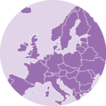
Worldwide GNI per capita in 2023
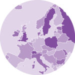
Distribution of GNI in 2023
Evolution of GNI across 217 countries
I built this unperfect viz in 2 hours.
You can do the same by learning how D3.js, React and AI work together!
Why this?
I'm currently working on an online course that teaches people how to create bespoke, interactive graphs for the web. As always when I launch a course, I'm confronted with a complicated truth: the financial effort for someone in Indonesia is ridiculously high compared to someone in Norway.
To mitigate this, the course is half price for people in developing countries.
But tonight, with the kid sleeping, the rain dropping and a bit of reggae in the background, I decided to dig a bit deeper into this topic.
GNI
I'm not an economist, and it's always been an enigma to me that money does not have the same value at all from one country to another. When you work an hour in Burundi, there isn't much you can buy on the world market compared to someone who worked for an hour in Switzerland.
The graph above does not try to find a reason for that. Instead, it just allows you to explore how much this is true, where and when! It is based on the GNI (Gross National Income), published by the World Bank.
GNI measures the total income earned by a country's residents in a year — wages, business profits, investment returns — divided by the population. It gives you a rough proxy for "what does an average person earn" in a given country.
A dataviz speedrun experiment
The interactive graphs above are far from perfect. That's the spirit of a speedrun experiment: with only ~2 hours, I wanted to see how far I could go to fetch and explore a dataset.
Turns out, pretty far!
I used Claude to help me build this using my favorite stack: React and D3.js, deeply described in the React Graph Gallery and its companion online course.