ShadcnUI
Shadcn/UI provides beautifully designed, accessible components that you can copy into your project and customize.
It's not a component library — it's a collection of reusable components you own and control.
The problem
Every web app needs UI elements: buttons, dialogs, dropdowns, tabs, accordions.
Building them from scratch is tedious and surprisingly hard: you need to handle keyboard navigation, accessibility, focus management, animations and more! 😳
Traditional component libraries like Material UI or Ant Design solve this, but they come with trade-offs: large bundle sizes, opinionated designs that are hard to override, and a dependency you can't easily escape.
What is Shadcn/UI?
Shadcn/UI takes a radically different approach. It's not a library you install: it's a collection of components you copy into your project.
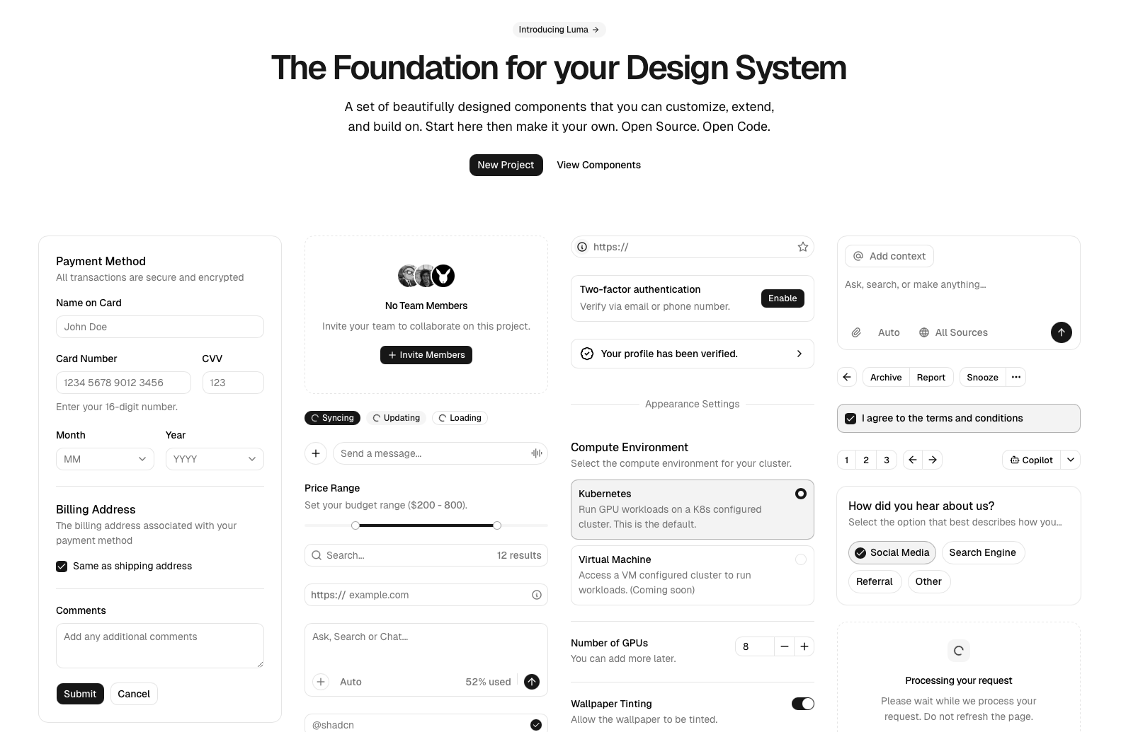
The ShadcnUI library homepage is a dashboard built only with its components
Under the hood, each component is built on two things:
- Radix UI — headless primitives that handle all the complex behavior (accessibility, keyboard navigation, focus trapping)
- Tailwind CSS — for all the styling, which you can customize freely
The key difference: since the component code lives in your project, you have full control. You can tweak anything — colors, spacing, animations — without fighting a library's API.
Installation
If you have a React project with Tailwind already set up, then initialize Shadcn/UI like this:
npx shadcn@latest initThis creates a few config files and a components/ui/ folder where all your components will live.
To add a component, you don't install a package — you run a command that copies the source code into your project:
npx shadcn@latest add buttonThis creates a file at components/ui/button.tsx that you own entirely. You can open it, read it, and change anything you want.
Oh no! 😱
It seems like you haven't enrolled in the course yet!
This is a lesson from the D3 ❤️ React course, where you learn to create bespoke, interactive graphs with d3.js and React.
Enrollment is currently closed. Join the waitlist to be notified when doors reopen:
Or Login